
Quick Answer
Use industry churn benchmarks for payment platforms as directional context, not as a copied target. Start with the closest peer set, then normalize metric type, churn cause, and reporting cadence before discussing performance. Vena’s below 1% monthly and 4.9% annual B2B SaaS references can sharpen discipline, but only when contract structure and cohort design are comparable. Final operating bands should come from your own logo, gross revenue, and net revenue churn history.
How to Use Churn Benchmarks by Industry#
If you run a payment platform, start with this assumption: there is no single churn benchmark you can safely copy from search results. Published benchmarks come from different market cuts, including broad industry datasets, B2B SaaS reports, subscription-app reports, and payment-method segments. These are not directly comparable without normalization.
That is why benchmark numbers can look useful at first, then fail when you try to use them. BillingPlatform publishes industry-specific churn context. Recurly states that average churn depends on market and industry. Stripe publishes payment-method churn benchmarks, while RevenueCat reports subscription-app benchmarks. Those are different peer sets, not one standard.
Use outside benchmarks as comparator inputs, not operating truth. Before you set a target, normalize each source against your own data on four points:
- Metric definition: customer churn tracks customers or accounts lost. Revenue churn tracks dollars lost.
- Churn driver: voluntary churn is customer choice. Involuntary churn is attrition not driven by customer choice, often tied to billing or payments.
- Time basis: monthly and annual churn are not directly comparable unless converted to a common basis.
- Peer group: industry-wide, B2B SaaS, subscription apps, and payment-method benchmarks represent different comparison sets.
This is practical, not academic. One benchmark source reports 2025 context figures like 3.8% annual SaaS churn and 4.9% for B2B SaaS. It also cites "good churn" claims like below 1% monthly or below 5% annual for B2B SaaS. That can be useful directional context, but not a payment-platform target unless your model, cohort, and reporting basis match.
Keep involuntary churn visible from the start. Stripe reports recovering over $6.5 billion for businesses in 2024, which reinforces that billing performance can materially affect churn outcomes. If losses are driven by billing or payment issues, pricing changes alone may miss the root cause. Adjacent checks like payment decline benchmarks belong in the same review.
This article helps you set a defensible churn range that matches your model, so product, pricing, and finance decisions are based on comparable inputs instead of mixed benchmark claims. If you want the full breakdown, read Subscription Business Benchmarks by Industry Vertical.
Who This Benchmark List Serves and How to Judge Source Quality#
This list is for operators who need churn benchmark ranges they can defend. It is not for anyone looking for one universal "good churn" number across software subscriptions, telecom, and ecommerce subscriptions. Recurly explicitly notes that churn depends on market and industry, so a universal target is the wrong baseline.
| Check | What to confirm | Grounded example |
|---|---|---|
| Definition match | Use the same churn type you track | ChartMogul separates customer/logo churn from revenue churn; lost accounts are not the same as revenue lost from cancellations or downgrades |
| Time-basis match | Compare on one cadence only | Monthly and annual churn are not interchangeable; Recurly shows 1% to 5% annual and 4% monthly examples |
| Segment match | Match similar peers before using the number | Stripe benchmarks payment methods, and Recurly emphasizes comparisons with similar companies within an industry |
| Method transparency | Prefer sources that disclose sample and window | Recurly cites more than 2,000 businesses over the last year and 1,200 subscription businesses over a four-month period; BillingPlatform is a secondary aggregation |
Use this reliability rubric before adopting any external benchmark. If a source misses a check, treat it as directional context rather than target-setting authority.
- Definition match
Confirm the source is measuring the same churn you are. ChartMogul distinguishes customer churn, or logo churn, from revenue churn and recommends analyzing both. If your team tracks lost accounts but the benchmark reports revenue lost from cancellations or downgrades, the comparison is misaligned.
- Time-basis match
Compare on one cadence only. Churn is calculated over a defined period, so monthly and annual rates are not interchangeable without conversion. Recurly presents both 1% to 5% annual churn and 4% monthly churn examples on the same page, which shows why normalization has to come first.
- Segment match
Match peers before you match numbers. Stripe benchmarks across payment methods, and Recurly emphasizes comparisons with similar companies within an industry. If your model differs, document why the segment is still comparable before using its benchmark as a target input.
- Method transparency
Prefer sources that disclose sample and window. Recurly publishes scope details such as more than 2,000 businesses over the last year and, in another study, 1,200 subscription businesses over a four-month period. BillingPlatform describes its table as compiled from multiple reliable sources, which is useful context but still a secondary aggregation. If method details are missing, keep the number in your evidence set as directional only.
Quick Comparison Table of Benchmark Sources You Can Actually Use#
Use this table as a directional benchmark map, not a payment-platform target sheet. These sources help frame decisions, but none is a payment-platform cohort baseline.
| Source | Segment | Metric type | Period | Confidence level | Best use | Cannot infer |
|---|---|---|---|---|---|---|
| BillingPlatform | Broad industry cuts, including Energy/Utilities (11%), IT Services (12%), Computer Software (14%), Industry Services (17%) | Customer churn and retention-rate framing | Compiled industry churn figures (period definitions vary across underlying sources) | Medium | Board reporting context and first-pass peer framing, including geography checks (for example, US vs Europe in energy) | Exact sample design, cohort construction, and payment-platform-specific comparability |
| Vena Solutions | B2B SaaS | Customer churn and revenue churn framing | Monthly and annual references (including below 1% monthly and 4.9% annual B2B SaaS (2025)) | Medium | Stretch comparator for software-style commercial motions and target-discipline discussions | Sample scope, geography, and direct monthly-to-annual comparability without normalization |
| Elena Verna (third-party repost) | Subscription-operator / subscription-app context | First-term churn with involuntary-churn emphasis | Annual first-term framing in repost | Low | Early hypothesis-setting when losses are concentrated in first billing cycles | First-party provenance, sample size, segment mix, and method details |
| Churnkey | Cross-segment monthly cuts: SaaS, ecommerce subscriptions, telecom | Customer churn | Monthly churn | Low-Medium | Trigger calibration and fast range checks (4-6% SaaS, 10-15% ecommerce, 1-2% telecom) | Cohort design, geography, and method transparency for how averages were assembled |
Treat the confidence labels as operating shorthand, not math. Medium is useful for context and pressure-testing. Low or Low-Medium is useful for orientation and alerts, not standalone target setting. Ravio is excluded here because the surfaced material is compensation benchmarking, not churn benchmarking.
Best Benchmark Input for Industry Context Through Broad Sector Cuts#
If you need a fast industry-context starting point, BillingPlatform is a useful first pass. Treat it as a directional comparator rather than a payment-platform target baseline.
Why this is the right first input#
BillingPlatform gives usable broad sector cuts: Energy/Utilities (11%), IT Services (12%), Computer Software (14%), and Industry Services (17%). That helps you choose a first comparator lane instead of defaulting to a generic software average.
It also surfaces geography risk inside a single sector: Energy/Utilities shows 30-35% in the United States vs 12-15% in Europe. Even if utilities is not your direct match, that spread is a practical signal that region can materially shift expected churn ranges.
PM Toolkit reinforces the same operating rule: churn benchmarks vary by business model, segment, contract type, and industry, so use them as directional reference points, not absolute standards.
Pick the nearest bucket before setting targets#
Choose the closest broad commercial motion first, then tighten from there:
| Sector | Churn figure | Use in this article |
|---|---|---|
| IT Services | 12% | Rough proxy for more service-led B2B motions |
| Computer Software | 14% | Rough proxy for software-style platform motions |
| Industry Services | 17% | Rough proxy for more operations-heavy motions |
| Energy/Utilities | 11%; United States 30-35% vs Europe 12-15% | Mainly a geography sensitivity check |
Use the nearest bucket as a first pass, then move to narrower comparators and your own cohorts before you set an internal target band.
What to verify before you use it#
Before you use one of these rows operationally, confirm that it matches your churn definition and operating geography. BillingPlatform defines churn as customers lost over a period. It also says its breakdown is compiled from multiple sources, but the surfaced material does not provide full methodology detail for definitive target setting, including full cohort construction or sample design.
Where teams get misled#
The common mistake is treating a broad category as a payment-platform baseline. Use BillingPlatform to answer one question: which broad lane are we closest to? Then tighten from there with more specific comparators and internal cohort data.
Best Benchmark Input for Tight B2B SaaS Target Discipline#
Use Vena Solutions as a directional stretch comparator when your model behaves like B2B subscription software. Do not use it as a default forecast baseline. Vena frames a "good" B2B SaaS churn rate as below 1% per month and about below 5% annual. It also cites 4.9% annual churn for B2B SaaS in a 2025 context.
When Vena Solutions is useful#
Vena is useful when you want tighter target discipline than a broad industry cut. Its framing can set a stricter retention target if your contracts, renewals, and customer lifecycle are genuinely comparable.
What makes it valuable#
Its value is metric discipline. Vena defines customer churn as active cancellations plus preventable payment-loss churn, and defines churn in recurring-revenue terms as expected recurring revenue lost in a period. That gives product, sales, and finance a cleaner way to work from shared definitions.
Use its below 1% monthly / below 5% annual framing as a challenge benchmark only after you confirm that the metric and period match your own.
Where confidence drops#
Treat Vena as directional until you validate methodology details. The visible material cites a "Vena SaaS data study," but the surfaced excerpts do not disclose the full sampling frame, cohort design, geography mix, or full metric construction.
That gap matters because different sources frame churn differently. Recurly presents 1% to 5% annual as average and 4% monthly as a good benchmark in its framing. It also discloses coverage of more than 2,000 businesses. SaaS Capital discloses a survey base of over 700 private SaaS companies.
How to use it without fooling yourself#
Use Vena when your retention motion is genuinely similar. If your economics or churn drivers differ, use it to test assumptions, not to set your primary target.
Before you use it operationally, run this check:
- Match the metric: customer churn vs revenue churn, and monthly vs annual
- Capture benchmark context: source name, September 19, 2025 date, exact quoted threshold, and a note that methodology detail is limited in the surfaced material
- Confirm comparability: align cohort and business model context before using any target
- Split churn drivers: separate voluntary vs involuntary churn before applying that retention target
For a step-by-step walkthrough, see What Is Churn Rate? Measuring Subscriber Loss for Subscription Platforms.
Best Benchmark Input for Subscription Volatility and Early-Lifecycle Risk#
When churn is concentrated at trial start or in the first billing cycles, early-lifecycle benchmarks are often more useful for that window than mature B2B SaaS targets. That is where an Elena-attributed framing can help.
Elena Verna as a lens, not a target#
Treat Elena Verna as a decision lens, not a payment-platform benchmark target. This framing helps you test whether customers fail to make it through the first term, which is a different problem from steady-state churn in contract-heavy B2B cohorts.
Keep the evidence bar high. The surfaced Elena material here is secondhand through a repost, not a retrieved primary publication with full method detail, so it should not carry a universal "good churn" claim.
Why this input matters when churn is early#
The strongest support for this section comes from subscription-app data. RevenueCat's State of Subscription Apps covers over 115,000 apps and more than $16 billion in revenue. That is useful when your product behaves more like a subscription app or self-serve recurring motion.
That dataset also shows how much cancellation pressure can sit in the opening window. RevenueCat reports that 55% of 3-day trial cancellations happen on Day 0, and nearly 30% of annual subscriptions are canceled in the first month. If your model shows similar behavior, broad blended software averages can hide the real problem.
"First-term churn" is useful here as a practical label, even though it is not a standardized industry metric. It helps separate onboarding-period loss from later retention decay.
Where the transfer risk shows up#
App-heavy patterns can misstate risk for contract-led B2B payment motions. The reposted material reports different scaling behavior between consumer subscriptions and B2B SaaS. It includes a claim that B2B SaaS in the $20-$100/month range can invert the consumer pattern as companies scale.
Use that as a caution signal, not a rule. The point is transfer risk: app-oriented benchmark behavior does not automatically map to contract-heavy B2B cohorts.
How to use it without overstating risk#
Use this benchmark family for scenario planning and trigger design when early-cycle losses dominate, not as a final target by default. Keep these checks explicit:
- Measure churn at the subscriber level first for comparability. Recurly recommends subscriber-level measurement and uses a monthly benchmark view.
- Split voluntary and involuntary churn before interpretation. Recurly tracks both, and the Elena-attributed view in the reposted source suggests early-term involuntary churn may be less dominant unless debit-card exposure is high.
- Normalize each benchmark row by cohort type, time basis (monthly or annual), early-window definition (trial vs post-first bill), and whether the source is app-heavy or B2B-heavy.
If losses are mostly involuntary, start with payment-performance diagnostics. If losses are mostly voluntary in the first term, this comparator family is typically the better starting point before moving to broader cross-segment ranges.
For a subscription-specific look at churn, expansion, and payment decline benchmarks, see SaaS Subscription Billing Benchmarks: Churn MRR Expansion and Payment Decline Rates.
Best Benchmark Input for Cross-Segment Monthly Range Checks#
Use Churnkey as a fast monthly range check across segments, not as a target-setting baseline. Its side-by-side ranges are useful for initial peer-group comparison, but the retrieved material does not provide cohort-method detail.
Where Churnkey helps most#
Churnkey publishes average monthly churn by industry and explicitly includes SaaS, ecommerce subscriptions, and telecom in side-by-side ranges. That format is useful because it makes the comparison segment explicit instead of relying on a blended "industry average."
| Segment | Churnkey monthly range | What it helps you check |
|---|---|---|
| SaaS | 4 to 6% monthly | Whether your monthly customer churn is closer to Churnkey's SaaS range |
| ecommerce subscriptions | 10 to 15% monthly | Whether your monthly customer churn is closer to Churnkey's ecommerce subscription range |
| telecom | 1 to 2% monthly | Whether your monthly customer churn is closer to Churnkey's telecom range |
It also highlights compounding risk: 5% monthly churn is around half of customers lost annually, and 10% monthly churn is about 70% annually. Use that as a severity check so monthly figures do not get treated as small by default.
How to use it without over-claiming#
Match metrics first. Customer churn is defined as customers who canceled during a period, so use a monthly customer-cancellation measure when comparing.
Then choose your closest segment and treat the other bands as guardrails. If you sit outside your nearest band, investigate quickly, but do not treat the gap as proof of a single cause.
Before acting, split voluntary and involuntary churn. Recurly's distinction is practical: voluntary churn reflects customer preference changes, while involuntary churn reflects payment issues. If the gap is mostly involuntary, payment-performance analysis should come first. See Payment Decline Rate Benchmarks: How Your Platform Compares to Industry Standards.
Limits to keep explicit#
Averages can mislead because they can miss context such as geography and macro conditions. Sample size, cohort design, geography weighting, and collection method for cross-industry tables are often not disclosed, so treat comparisons accordingly.
Use this input for quick cross-segment monthly range checks. Do not use it as a payment-platform baseline or as board-grade precision.
Best Benchmark Input for Final Target Setting Using Your Own Cohorts#
For payment-platform churn benchmarking, external benchmarks are anchors and your own cohorts provide execution context. Benchmarks help with health checks and realistic target setting, but they are not a universal number.
- Best for: turning external benchmarks into targets finance and product can execute
- Pros: combines external anchors (BillingPlatform, Vena, and Recurly range checks) with your own logo churn, gross revenue churn, and net revenue churn
- Cons: only works if your internal definitions, cohort logic, and time basis are consistent
- Concrete use case: pick the closest external cohort for a base target, then tighten or relax it after splitting voluntary vs involuntary churn
1. Pick one external anchor, not a blended average#
Start with the closest comparator to your business motion. BillingPlatform is a compiled external reference. Vena provides software-oriented benchmarks, including 4.9% annual B2B SaaS churn and a below 1% monthly "good" threshold. Recurly is useful for range checks and voluntary/involuntary churn context.
Do not average mismatched definitions or cadences. A mixed number built from annual and monthly benchmarks can look precise without being operationally reliable.
2. Convert that anchor into a three-metric internal view#
Set targets only after viewing the same cohorts through these three metrics:
| Internal metric | What it shows |
|---|---|
| Logo churn | Lost subscriber accounts over a period |
| Gross revenue churn | Recurring revenue lost from churn or contraction, excluding expansion |
| Net revenue churn | Revenue change in the existing base, including losses and gains |
Customer churn and revenue churn can diverge, so one metric alone can mislead. Keep the cohort window and definitions aligned across all three metrics before you set the final number.
3. Adjust by voluntary vs involuntary mix#
Split churn before assigning ownership. Recurly's framing is practical: voluntary churn reflects customer choice, while involuntary churn points to payment issues. It also reports 3.27% overall, 2.41% voluntary, and 0.86% involuntary.
Use that as a diagnostic structure, not a universal target. If most of your gap versus the anchor is involuntary churn, prioritize payment-performance work first.
4. Resolve external vs internal conflicts with cohort history#
When external benchmarks and internal cohorts disagree, first align definitions and cadence (logo vs revenue churn, gross vs net, voluntary vs involuntary, monthly vs annual). Then set a target band that is defensible against both the external comparator and your own comparable cohorts.
Use outside numbers to pressure-test whether your target band is too soft or too aggressive, and use cohort history to decide where to operate inside that band.
Related: Gateway Routing for Platforms: How to Use Multiple Payment Gateways to Maximize Approval Rates.
Normalize Metrics Before You Compare Anything#
Normalization is the gate. If a benchmark row cannot be mapped to your metric taxonomy and reporting cadence, reject it.
| Step | What to do | Grounded detail |
|---|---|---|
| Lock definitions | Classify customer vs revenue churn, then voluntary vs involuntary, then monthly vs annual | Customer churn is customers ceasing subscriptions; revenue churn is recurring revenue lost |
| Split churn drivers | Keep voluntary and involuntary churn separate before performance discussions | Involuntary churn reflects non-intent causes such as payment failure |
| Align time basis | Convert every benchmark row to one cadence before setting targets | Use 1 - (1 - Monthly Churn Rate)^12; 5% monthly is around half annually |
| Build an evidence pack | Capture source, segment, metric definition, period, geography, sample or time window, and known unknowns | The article notes geography and method context matter and gives examples such as more than 2,000 businesses over the last year |
| Apply an acceptance checkpoint | Keep only rows that map to your taxonomy, cadence, segment, and geography labels | If your platform has mixed motions, set separate churn targets by motion instead of forcing one blended KPI |
- Lock definitions in this order:
customer churnvsrevenue churn, thenvoluntary churnvsinvoluntary churn, thenmonthly churnvsannual churn.
Customer churn is customers ceasing subscriptions. Revenue churn is recurring revenue lost. If you cannot classify a row confidently, do not use it for target setting.
- Separate voluntary and involuntary churn before performance discussions.
Voluntary churn reflects customer choice. Involuntary churn reflects non-intent causes such as payment failure. Keep the split explicit so your comparison points to the right fix.
- Convert every row to one time basis before setting targets.
Do not compare monthly and annual churn directly. Use compounding for conversion: 1 - (1 - Monthly Churn Rate)^12. A 5% monthly rate is around half annually, not a simple 5% x 12.
- Create a one-page evidence pack for each benchmark row.
Include: source name, segment, metric definition, period, geography (e.g., United States or Europe), sample or time window, and known unknowns. Geography and method context matter. Published churn can differ by region, and some sources disclose sample context such as "more than 2,000 businesses over the last year."
- Run a hard acceptance checkpoint, then split targets by motion when needed.
Keep only rows that map to your taxonomy, cadence, segment, and geography labels. If your platform has mixed motions, set separate churn targets by motion instead of forcing one blended KPI.
Need to operationalize this in your own stack? Start with the Gruv docs.
Turn Benchmark Bands Into Product Pricing and Ops Decisions#
Benchmarks matter only when they change who acts next. After normalization, route churn movement to the right owner instead of treating every increase as a pricing issue.
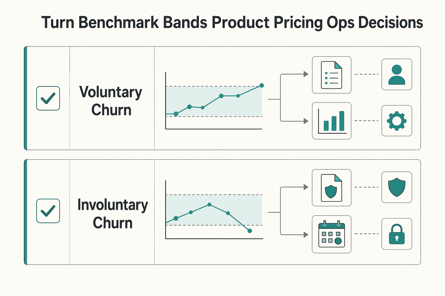
For subscription businesses, that split is critical. Recurly's published breakdown of 2.41% voluntary churn and 0.86% involuntary churn shows how a blended churn number can hide different problems. Use benchmark bands to decide what to inspect first, not to force one generic response.
| Churn movement | Primary owner | First checks |
|---|---|---|
| Voluntary churn rises | Product + pricing | Subscriber experience, ongoing value, pricing fit |
| Involuntary churn rises | Finance ops + payments ops | Failed payments, retry recovery, approval performance, decline management |
- Map the movement to one owner before debating fixes
If churn is mostly voluntary, start with product and pricing because customers are choosing to leave. If churn is mostly involuntary, lead with finance and payments operations because cancellations can come from payment failure, not customer intent.
- Use trigger rules to avoid fixing the wrong layer
Involuntary churn spikes should trigger payment-performance checks first, including retries and recovery flow. Voluntary churn spikes should trigger value and pricing-fit checks first. Different churn types need different responses.
- Pair churn review with decline and routing signals
Review churn split alongside failed payments, recovery after retries, and approval performance by processor or path where available. Routing and retries are operational levers that can improve approval likelihood, not a standalone cure for churn. For the adjacent layer, use Payment Decline Rate Benchmarks: How Your Platform Compares to Industry Standards.
- Run a regular decision rhythm as an operating choice
Choose a repeat cadence that fits your operating model, then use it to refresh benchmark inputs, re-score confidence in each benchmark row, adjust target bands if cohort mix changed, and run a short miss post-mortem. Keep one standard explicit: evaluate payment recovery with the same rigor as pricing support before changing pricing.
For churn by type, see Involuntary vs Voluntary Churn on Platforms and How to Attack Each.
Mistakes That Make Churn Benchmarks Dangerous#
Churn benchmarks get dangerous when you trust off-intent sources, mix time bases, copy broad averages, or hide regional differences. Before you use any number to guide pricing or retention decisions, validate source intent, period basis, model fit, and geography.
- Using off-intent sources because they rank nearby
Ravio benchmarks compensation, including salary data for up to 300 key job roles, not customer churn. If a source cannot clearly state a churn metric and measurement period, exclude it from your benchmark set.
- Mixing monthly churn and annual churn in one trend line
Monthly and annual churn are not directly comparable. Convert to one basis first using Annual Churn Rate = 1 - (1 - Monthly Churn Rate)^12. The monthly range-check source also notes that 10% monthly churn compounds to over 70% annual churn. So when you see framing like 1-5% annual and 4% monthly, treat it as a normalization task before calling it a trend.
- Copying broad Computer Software averages into payment-platform targets
BillingPlatform reports around 14% churn for Computer Software, and the same source says that figure varies by B2B vs B2C model. Use broad sector numbers for orientation, not as your operating target, until model match is explicit.
- Ignoring geography when benchmark rows already show regional spread
Keep United States and Europe split in your benchmark view. BillingPlatform's sector example shows 30-35% in the United States versus 12-15% in Europe, which is enough to require separate comparisons.
Related reading: Subscription Churn Benchmarks by Vertical.
Conclusion#
Do not set targets from one headline churn number. Set them from matched comparators, normalized definitions, and confidence-weighted evidence from your own cohorts.
- Match the comparator before you use the benchmark.
Churn varies materially by business structure and geography, so broad averages are orientation only. One benchmark source, for example, shows energy-provider churn at 30% to 35% in the United States versus 12% to 15% in Europe. If you cannot map a benchmark to your model, segment, and region, do not use it as a target anchor.
- Normalize definitions and time basis before making decisions.
Review both customer (logo) churn and revenue churn, then split voluntary from involuntary churn because they point to different root causes. One benchmark view reports 3.27% overall churn with 2.41% voluntary and 0.86% involuntary, which shows why a single blended number can hide the operating issue. Also align monthly and annual comparisons: 5% monthly can mean losing around half of customers annually, and 10% monthly can imply about 70% annual loss.
- Use external benchmarks as directional, then finalize bands with internal cohort performance.
Published benchmark levels conflict across sources, so treat them as inputs, not authorities. Build your target band from segmented internal cuts, then pressure-test it with external data where metric definition, period, segment, and geography are actually comparable.
Teams that separate voluntary and involuntary churn, track both logo and revenue churn, and avoid mixing monthly and annual figures are less likely to miss important risk signals. If involuntary churn rises, inspect payment performance before changing packaging or price, and pair that review with adjacent checks like payment decline benchmarks. If you are turning churn targets into cross-functional execution across collection, conversion, and payouts, talk with Gruv.
Frequently Asked Questions
What is a good churn rate by industry for payment platforms?
There is no universal "good" churn rate for payment platforms in these sources, so use comparators by operating model, not by keyword match alone. BillingPlatform shows broad and narrow cuts that differ materially, including Computer Software at 14% and B2B SaaS at 3.5% to 4.67%, plus regional spread in some sectors, for example United States 30% to 35% vs Europe 12% to 15% for energy providers. If your motion is closest to B2B SaaS, Vena cites below 1% monthly as a "good" threshold and separately reports about 4.9% annual for B2B SaaS; treat these as reference points, not universal targets.
Why do `SaaS` churn benchmarks from `BillingPlatform`, `Vena Solutions`, and `Churnkey` conflict?
They conflict because the datasets and construction methods are different. Vena reports 3.8% annual SaaS and 4.9% annual B2B SaaS in 2025 context, while the other source reports 4.00% monthly and 38% annual for SaaS in its Stripe-linked benchmark set and discloses inputs including 5.4M failed payments and 25M subscriptions. BillingPlatform states its benchmarks are compiled from multiple sources, so disagreement across scope, segment, and time basis is expected.
Can I compare `subscription apps` monthly churn with annual `B2B SaaS` churn targets?
Not directly. Normalize both to one time basis first using Annual Churn Rate = 1 - (1 - Monthly Churn Rate)^12. For example, 3% monthly = 30.62% annual. After conversion, compare only if the business motion and cohort are still genuinely similar.
Which matters more for operators, `logo churn` or `revenue churn`?
You need both, because they answer different operating questions. Logo churn, or customer churn, tracks subscriber loss, while revenue churn tracks recurring revenue loss, and one source explicitly frames revenue churn as a more complete finance view. Use both together so customer loss and revenue impact stay visible at the same time.
How should teams treat benchmarks when source methodology is unknown?
Treat those numbers as directional, not as target-setting anchors. When a benchmark does not clearly disclose metric definition, time basis, segment scope, and dataset context, comparability is uncertain. In practice, unknown methodology is a reason to lower confidence, not force precision.
What should payment platforms track beyond one churn number to set better targets?
Track at least customer/logo churn, revenue churn, and a split between voluntary and involuntary churn. That split matters operationally because payment-failure churn is a different problem from value-driven cancellation, and Chargebee treats them as distinct classifications. One source also reports involuntary churn at 22% of total SaaS churn, which is a useful signal to monitor payment failure patterns separately.
Try a related tool
Researched and edited by the Gruv editorial team. Gruv builds cross-border billing, payouts, and finance-operations software for global businesses.
Sources
Includes 6 external sources outside the trusted-domain allowlist.
- stripe.com/en-se/resources/more/monthly-churn-101trusted
- stripe.com/lp/churn-benchmarkstrusted
- billingplatform.com/blog/average-churn-rate-by-industryexternal
- chartmogul.com/saas-metrics/customer-churnexternal
- chartmogul.com/saas-metrics/revenue-churnexternal
- churnkey.co/blog/the-average-churn-rate-for-subscription...external
- churnkey.co/blog/convert-monthly-churn-to-annual-churnexternal
- club.laetor.co/veille-growth-b2b/post/subscription-churn-me...external
Educational content only. Not legal, tax, or financial advice.
Related Posts

Payment Decline Rate Benchmarks for Platform Operations
A useful decline-rate benchmark is not a headline percentage. It is a repeatable view of your own traffic that clearly defines the cohort, the processor path, and what happened after authorization through settlement and payout reconciliation.

How to Compare SaaS Billing Benchmarks Before Expansion
For expansion decisions, treat payment decline rate, churn, and expansion as one system, not three separate metrics. That gives product, finance, and GTM a view they can defend before rollout resources are committed. If you own the budget call, you need that view before your team starts treating one good month as a trend.

Gateway Routing for Platforms: How to Use Multiple Payment Gateways to Maximize Approval Rates
Adding a second payment gateway is not the win. The win is routing each payment on purpose, then proving approvals improved without creating new latency, cost, or reconciliation problems.