
Quick Answer
Choose from the best figma ui kits by validating one real delivery flow before you buy: confirm visible component states (like default, hover, pressed, and disabled), usable variables, and clean Dev Mode handoff. Then apply a strict no-go rule on rights clarity and documentation quality. If two critical checks still rely on guesswork, keep shopping.
Why Your UI Kit is a Business Asset, Not a Design Expense#
A UI kit becomes a business asset when it removes repeat production work from paid projects. If it helps you reuse decisions, keep handoff cleaner, and reduce avoidable cleanup, it protects margin in a way a polished starter file does not.
- Reusable capacity you can actually feel. The real value is not visual polish. It is the hours you stop burning on repeat components, state handling, and pre-handoff cleanup. If you are rebuilding buttons, inputs, cards, tables, navigation, and empty states from scratch, you are spending skilled time on work Figma components were built to reuse. A good kit also shows real variant depth, with states like default, hover, pressed, and disabled structured consistently inside a component set.
What matters: it gives you back capacity for client decisions, IA, and product thinking instead of trapping you in redraw work.
- Proof surfaces you can inspect before you buy. With so many options, including a recent snapshot showing 4,770+ free UI kits in Figma Community, inspection is not optional. Start with the preview file structure, but remember that for paid Figma Design files, you can access the first page only before purchase. That makes page one a real test. Can you find a clear library layout, logically grouped components, visible variants, variables or token readiness, docs, FAQs, and creator contact details for support? If the preview hides structure, docs are thin, or the support surface is hard to find, treat that as a fail, not a maybe.
What matters: the best kits make quality legible before you pay, even within preview limits.
- Pricing confidence that comes from cleaner client review. You cannot promise faster approvals just because you bought a kit, but you can control consistency, review clarity, and how much visual drift shows up between screens. Variables matter here because Figma lets reusable values update across files, which helps keep colors, spacing, and other shared values aligned when a project changes. That makes your work easier to present and easier to defend in scope conversations. If you want to connect that to pricing, pair your kit choice with a clear model like Value-Based Pricing: A Freelancer's Guide.
What matters: you are selling steadier execution, not endless revision loops.
- Risk controls that keep you out of bad buys. Your no-go rule should be simple. If rights are unclear, documentation is weak, or handoff behavior is hard to verify in Dev Mode, do not buy yet. Rights matter because Community resources are licensed by the creator, not by Figma, and terms can vary. Check the license wording, especially if you need to share a paid file with collaborators, since Figma's guidance references sharing with up to five editors. Also watch for duplicated Community files, because they can lose original updates, comments, and version history. Figma records a version checkpoint every 30 minutes, so recency and maintenance are worth checking when available.
What matters: if two or more critical checks depend on guesswork, keep shopping.
That is the lens. Next, use a simple three-part test to compare kits as investments instead of treating them like inspiration files. If you need background on building your own system, see How to create a 'Design System' in Figma.
The 3-Pillar Framework for Evaluating UI Kits as Investments#
Use this sequence every time: return, risk, operating fit. If any pillar fails on evidence, pause the purchase.
| Pillar | What you verify | Pass | Fail |
|---|---|---|---|
| 1. Prove the return | Component depth, variant state coverage, variables/tokens readiness | Reusable components are visible, state variants are explicit, and variables are structured for reuse across contexts/libraries | Components look polished but states are missing, or variable/token structure is unclear |
| 2. Reduce delivery risk | Accessibility evidence, naming consistency, docs quality, Dev Mode handoff reliability | You can verify state usage guidance, naming structure, accessibility/contrast guidance, and handoff detail in Dev Mode | Missing state guidance, vague naming, thin docs, or handoff requires guesswork |
| 3. Check operating fit | License scope, team reuse rights, governance, onboarding continuity | Rights match your team setup, reuse is clear, and another teammate can work from the file without a live walkthrough | Seat/use rights are unclear, redistribution/reuse rules conflict with your workflow, or knowledge depends on one person |
1. Prove the return#
Run a short ROI workflow with your real inputs, not generic benchmarks:
| Factor | What to confirm | If missing |
|---|---|---|
| Kit price and billable rate | Verify the current kit price and your current billable rate | Use real inputs, not generic benchmarks |
| Repeat-task time saved | Estimate savings from your last 2-3 similar projects | Base savings on repeat work you actually do |
| Variant depth | Require explicit state coverage such as default, hover, pressed, disabled | Reduce expected savings if those states are not visible |
| Variables | Confirm variables are present and usable as reusable values that can change by context | Expect extra migration work if they are not present |
- Verify the current kit price and your current billable rate.
- Estimate repeat-task time saved from your last 2-3 similar projects.
- Record the decision after the current inputs are verified from vendor and project source records.
Base savings on repeat work you actually do. For variant depth, require explicit state coverage in component sets, for example default, hover, pressed, disabled. If those states are not visible, reduce your expected savings. Then confirm variables are present and usable as reusable values that can change by context; if not, expect extra migration work.
2. Reduce delivery risk#
Treat evaluation like QA, not browsing. Use this checklist before shortlisting:
| Check | What to verify | Fail signal |
|---|---|---|
| State evidence | Confirm key components show explicit state coverage | State coverage is unresolved |
| Naming quality | Confirm components follow a documented, readable naming structure | Naming is vague or undocumented |
| Accessibility evidence | Look for guidance that supports text contrast at 4.5:1, non-text contrast at 3:1, and visible keyboard focus | Accessibility guidance is missing or unclear |
| Handoff reliability | Verify in Dev Mode that implementation detail is clear enough for design-to-code handoff | Handoff requires guesswork |
| Dependency visibility | Flag hidden dependencies on private libraries, assets, or undocumented setup | Dependencies are hidden or undocumented |
| Escalation rule | If 2 or more checks are unresolved because preview, docs, or support surfaces are incomplete, stop and ask for clarification or reject | 2 or more unresolved checks |
If state coverage, naming, accessibility guidance, handoff detail, or dependencies are still fuzzy after review, do not assume they will sort themselves out later.
Escalation rule: if 2 or more checks are unresolved because preview, docs, or support surfaces are incomplete, stop and ask for clarification or reject.
3. Check operating fit#
Assume your future team, not just your current self, has to operate this kit. Confirm licensing and governance first, then continuity.
| Topic | What to verify | Cited detail |
|---|---|---|
| License scope | Rights are explicit for your real team usage | Untitled UI defines a user at the individual-access level, lists a PRO TEAM scope of up to 5 users, and notes a license updated 10 June 2025 |
| Restrictions and terms | Reuse limits and required acceptance are clear | Untitled UI restricts resale, sublicensing, and distribution of source files/assets; Material 3 requires terms acceptance at download |
| Continuity | The file can function as a maintained source of truth | Confirm library publishing and that onboarding does not depend on a live walkthrough |
| Update visibility | Recency can be reviewed when it matters in your decision | Version-history visibility can vary by plan, including 30 days on Starter teams, while checkpoints are recorded every 30 minutes |
License scope must be explicit for your real team usage. For example, Untitled UI defines a "user" at the individual-access level, lists a PRO TEAM scope of up to 5 users, and restricts resale/sublicensing/distribution of source files/assets (license updated 10 June 2025). Material 3 also requires terms acceptance at download. If rights are unclear for how you actually share and reuse files, treat that as a fail.
For continuity, confirm the file can function as a maintained source of truth through library publishing and that onboarding does not depend on a live walkthrough. If update recency matters in your decision, remember version-history visibility can vary by plan, including 30 days on Starter teams, while checkpoints are recorded every 30 minutes.
Final gate: Shortlist only when all three pillars pass with visible evidence. Run a deeper trial when return is strong but one operating-fit question remains. Reject when state coverage, license scope, or handoff still depends on guesswork after first review.
If you want a deeper dive, read The Best Tools for Creative Collaboration with Remote Teams.
Applying the Framework: A Strategic Review of Top UI Kits#
Pick by bottleneck, not by reputation: choose the option that solves your next delivery constraint with the least new risk. Use this table as a go/no-go screen, then open the actual file and try to disprove your first choice.
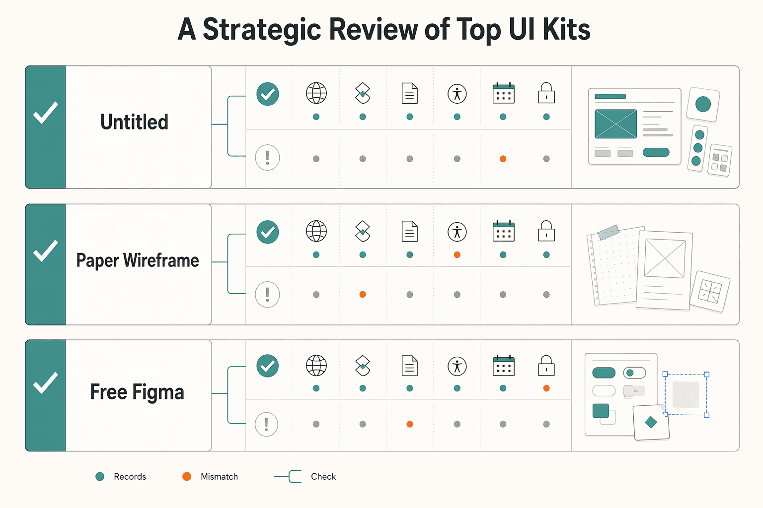
Before you adopt any option, verify these six checks in the live file or listing: state coverage, variables or token consistency, documentation depth, accessibility guidance, update history, and dependency risk.
| Option | Best-fit scenario | Verification checks | Tradeoff | No-go trigger |
|---|---|---|---|---|
| Untitled UI | You ship recurring web app/SaaS work and want a reusable library rather than one-off screens. The publisher presents it as a free UI kit/design system, so you can trial it first. | Current component scope pending vendor/source-record verification. Confirm component sets include explicit states like default, hover, pressed, disabled. Verify variables are present and usable across contexts. Current license scope pending vendor/source-record verification. Check docs/descriptions for usage, accessibility, and handoff guidance. Verify maintenance via visible history/release signals. | Broad coverage can remove repeat work quickly, but adoption can be slower if naming structure or library logic is hard to onboard. | Stop if rights are unclear, common components have weak state coverage, or setup depends on private libraries/undocumented dependencies. |
| Paper Wireframe Kit | You need fast alignment on structure and flows before visual polish, including early collaboration with non-designers. | Current component scope pending vendor/source-record verification. Test one real upcoming flow first to confirm low-fi patterns reduce redraw work. Verify how far variables/tokens go before assuming production reuse. Check docs for intended usage, then check history signals so you are not adopting a stale file. | You gain speed in early decisions, but you may rebuild later for production states, tokens, and developer handoff. | Stop if your next project already requires production-ready states, token consistency, or strong Dev Mode handoff from day one. |
| Free Figma Community kits | You want a no-cost starting point, backup option, or a way to test your evaluation process before paying. | Check license terms on the exact file; terms can vary by creator. If the file uses CC BY 4.0, confirm attribution obligations for covered files. Verify forms/nav/overlays and error/empty states. Confirm variables where reuse is claimed. Check docs for state/accessibility guidance. Validate provenance and maintenance, since Community files are duplicable snapshots. | Zero entry cost, but quality and maintenance are inconsistent, and some files are showcase-heavy with weak internals. | Stop if provenance is unclear, the file is mostly static screens, or two or more checks depend on chasing the creator for missing basics. |
Treat each option with an operational test, not a visual test:
- Untitled UI first test: inspect buttons, inputs, tables, and nav for real variant depth and usable docs.
Failure pattern: it looks complete, but state coverage, accessibility guidance, or reuse rights are still unclear.
- Paper first test: run one live client flow end-to-end in low fidelity.
Failure pattern: it helps ideation, but you still need a near-full rebuild for production and handoff.
- Free Community first test: validate license and provenance before you evaluate polish.
Failure pattern: it is easy to duplicate and hard to verify for ownership, terms, or ongoing reliability.
Use this shortlist checklist before final selection:
- ROI: removes repeat work in your next 1-2 projects.
- Risk: states, variables, docs, accessibility guidance, update signals, and dependencies are reviewable without guesswork.
- Operational fit: license scope, maintenance posture, and library behavior still work when another teammate owns delivery.
You might also find this useful: Best Figma Plugins for Reliable Client Design Work.
The Confident Choice#
Make the decision you can defend in delivery: choose, verify, then commit. The right option is the one that clears profitability, risk control, and growth-readiness checks, not the prettiest preview.
- Choose (profitability)
Pick a kit only if it works as a reusable library across files, not just as a duplicated snapshot. If your recurring forms, tables, navigation, and states are not reusable, treat it as a no-go.
- Verify (risk control)
Run pass/fail checks before rollout:
- License fit: confirm the exact license terms in the file or product page. Current license conditions pending vendor/source-record verification.
- Handoff clarity: check one real flow in Dev Mode for inspectable code details, clear component naming, and variable use.
- Accessibility evidence: log whether text contrast evidence meets 4.5:1 (normal text) or 3:1 (large text). If evidence is missing, record that as an open risk.
- Commit (growth readiness)
Roll it into one active project first, then scale. Assign one owner to review library updates, accept or reject changes, and document decisions so maintenance stays consistent.
Use this final validation gate before rollout:
- Reusable components confirmed in a published library
- Current license conditions pending vendor/source-record verification
- Handoff checked in Dev Mode on one live flow
- Maintenance continuity confirmed through reviewable updates
- Accessibility evidence logged, including contrast results
- Pilot project selected, decisions documented, update owner named
If you want the implementation pattern after selection, use How to create a 'Design System' in Figma.
Frequently Asked Questions
Is a premium kit worth it for freelance work?
Yes, but only if it removes repeat work on the next one or two jobs. In Figma, open the file, go to Libraries, click Add to file, then test whether you can browse components, swap instances, and customize variants before insertion. If the file saves time only in demos, not in delivery, skip it.
What is the real risk with free vs paid kits?
A practical risk is unclear rights and weak internals, not just the price tag. Verify the kit’s license requirements and confirm you have can edit access. For Apple kits, make sure the required EULA is accepted before use. Then check whether updates are available in your design file with the option to accept them. If rights, provenance, or maintenance still feel fuzzy after that check, treat it as a no.
What should you prioritize for a SaaS product?
Prioritize handoff readiness and consistency over screen count. In the file, inspect the patterns you actually need and how updates are handled before your team accepts them. If you rely on Code Connect, verify your plan first because support is only listed for Professional, Organization, and Enterprise. If your app has recurring product patterns, choose the kit your team can customize more reliably, not the prettier marketing page.
Can you bill a client for a kit?
You can, if your contract and the kit license both support that use. Verify reuse rights, keep a copy of the license terms, and spell out whether the client is paying for a deliverable, a seat, or a reimbursed tool cost. If the license boundary is unclear, do not pass it through as a clean billable.
What matters more, quantity or quality?
Quality wins once you have to ship and hand off. Verify not just buttons but states, variant logic, usage notes, and whether the file behaves like a real library instead of a static showcase. If a smaller kit is easier to govern and trust, it is usually the better buy.
Will a UI kit make your work look generic?
Only if you use it as finished design instead of base infrastructure. Test one real flow and see whether you can change layout, hierarchy, copy, and patterns without fighting the components. A community-reported blocker is that one user could not swap Card content text directly to other component types. If the file resists customization, or two checks still fail, go back to the framework and comparison table before you shortlist it.
Try a related tool
Researched and edited by the Gruv editorial team. Gruv builds cross-border billing, payouts, and finance-operations software for global businesses.
Sources
Includes 8 external sources outside the trusted-domain allowlist.
- creativecommons.org/licenses/by/4.0/deed.enexternal
- figma.com/community/ui-kitsexternal
- figma.com/community/file/1035203688168086460/material-...external
- help.figma.com/hc/en-us/articles/24037724065943-Start-desig...external
- help.figma.com/hc/en-us/articles/360042296374-Figma-Communi...external
- untitledui.com/licenseexternal
- w3.org/WAI/WCAG22/Understanding/contrast-minimumexternal
- w3.org/WAI/WCAG22/Understanding/focus-visible.htmlexternal
Educational content only. Not legal, tax, or financial advice.
Related Posts

Value-Based Pricing for Freelancers Under Real Payment Risk
Value-based pricing works when you and the client can name the business result before kickoff and agree on how progress will be judged. If that link is weak, use a tighter model first. This is not about defending one pricing philosophy over another. It is about avoiding surprises by keeping pricing, scope, delivery, and payment aligned from day one.

The Best Tools for Creative Collaboration with Remote Teams
As the CEO of your business-of-one, you're not here for vibes; you're here for a repeatable system you can run.

How to Create a Design System in Figma
A **design system in Figma** gives your team shared foundations, reusable assets, and enough documentation to move with fewer repeated decisions. Treat this as a focused v1 build target, not permission to start a side project that drags on for months. The point is not to make files look tidy.