
Quick Answer
Start with native Notion chart views unless your reporting needs clearly exceed them. For most internal KPI tracking, create a chart from a database view, verify field mapping, and confirm updates by editing one known row. Then decide if an external integration is worth the added setup and risk review. The best chart tools for notion are the ones that match your mission, refresh behavior, and sharing requirements without adding fragile workflow overhead.
Why Your Current Notion 'Dashboard' is Costing You Money and Peace of Mind#
Your Notion dashboard is probably not failing because it looks plain. It fails when it makes you do the thinking manually, too late, and with stale data. That creates an operations problem: less visibility, more admin work, and worse decisions when spending and renewals need quick calls. In practice, that usually looks like this:
| Issue | What it looks like | Practical check |
|---|---|---|
| Data blindness | No clear view of expense tracking over time, recurring costs, or upcoming renewal dates | If the chart does not clearly reflect current costs, renewal dates, and the latest entries, do not trust it |
| Admin tax | The Friday afternoon spent exporting, cleaning, checking formulas, and rebuilding the same report by hand | If a chart feeds financial reporting, keep one approval step before you act on it |
| Decision opacity | Entries and statuses exist, but you still cannot tell where costs are drifting or what needs action first | If dates, categories, or amounts are out of date, the visual looks precise while hiding weak data |
| Illusion of control | A crowded page full of linked databases can feel organized because everything is technically there | If you still need six clicks and a manual sort to answer those, you do not have control |
- Data blindness
This shows up when you plan your month without a clear view of expense tracking over time, recurring costs, or upcoming renewal dates. You have the raw rows, but not the shape of the trend. That means rising recurring spend can stay hidden until it hurts. Once the data is charted, you can scan income, expenses, and savings in one view, see whether the line is improving or slipping, and act sooner. A good checkpoint here is freshness: if the chart does not clearly reflect current costs, renewal dates, and the latest entries, do not trust it.
- Admin tax
The cost is the Friday afternoon spent exporting, cleaning, checking formulas, and rebuilding the same report by hand. Limited integrations create manual update work and raise error risk, so even a careful spreadsheet pass can leave you with numbers that look tidy but are already wrong. A charted setup earns its keep when it cuts manual work and improves accuracy, especially for recurring payments, subscription renewals, and category-level spend. The tradeoff is that automation still needs oversight. If a chart feeds financial reporting, keep one approval step before you act on it.
- Decision opacity
A long list of subscriptions and expenses is not the same as a view you can manage. In practice, you may have entries and statuses but still cannot tell where costs are drifting or what needs action first. Once you combine visibility tools like automated tagging, anomaly checks, and dashboard views, the list becomes operational. You can see where attention belongs this week. The failure mode is stale inputs. If dates, categories, or amounts are out of date, the visual looks precise while hiding weak data.
- Illusion of control
A crowded page full of linked databases can feel organized because everything is technically there. But complex layouts reduce day-to-day usability, and simplicity is what makes tracking useful. Real control means you can answer a few hard questions at a glance: what your current costs are, which renewals are coming up, and how your income, expenses, and savings are trending. If you still need six clicks and a manual sort to answer those, you do not have control. You have storage.
The fix is not to start by comparing chart features. First define the mission your page needs to serve, then choose the tool that supports that mission. You might also find this useful: How to Create a Project Timeline in Notion.
The Command Center Framework: Choose a Tool Based on Your Mission, Not Just Features#
Start with the decision you need to make, not the feature list. If the mission is unclear, the page usually turns into a static report that drifts out of date as work changes.
| Mission | Primary user | Cadence | Decision lens |
|---|---|---|---|
| Daily Stand-Up | you | daily | Prioritize freshness and clarity over deep analysis |
| Quarterly Review | you, sometimes with an accountant or collaborator | monthly and quarterly planning | Treat this as your source-of-truth check, not just a presentation layer |
| Client Showcase | your client | milestone reviews, monthly updates, or retainer check-ins | Clear delivery and tight access control matter more than visual flair |
- Daily Stand-Up
Primary user: you. Decision cadence: daily. Required chart behavior: quick readability, simple filters, and data you can sanity-check against the latest Notion entry before acting. Decision lens: prioritize freshness and clarity over deep analysis.
- Quarterly Review
Primary user: you, sometimes with an accountant or collaborator. Decision cadence: monthly and quarterly planning. Required chart behavior: segmentation across periods, clients, or service lines, plus a clear path back to the underlying records and notes. Decision lens: treat this as your source-of-truth check, not just a presentation layer.
- Client Showcase
Primary user: your client. Decision cadence: milestone reviews, monthly updates, or retainer check-ins. Required chart behavior: clean embeds, controlled sharing, and visuals that stand on their own without extra explanation. Decision lens: clear delivery and tight access control matter more than visual flair.
Mission-to-capability checklist#
| Mission | Refresh behavior | Filtering depth | Embed/sharing control | Permission scope |
|---|---|---|---|---|
| Daily Stand-Up | Current enough for day-to-day calls; easy to verify against latest rows | Light filters for fast scans | Useful in your own workspace view | Keep access limited to what this view needs |
| Quarterly Review | Reliable across longer planning cycles | Compare by time period, client, service line, and status | Shareable with collaborators when needed | Grant only the databases tied to review decisions |
| Client Showcase | Stable at reporting checkpoints | Focused filters that support the story | Clean client-facing embeds and controlled visibility | Limit access to client-relevant data only |
Use this checklist to screen options consistently. In the next section, tool names are evaluated against these missions, not feature sprawl. If you want a deeper dive, read Value-Based Pricing: A Freelancer's Guide.
A Strategic Review of Notion Chart Integrations (2024)#
If you want a reliable starting point, begin with the option you can verify fastest in your own workspace. For now, native Notion charts have the clearest documented behavior: they are a database view, you create them with + → Chart, and they auto-update when the underlying data changes.
Because the available excerpts for many third-party tools are not capability-complete, use a strict comparison standard. If a capability is not verified, mark it as current capability pending official verification.
| Tool | Mission fit | Setup effort | Refresh behavior | Chart flexibility | Sharing / client presentation | Data-handling posture |
|---|---|---|---|---|---|---|
| Native Notion charts | Strong first check for Daily Stand-Up and basic Quarterly Review when data already lives in Notion | Create from a database via + → Chart | Auto-updates when source data changes | Filtering and customization in-view; 4 layout options; same data can be viewed in multiple ways | Works as a Notion database view; confirm page-sharing setup in-product | Native view in Notion; synced databases can pull outside data into Notion |
| Notion2Charts | Current capability pending official verification | Current capability pending official verification | Current capability pending official verification | Current capability pending official verification | Current capability pending official verification | Current capability pending official verification |
| Datajumbo | Current capability pending official verification | Current capability pending official verification | Current capability pending official verification | Current capability pending official verification | Current capability pending official verification | Current capability pending official verification |
| GRID | Current capability pending official verification | Current capability pending official verification | Current capability pending official verification | Current capability pending official verification | Current capability pending official verification | Current capability pending official verification |
| ChartBrick | Current capability pending official verification | Current capability pending official verification | Current capability pending official verification | Current capability pending official verification | Current capability pending official verification | Current capability pending official verification |
| Graphy | Current capability pending official verification | Current capability pending official verification | Current capability pending official verification | Current capability pending official verification | Current capability pending official verification | Current capability pending official verification |
Daily Stand-Up#
Choose native charts when your core numbers already live in Notion and you need a current read without manual upkeep. Validate once: set your filter, change one source row, and confirm the chart updates.
Avoid forcing this setup when your reporting depends on manual workarounds or complex cross-tool logic. Synced databases can pull data from tools like Jira, Asana, and GitHub, but that does not remove every complexity gap.
Quarterly Review#
Choose native charts when your review is mostly slicing one database by date, category, or owner. In-view filtering and customization are built in, and simple distribution checks can be handled with donut charts.
Avoid approving any third-party option until it proves your required refresh behavior, filter depth, and traceability back to source records in a test page.
Client Showcase#
Choose an external tool only when your client-facing report needs presentation control beyond a Notion database view, and verify that it embeds cleanly. Your practical pass/fail check is simple: current data, clear linkage to source records, and access scope limited to what the report needs.
Avoid rollout based on marketing pages alone. Features and pricing can change, chart capabilities continue to evolve, and integrations can push and pull data in and out of your workspace via API. That is why the next step is a security review. We covered this in detail in The Best Notion Templates for Freelancers.
The Unspoken Risk: Is Your Data Safe with Third-Party Chart Tools?#
Before you compare chart features, confirm that the integration's data handling fits your client commitments and your own obligations. If you cannot explain where data goes, who can access it, and how you can disconnect and offboard later, it is not production-ready.
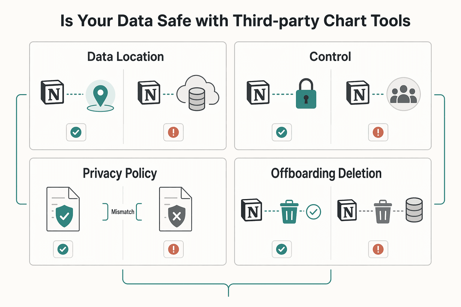
The core risk is accountability drift. Once a third party sits between your Notion data and the final chart, responsibility boundaries can blur, especially when intermediaries or subprocessors are involved. For EU personal data, that is a practical due-diligence issue with potential contractual consequences, not just a policy footnote.
| Due-diligence check | What to verify before you connect | Red flag to watch for |
|---|---|---|
| Data location and subprocessors | Review the privacy policy, terms, and any subprocessor list. Confirm whether the vendor clearly states where data is stored or processed and whether other providers are involved. | No subprocessor disclosure, vague language like "trusted partners," or no clear processing-location statement. |
| Encryption and access controls | Check for concrete security documentation covering baseline protections like encryption and identity/access controls. You want evidence of an organization-wide security program, not badge-heavy marketing. | Broad security claims with little detail, no access-control explanation, or no clear security contact path. |
| Privacy policy use-of-data terms | Read how customer data may be used, including product improvement or analytics language, and check alignment with your client promises. | Broad reuse rights for uploaded data, or "anonymized" claims that do not explain re-identification risk handling. |
| Offboarding and deletion | Confirm the closure path, export options, and whether deletion is addressed for active systems and backups. Keep the relevant help doc or contract clause in your records. | Cancellation is documented, but deletion is unclear or only available through ad hoc support requests. |
Use minimum permissions as a default operating rule. If the connection flow allows scope choices, connect only the pages or databases required for this chart and avoid broader access unless you can justify it. After setup, review what the app can access and record that decision in your project notes or client file.
Be cautious with "anonymous" or "aggregated" language. Under the GDPR Recital 26 framing, the practical question is whether re-identification remains plausible, and that is often harder to validate than marketing copy suggests. If a vendor cannot explain this clearly, treat the claim as unproven.
Once trust checks, permissions, and offboarding are validated, move to setup and dashboard build steps. For a step-by-step implementation walkthrough, see The Best Tools for Creating SOPs and Process Documentation.
How to Build Your First "Business-of-One" Command Center in Notion#
Build this as a working system first. Your Command Center should be the single source of truth you use to make decisions, not a page you only maintain for appearance.
| Step | Focus | Key check |
|---|---|---|
| Choose your vital signs | Start with KPIs that reflect operational performance and change what you do next | If a metric will not change an action in your next review, leave it out |
| Prepare source data before you open any chart tool | Keep property types consistent, set up relation/rollup links, and validate formulas before charting | Blanks, units, and edge cases should not distort results |
| Connect delivery progress to invoicing | Mark key deliverables as Billing Milestones and connect them to your invoicing database | This helps you catch scope expansion that adds work without becoming billable |
| Connect your chart tool with implementation hygiene | Grant the least access available, verify the intended source table or filtered view, and sanity-check axis mappings before sharing the embed | Update one known Notion record and confirm that change appears in the chart |
| Assemble the page and run a maintenance loop | Create one Command Center page with vital signs first, then delivery and billing, then deeper detail | Add a recurring review rhythm and apply corrective actions when a KPI signals a problem |
- Choose your vital signs
Start with KPIs that reflect operational performance and change what you do next. Keep the "vital signs" idea, but choose your versions based on your service model, delivery cycle, and how often you make decisions. If a metric will not change an action in your next review, leave it out.
- Prepare source data before you open any chart tool
Reliable charts start with deliberate KPI setup and clean inputs. In Notion, keep property types consistent (Number as number, Date as date, controlled Select/Status values instead of free text), and set up relation/rollup links where one database should feed another. Validate formulas before charting so blanks, units, and edge cases do not distort results.
- Connect delivery progress to invoicing
Link execution to cash flow so the dashboard supports financial control, not just project visibility. Mark key deliverables as Billing Milestones and connect them to your invoicing database so progress and billing status stay in one view. This helps you catch scope expansion that adds work without becoming billable.
- Connect your chart tool with implementation hygiene
Keep the integration tight and testable. Grant the least access available, verify that you connected the intended source table or filtered view, and sanity-check axis mappings before sharing the embed. Then run a quick refresh test: update one known Notion record and confirm that change appears in the chart.
- Assemble the page and run a maintenance loop
Create one Command Center page with vital signs first, then delivery and billing, then deeper detail. If you share progress externally, keep a separate filtered client view with high-level milestones only. Add a recurring review rhythm so the page stays reliable: check it during the week, review it more deeply on a set cadence, and apply corrective actions when a KPI signals a problem.
Related: A Guide to Notion for Freelance Business Management.
Conclusion: From Data Entry to Data Intelligence#
Stop building charts just to make Notion look polished. The real goal is to reduce manual scanning, cut copy-paste reporting, and give yourself a small set of visuals that help you spot issues earlier and decide faster.
The right end state is not more dashboards. It is a reporting setup that fits your mission. If you only need internal KPI checks, start with native Notion charts. A chart in Notion is just another database view, and Notion gives you 4 layout options, so you can often get useful visibility without adding another tool. If you need more presentation control or client-facing reporting, compare external options by purpose, not by feature volume.
Use this filter when you choose among the best chart tools for Notion: start with a quick comparison, then do a deeper check on fit for purpose and refresh behavior. If a tool looks impressive but you cannot confirm how it handles your real database or how often it refreshes, do not roll it out yet. The common failure mode is not bad charts. It is trusting a chart built on messy properties or stale sync.
- Clean the data model
Standardize key properties first so labels and groupings stay consistent before you visualize anything.
- Validate tool fit before rollout
If you are comparing external options, run a quick comparison first, then deep-dive on the one that best matches your reporting goal.
- Build, verify, and embed
Create the chart from the database + menu, filter it, customize it, and place it where you will actually review it. Then edit one known record and confirm the chart updates automatically and the labels still match the source data.
- Review on a rhythm
Watch only the few KPIs that change decisions each week. Done well, this can give you earlier issue detection, clearer prioritization, and less reporting overhead.
This pairs well with our guide on The Best SEO Tools for Freelancers.
Frequently Asked Questions
How do you set up your first chart in Notion?
Start with a real database, not a blank page, and make sure that database has at least a few different properties before charting. In native Notion Charts, you can add a new database view and choose Chart, or type /chart to open the options, then map the properties you want on the axes or donut slices. Before you trust the result, change one known record and confirm the chart reflects that exact change and that the labels still match your expected values.
Do you need one of the best chart tools for notion if native Notion Charts already exist?
Often, no. You can start with native charts if your need is simple and internal. Notion’s built-in chart view supports 3 chart types in the provided guide excerpt, and the main tradeoff is the current 1 property per chart limit, which means you cannot show several different properties from the same entry on one Y axis. Also check horizontal bar charts carefully, because the expected X and Y orientation can be reversed, which is an easy way to misread a result.
How should you choose quickly?
If you need daily KPI monitoring inside Notion and you can live with single-metric charts, start with native Notion Charts. If you need more presentation flexibility, test a third-party category after the privacy check. If you need deeper analysis across related data, consolidate your reporting data first in Notion or choose a tool category that clearly documents broader reporting depth and multi-source handling.
What security due diligence should you do before connecting any chart tool?
First confirm you are on the official site before you enter credentials or connect sensitive data. Then review the privacy policy, where data is stored, what access scope the integration requests, and how deletion works if you disconnect later. If you are evaluating a paid vendor, add a note in your checklist that says “Current compliance statement pending official verification”, because you should not assume a current security or compliance posture without evidence.
How should you compare Notion2Charts and Datajumbo without guessing?
Treat the table below as a buyer checklist, not a winner board. Current product details can change, so verify each point in the vendor’s own docs or sales pages before you buy. | Decision criterion | Notion2Charts | Datajumbo | What you should do | | --- | --- | --- | --- | | Best use case | Verify whether the product is positioned around quick chart creation, embedded dashboards, or broader reporting | Verify the same positioning in current docs | Match the tool to your mission, not to a feature list | | Data scale handling | Verify any documented row guidance, performance notes, or database size examples | Verify any documented row guidance, performance notes, or database size examples | If your database is already large, test with real data before rollout | | Chart and reporting depth | Verify current chart types, filters, summary cards, and export or sharing options | Verify current chart types, filters, summary cards, and export or sharing options | Choose based on the reporting depth you actually need each week | | Refresh behavior | Verify whether refresh is manual, scheduled, or near-live, and whether plan tier changes it | Verify whether refresh is manual, scheduled, or near-live, and whether plan tier changes it | Do a live edit test instead of assuming sync speed | | Operational constraints | Verify embed limits, workspace access scope, and any setup friction | Verify embed limits, workspace access scope, and any setup friction | Prefer the option you can maintain without constant troubleshooting | | Free plan tradeoffs | Current plan-limit details pending official verification | Current plan-limit details pending official verification | Do not choose on price until you know the real caps |
Will your charts refresh automatically when Notion data changes?
Do not assume a named tool refreshes instantly unless its current documentation says so. The practical check is simple: edit one record, refresh the page or embed, and see whether that exact value appears where you expect it. If it does not, you may be looking at a stale sync, the wrong database view, or a field mapping problem rather than a chart bug.
Can you chart data from multiple Notion databases?
In native Notion chart views, the setup in the provided guidance starts from a single database view, not a cross-database join workflow. If you need one chart to reflect Projects, Invoices, and Tasks, consolidate the data into one reporting database first, then chart that view. For any third-party tool, verify documented multi-database handling directly, because that capability should not be assumed.
Are free plans enough to start?
Usually, yes, if your goal is to test fit rather than commit to production reporting on day one. Verify chart count limits, sharing restrictions, branding, and any refresh constraints before you depend on a free tier, and keep a note that says “Current plan-limit details pending official verification.” A good rule is to upgrade only after you have a stable KPI page and know exactly which missing limit is slowing you down.
Try a related tool
Researched and edited by the Gruv editorial team. Gruv builds cross-border billing, payouts, and finance-operations software for global businesses.
Sources
Includes 2 external sources outside the trusted-domain allowlist.
- ada.gov/law-and-regs/regulations/title-ii-2010-regul...trusted
- ncbi.nlm.nih.gov/pubmed/19919329trusted
- public-inspection.federalregister.gov/2021-23643.pdftrusted
- pubmedcentral.nih.gov/articlerender.fcgitrusted
- science.gov/topicpages/p/performance+indicators+kpistrusted
- stu.edu/wp-content/uploads/2025/09/Catalog-and-Stude...trusted
- cdn.ttgtmedia.com/rms/pdf/CISSP_Exam_Guide_ch1.pdfexternal
- doit.com/blog/10-top-finops-tools-for-your-cloud-cost...external
Educational content only. Not legal, tax, or financial advice.
Related Posts

Value-Based Pricing for Freelancers Under Real Payment Risk
Value-based pricing works when you and the client can name the business result before kickoff and agree on how progress will be judged. If that link is weak, use a tighter model first. This is not about defending one pricing philosophy over another. It is about avoiding surprises by keeping pricing, scope, delivery, and payment aligned from day one.

A Guide to Notion for Freelance Business Management
If your workspace feels busy but fragile, you do not need more pages. You need one connected system. Treat your freelance business like a business-of-one and use Notion as the control layer that connects client decisions, delivery, and billing in one place.

How to Create a Project Timeline in Notion
**Step 1. Anchor everything in one master project database.** You do not need a rigid methodology to make a project timeline useful. You need one master project database with a Timeline view so key project details, tasks, costs, and progress live in the same place. This approach is intentionally light. One database, a few working views, and a record you can trust. It is not a heavy process, a pile of disconnected templates, or a setup that makes you manage work in three places.