
Quick Answer
Choose best author websites by function, not aesthetics: one clear next step, a scannable Homepage, a usable Books page, and a credible Contact/About route that still works on mobile. The sites that hold up use a goal-first structure and keep core pages current with a light maintenance rhythm. Start with the 30-day rollout, publish only essential pages, and add extras like Events or Sample chapters only when you can keep them updated.
What the best author websites actually do#
If you are looking for the best author websites, you probably do not need another gallery of attractive sites. Short answer: the best ones make the next step obvious, present you credibly, stay easy to maintain, and do not quietly decay between launches. Reedsy has a 13-example roundup, and Charlotte Duckworth Studio shares 22 sites for inspiration. Those are useful for taste and ideas. They are less useful when you need to decide what to publish first, what to cut, and what your site needs to do right now.
Here, "best" means something narrower and more practical. A strong author site makes the next step obvious, presents you credibly, stays easy to maintain, and does not quietly decay between launches. Reedsy's own guidance points to the basics that matter: the site should look professional, reflect your brand, and help turn casual visitors into loyal fans. It also highlights one detail many authors miss: freshness matters. A site that is consistently updated signals that you are active, which gives people a reason to come back.
That definition matters because a polished site can still fail at the job. If the front page looks good but gives visitors five equal-priority actions, or your Books page is hard to scan, or your Contact/About page is thin, the design is not carrying its weight. The Helped Author makes a useful point here: most traffic lands on the homepage. So that page is not just an introduction. It is the main decision point, and it needs to explain who you are and give clear information about your books without making people hunt.
This guide is for authors building a durable platform, not a one-time launch page that goes stale after one release. If your site supports your broader professional goals, you need it to keep working between campaigns. In most cases, that means a dependable front page, a clean Books page, a visible email signup, and a credible Contact/About page before you worry about extras. Four practical outputs follow:
- A scoring method
A simple way to judge a site by conversion path, trust signals, usability, and upkeep burden, not by aesthetics alone.
- A practical shortlist by use case
Examples broken out by goal, such as audience growth, launch support, or media visibility, so you can model the right kind of site.
- A launch checklist
The minimum pages and checks to get live without bloating the build or delaying publication.
- A maintenance schedule
A lightweight cadence to keep your key pages, email capture, books information, and other essentials from going stale.
If your current site cannot tell a new visitor who you are, what you write, and what to do next quickly, start there. Everything that follows is built to help you fix that first. Related reading: The Best Antivirus and Malware Protection for Freelancers.
How to decide what counts as one of the best author websites#
Count a site as "best" only if it helps the right visitor take the right next step, works well on mobile, and stays easy to keep current.
- Use a 5-part scorecard
Score front-page clarity, email signup strength, Books page usability, Contact/About trust signals, and maintenance effort. This keeps you focused on function, not taste. A site that looks great but is hard to update will usually drift out of date and lose usefulness.
- Filter for fit before design opinions
Start with your goal and your visitor's action. If you need preorders, prioritize the path from homepage to book page to retailer links. If you need speaking or media opportunities, prioritize media-facing pages and event information. The same design can be strong for one goal and weak for another.
- Use one primary action on the homepage
Give the hero one clear job. If your main action is newsletter signup, do not give blog, social links, and events equal weight in that same space. Keep secondary actions lower on the page or in navigation.
- Reject polished sites with weak operating basics
Rule out sites if core pages are stale, key links are dead, or trust pages are thin or missing. Freshness is an operating requirement, not a cosmetic extra. Also watch for the "basic business card" pattern (bio, books, social links): it can be a valid minimum, but it may not support discoverability for lesser-known authors.
Best author websites compared at a glance#
Start with Austin Kleon if your priority is reader growth and Anthony Horowitz if your priority is media-facing visibility. Treat Diana Urban, Malorie Blackman, Kate Hewitt, and Freda Lightfoot as live-site audit candidates before you copy their structure.
Use one practical standard: can a visitor quickly find books, signup, bio/about, and contact, and see at least one current update signal. Reedsy's pattern and freshness cues support this approach; the rest is fit and maintenance discipline.
| Author | Best for | Primary conversion | Navigation clarity | Update signals | Upkeep burden | Watch-out |
|---|---|---|---|---|---|---|
| Austin Kleon | Audience building and direct reader relationship | Newsletter signup | Strong in Reedsy's description: blog posts, books, newsletter signup, bio, and contact are easy to find | A current social feed or upcoming events can keep the site feeling current | Medium if you keep visible updates moving | Personality-forward pages can slow scan speed if the main action is not obvious |
| Diana Urban | Possible launch-first model if the homepage clearly prioritizes the current title | Verify whether the current ask is preorder, current book, or email signup | Check mobile paths to Books, About, and Contact before borrowing the layout | Look for current release copy, event dates, or active links | Medium when launch assets need regular resets | Campaign-led homepages can age quickly after launch |
| Malorie Blackman | Candidate when the site can serve multiple visitor types without clutter | Verify whether the main path is books, events, or email signup | Confirm each visitor type has a clear next click | Look for current appearances, social activity, or recent news | Medium to high if multiple paths must stay updated | Broad menus can reduce first-visit clarity |
| Anthony Horowitz | Media-facing visibility and quick follow paths | Social follow (Westwind highlights his Twitter handle as front-and-center) | Clear when rapid author recognition and social connection are the goal | A visible, current social presence can also act as a freshness cue | Low to medium for a route-to-social model | Social-first setups are weaker for list building if email capture is secondary |
| Kate Hewitt | Candidate after confirming one obvious homepage action | Verify whether the site currently favors email signup, current book, or browsing | Keep navigation short enough to scan in one pass on mobile | Check for current book info and active links | Depends on page count | Brochure-style structures are easy to run but can limit discoverability if signup is buried |
| Freda Lightfoot | Candidate if the live structure matches your current goal with minimal friction | Confirm whether arrival flow points to books, events, or email signup | Test whether new visitors reach Books and Contact without friction | Look for current releases, events, or active social links | Depends on exposed archive depth | Older catalog-heavy pages can feel dated if details are not maintained |
| Quick pick (working picks, verify live) | Low-maintenance model: Austin Kleon-style structure with one visible freshness cue. Launch model: whichever site makes the current book CTA unmistakable on the homepage (validate live). Media-facing model: Anthony Horowitz-style social-forward path. | Use email for durable audience building; use launch CTAs during launch windows; use social-forward paths for visibility pushes | Pick the model where core pages are immediately findable | One current signal is enough if it stays current | Choose the version you can realistically maintain | Do not copy a model that depends on frequent updates you will not sustain |
The best author websites by business goal#
Choose by business job, not by looks. Start with who you want to visit and what you want them to do first, then build around that action. Your site is where people find you, your books, and your writing, and it has to stay up to date to keep doing that work.
| Style | Best for | Key pros | Key cons |
|---|---|---|---|
| Austin Kleon style | long-term reader growth anchored to email signup | clean and easy to handle; supports a clear first action instead of scattered browsing | if updates stop, trust drops fast; hard-to-update design usually becomes stale |
| Diana Urban style | periods when one current title is the main business priority | a launch-led structure keeps the next step obvious and reduces decision friction | this setup can date quickly after a launch window if the page is not refreshed |
| Anthony Horowitz style | broad public discovery and fast routing to public-facing channels | simple navigation can make media and casual-visitor paths faster to follow | if email capture is secondary, audience ownership can become weaker over time |
| Malorie Blackman style | authors supporting both reader and professional paths from one site | works when information is logically organized and not overloaded with busy, disorganized content | multi-audience pages get cluttered fast if every path is weighted equally |
| Kate Hewitt or Freda Lightfoot style | steady catalog discovery without a heavy ongoing publishing workflow | practical and maintainable when core pages are clear and current | older book pages and stale details can make the whole site feel out of date |
- Austin Kleon style for audience building
Best for: long-term reader growth anchored to email signup. Key pros: Reedsy highlights this style as clean and easy to handle, which supports a clear first action instead of scattered browsing. Key cons: if updates stop, trust drops fast; hard-to-update design usually becomes stale. Concrete use case: lead your homepage with one clear signup path, then route visitors to books and writing from there.
- Diana Urban style for a launch-first site
Best for: periods when one current title is the main business priority. Key pros: a launch-led structure keeps the next step obvious and reduces decision friction. Key cons: this setup can date quickly after a launch window if the page is not refreshed. Concrete use case: prioritize your homepage-to-Books flow and keep the main CTA aligned with the current release.
- Anthony Horowitz style for media-facing visibility
Best for: broad public discovery and fast routing to public-facing channels. Key pros: simple navigation can make media and casual-visitor paths faster to follow. Key cons: if email capture is secondary, audience ownership can become weaker over time. Concrete use case: keep About, Books, Contact, and public follow paths easy to find in primary navigation.
- Malorie Blackman style for serving multiple visitor types
Best for: authors supporting both reader and professional paths from one site. Key pros: works when information is logically organized and not overloaded with busy, disorganized content. Key cons: multi-audience pages get cluttered fast if every path is weighted equally. Concrete use case: use clear navigation labels so each visitor type can find its destination quickly.
- Kate Hewitt or Freda Lightfoot style for a low-burden catalog site
Best for: steady catalog discovery without a heavy ongoing publishing workflow. Key pros: practical and maintainable when core pages are clear and current. Key cons: older book pages and stale details can make the whole site feel out of date. Concrete use case: focus your maintenance on a current Books page, a clear About/Contact path, and one visible signup route.
If you are torn, use one rule: pick the model that matches your next business outcome and keep it easy to update. Keep navigation clear, avoid overwhelming layouts, and make the primary action obvious on arrival.
The non-negotiable pages every credible author site needs#
Lock your core pages before you worry about design: visitors should quickly understand who you are, what you write, where to buy, and how to contact you, especially on mobile. More than half of web traffic comes from mobile devices, so mobile-friendly, responsive design is a baseline. Use this as your minimum practical set, then add only what you can keep current.
| Page | What it should do | Key note |
|---|---|---|
| Homepage | answer who you are, what you write, and the next step | on mobile, that should be clear without pinching, zooming, or digging through clutter |
| Books page | keep every title in one clean place | each book should clearly show available formats and where to go next |
| Contact/About page | do more than list a bio | explain who you are, why your work matters to this reader, and guide them to a next action |
| Newsletter signup | make signup visible, not buried | put the form or signup path in navigation, on the homepage, or both |
| Media kit | keep it practical | downloadable assets and a current bio; important once reviewers, podcasters, booksellers, or event organizers are part of your audience |
| Social links | use social links as support paths, not your main conversion path | link only to active profiles, and regularly check for broken or outdated URLs |
- Homepage
Make the first screen answer three things fast: who you are, what you write, and the next step. On mobile, that should be clear without pinching, zooming, or digging through clutter.
- Books page
Keep every title in one clean place. Each book should clearly show available formats and where to go next.
- Contact/About page
A combined page is fine for smaller sites, but it should do more than list a bio. Treat your About page as a trust-and-conversion page: explain who you are, why your work matters to this reader, and guide them to a next action (buy, subscribe, or contact).
- Newsletter signup
If email matters to your business, make signup visible instead of burying it. Put the form or signup path in navigation, on the homepage, or both.
- Media kit
This becomes important once reviewers, podcasters, booksellers, or event organizers are part of your audience. Keep it practical: downloadable assets and a current bio.
- Social links
Use social links as support paths, not your main conversion path. Link only to active profiles, and regularly check for broken or outdated URLs.
Optional pages should match your stage, not your wish list: Blog, Sample chapters, Audiobooks, Book club questions, and Events all work when they are maintained and relevant. If you will not update a page, leave it out.
Common failure modes that weaken trust:
- No Contact/About page: visitors cannot confirm who is behind the site or how to reach you.
- Broken Social links: one dead profile link signals neglect.
- Empty Events page: outdated or blank listings make the site feel stale.
- Buried Newsletter signup: if email is a core goal, hiding signup undercuts that goal.
Use one rule: publish fewer pages, but keep each one current, mobile-usable, and clear about the next step. For a step-by-step walkthrough, see How to get 'book reviews' on Amazon and Goodreads.
What to place above the fold on your homepage#
Your above-the-fold area should do one job clearly: tell visitors who you are, what you write, and the one action you want next.
- Lead with identity and intent
Start with a plain line about who you are and what you write, then keep supporting copy short. A practical structure is four short areas of text, with explanatory blocks at about 1-2 sentences each, so the hero stays easy to scan.
- Use one primary CTA
Put one visible CTA button in the hero and make it your main priority, usually newsletter signup or your current book action. If you have other channels, keep them secondary so the main step is obvious.
- Show one trust signal above the fold
Use one clear proof element, such as your latest book or series, one credible blurb, or one featured mention. Keep the visual hierarchy tight so visitors can still spot the CTA immediately.
Quick check: after a brief mobile glance, a new visitor should be able to tell your genre and the next step without hunting. Related: How to Write a Book to Establish Your Freelance Expertise.
Launch in 30 days without building a bloated site#
The 30-day goal is simple: launch the minimum credible site first, then add only what supports this month's campaign. That is how you launch a credible author site without creating pages you will not maintain.
| Week | Focus | Actions |
|---|---|---|
| Week 1 | Ship the core path | Publish Homepage, Books page, Contact/About page, and Newsletter signup first; defer Blog and extras unless they directly support the immediate goal |
| Week 2 | Add credibility, then QA the visitor path | Add a Media kit and Social links, then test links, mobile scan path, and key form submissions like a real visitor would |
| Week 3 | Add one growth layer only | Add either an Events page or Sample chapters based on the campaign you are actively running; if you cannot keep a page current, skip it for now |
| Week 4 | Set measurement and ownership | Baseline analytics and assign clear monthly ownership so the site does not go stale |
- Week 1: Ship the core path
Publish your Homepage, Books page, Contact/About page, and Newsletter signup first. Defer Blog and extras unless they directly support the immediate goal.
- Week 2: Add credibility, then QA the visitor path
Add a Media kit and Social links, then test links, mobile scan path, and key form submissions like a real visitor would. Fix dead links and silent forms before adding more pages.
- Week 3: Add one growth layer only
Add either an Events page or Sample chapters based on the campaign you are actively running. If you cannot keep a page current, skip it for now.
- Week 4: Set measurement and ownership
Baseline analytics and assign clear monthly ownership so the site does not go stale. "Fast to launch" is useful, but it is not the same as "good forever."
When you choose your platform, match it to your operating model: Wix or Squarespace for design-and-simplicity-first workflows, WordPress.org when you need more control, or Ghost, Substack, or Beehiiv for newsletter-first publishing. Starting without upfront spend is possible, but choose with long-term flexibility in mind. If you need help choosing that base, see The Best Website Builders for Freelancers.
Keep the site current with a lightweight maintenance cadence#
Use a simple review rhythm so the site stays trustworthy between launches. Most author sites drift because of small disconnects, not one big failure.
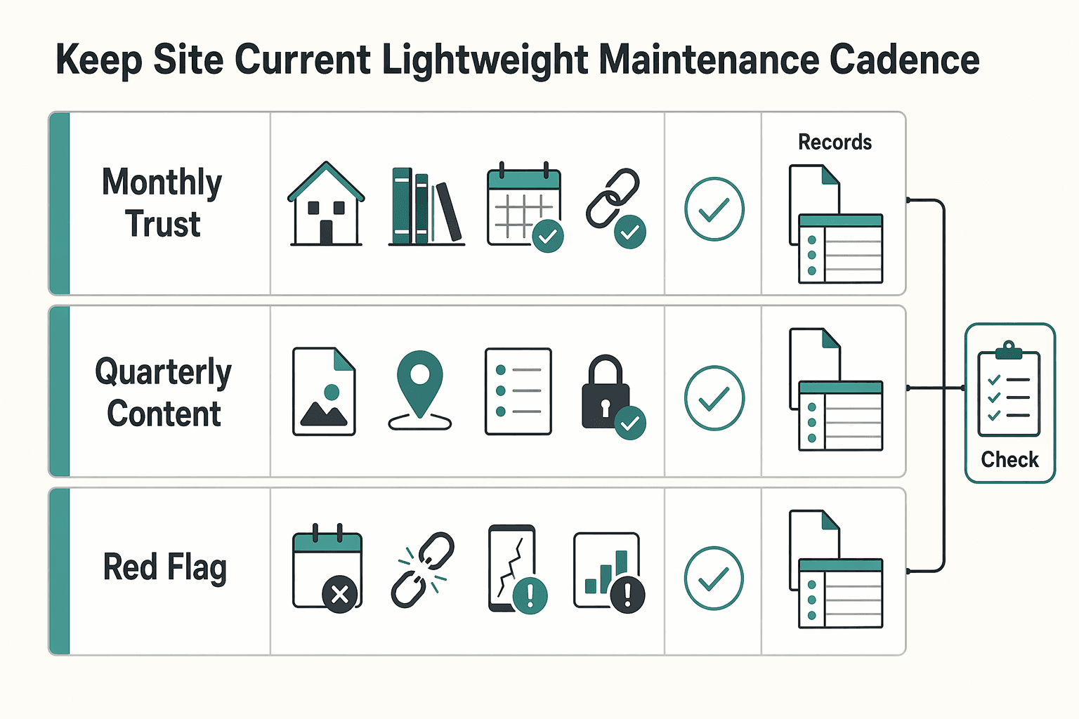
- Monthly check-in on trust pages
Review the pages that carry the most trust: homepage freshness, Books page status, Events page currency, and social-link validity. Verify, do not skim: test your signup flow yourself, confirm the thank-you state or email arrives, and open key links on mobile.
- Quarterly content sweep tied to your goal
Check whether pages like Blog, Audiobooks, or Book club questions still support your current business goal or just create maintenance drag. Freshness expectations vary by niche, so set your update pace to your topic and audience, not a universal schedule. If a section is thin or off-path, trim, merge, or hide it until you can maintain it well.
- Red-flag trigger list for fast fixes
Keep a short list of issues that require action right away: outdated release dates, dead signup flows, empty Events listings, and inconsistent voice between Contact/About and your Media kit. This protects the site architecture, because when homepage messaging, page flow, and subscriber path disconnect, readers often leave after one page instead of taking the next step.
A durable author site is maintained, not just launched. If you can keep only a few pages strong, protect those first and let every extra page earn its place.
Conclusion#
The best author websites are not always the prettiest ones in a gallery. The ones that work usually make clear decisions, give readers one obvious next step, and stay current over time. Three practical actions can have outsized impact.
- Start with one job
Pick the primary goal your site needs to do right now: newsletter signup, current book sales, or speaking and media. That single decision often matters more than personality styling, because a front page that asks for three things at once can weaken all three. If a new visitor cannot quickly tell who you are, what you write, and what to click next, your homepage is not finished yet.
- Score the pages that carry trust
Before you redesign anything, review the pages that make your site feel current and credible: Homepage, Books page, Contact/About page, newsletter signup, and, if relevant, Media kit and Events page. Check the basics by hand: submit the signup form, click every social link, confirm the latest book status, and make sure your contact route works on mobile. A common failure mode is not ugly design. It is stale preorder copy, an empty Events page, or a broken form that makes the whole site look abandoned.
- Use the 30 day plan, then protect it with light upkeep
If your site is thin or messy, do not fix everything at once. Publish the core pages first, then add only one growth layer such as sample chapters or events, and finish with a monthly 30 minute review so the site does not drift. That cadence can turn a site from a digital business card into one that supports visibility, trust, and audience engagement over time.
There is a practical reason to take upkeep seriously. Reported figures in one industry roundup suggest that most authors have a website, and that many people search online for a brand's website. You do not need to treat those figures as universal truth to get the decision rule: when people go looking for you, your site should answer the visit cleanly. If you want the simplest next move, do this in order:
- Choose one primary goal for the next 90 days.
- Score your current site against the checklist from this article.
- Execute the 30 day launch or cleanup plan without adding extra pages that you will not maintain.
If builder choice is still slowing you down, read The Best Website Builders for Freelancers. If your larger goal is audience growth and authority, follow with How to Write a Book to Establish Your Freelance Expertise.
Frequently Asked Questions
What pages should every author website include before launch?
Start with the pages people actually look for: Home, About, Books, and Contact. Make sure your email signup is visible, not buried, since strong author-site examples also surface books, bio, and contact info clearly. Add an Appearances or Events page if you can keep it current.
What should go above the fold on an author homepage?
Keep the hero clear: who you are, what you write, and one primary next step. That next step might be email signup or the current book. If a new visitor cannot quickly tell your genre and what to click next, rewrite the top section.
How often should an author website be updated?
There is no fixed rule like weekly or monthly, but the parts that affect decisions should stay current. Release status, event listings, and signup flows are the first things to verify. If your site shows old preorder language or empty appearances, it can look abandoned fast.
Do authors need a Blog, or can they skip it?
You can skip it. A clean site with a controlled domain, solid Books page, clear bio, and email path is often more useful than a half-maintained blog. Stale posts can make the whole site feel neglected.
What makes an author website look professional instead of generic?
Professional usually means clear and current, not flashy. Own your domain, use straightforward navigation, and surface your books and contact info. Generic shows up when the template is polished but the key details are out of date.
Should my main CTA be newsletter signup, preorder, or events?
Pick the CTA that matches your real goal right now. If you are building long-term reader access, lead with newsletter signup. If you are in a launch window, lead with preorder or buy-now. If appearances are your business priority, make events visible. Trying to give all three the top spot at once can make the page feel unfocused.
Which website builder is most practical for non-technical authors, including Squarespace?
There is no universal winner. Common starting options include WordPress, Squarespace, and Wix, and the practical choice comes down to cost, ease of use, and long-term portability. Squarespace is simple because it combines site building and hosting in one service, with plans described as starting at £12 per month, but you should still compare it against your comfort level and future needs. If you want a broader builder breakdown, read The Best Website Builders for Freelancers.
Try a related tool
Researched and edited by the Gruv editorial team. Gruv builds cross-border billing, payouts, and finance-operations software for global businesses.
Sources
Includes 3 external sources outside the trusted-domain allowlist.
- bates.edu/biology/files/2010/06/How-to-Write-Guide-v10...trusted
- extapps.dec.ny.gov/docs/water_pdf/dietlake09.pdftrusted
- gcc.edu/Portals/0/2025-26-Catalog.pdftrusted
- ncbi.nlm.nih.gov/books/NBK21054trusted
- pmc.ncbi.nlm.nih.gov/articles/PMC10807936trusted
- allianceinteractive.com/blog/best-author-website-examplesexternal
- almostanauthor.com/what-to-include-in-your-home-pages-above-the...external
- charlotteduckworthstudio.com/blog/author-website-examplesexternal
Educational content only. Not legal, tax, or financial advice.
Related Posts

Georgia 1% Tax for Entrepreneurs Without Filing Surprises
Treat Georgia's 1% tax path as a compliance question first and a rate discussion second. The goal is a setup you can defend under review, not a shortcut that fails at filing time.

The Best Website Builders for Freelancers
If you are trying to choose the **best website builder for freelancers**, stop looking for a universal winner. The right pick is the one that fits your conversion path, your editing habits during busy client weeks, and a budget you can actually sustain.

How to Write a Book as a Freelancer Without Scope Drift
The book needs a defined job and a defined boundary before you draft. In this cycle, give it one job: either support your client book services, or strengthen your own authority book so your niche, offer, and sales conversations become clearer.