
Quick Answer
Map the main user path from entry to completion first, then build wireframes for mobile app work in a strict order: navigation-changing states, edge states, and only then handoff notes. Keep one canonical file in Figma or Miro, assign a single review owner, and log decisions as accepted, rejected, or open. The draft is ready when someone can follow the flow and explain one failure branch without live narration.
Start here and define what good looks like#
Start rough on purpose. Good mobile app wireframing work is not the set of screens that looks finished first. It is the set that lets another person follow the core task, understand each screen's job, and spot structural problems before visual detail starts hiding them.
Put a one-sentence success statement at the top of the file and review against that sentence, not against taste. A practical version is: "This draft proves the main user path from entry to completion, shows the purpose of each screen, and makes blockers or decisions visible without visual polish." If a comment does not make that statement more true, it probably belongs later.
A wireframe is an early sketch of the app UI, whether that is a paper sketch or a simple digital outline. At this stage, simplicity is the point. Wireframing helps you visualize ideas, gather feedback, and fix major structural issues in the user flow before you spend more time or money on polish.
Hold the scope line early#
Keep this pass low fidelity. Use basic shapes and text, not color, imagery, or finished spacing. You want the structure to stay reviewable. Once a draft starts looking polished, feedback often drifts from flow to style.
Use this mini checklist to keep the scope tight:
- In scope
- core task screens in sequence * main navigation choices * key decision points * obvious blocked, empty, or error paths * short notes where behavior could be read two ways
- Out of scope
- brand colors * final icon style * refined typography * pixel-level spacing * decorative illustrations * micro-copy debates that do not change the flow
That last in-scope item matters more than many teams expect. A simple screen rarely explains intent on its own. If the next action, state change, or outcome could be interpreted differently by two reviewers, add a short ambiguity note now instead of hoping visuals will fix it later.
| Draft style | Review quality | Risk of rework | Handoff clarity |
|---|---|---|---|
| Structure-first draft | Feedback stays on flow, screen purpose, and missing states | Lower, because you catch user journey gaps before styling effort accumulates | Clearer, because sequence and intent are visible |
| Polish-first draft | Feedback drifts toward colors, spacing, and visual preference | Higher, because unresolved logic gets discovered after more work | Weaker, because pretty screens can still hide unanswered behavior questions |
Use a peer check before you style anything#
Before you add polish, get a quick peer read with minimal narration. Ask whether the start point, next action, completion state, and blocked or empty paths are clear.
You are not testing taste. You are checking whether the structure stands on its own. If the reviewer has to guess what a screen is for, skips over a missing step, or cannot tell success from failure, treat that as a flow problem and revise before styling. The real red flag is not confusion by itself; it is confusion that polished visuals might briefly hide.
A useful checkpoint is to listen for the reviewer's exact nouns and verbs. If they describe the screen purpose differently from what you intended, your labels or sequence are too vague. If they invent a missing state that is not shown, the draft probably needs another screen or note.
Define the output for this phase#
Do not aim for "some wireframes." Aim for a reviewable package with a clear shape:
- screen sequence for the main path
- edge-state coverage for the important blocked, empty, or failed moments
- ambiguity notes where behavior could be misunderstood
- open decisions that still need a product call
That output is plain, but it moves the work forward with less guesswork. If the set can be reviewed without narration and still expose structural weak spots, you are ready for the next step. If not, keep it low fidelity and fix the flow first.
Know what a wireframe is and what it must prove#
Your wireframe needs to prove structure, not polish. In this phase, the file should make each screen's purpose clear, show what the user does next, and show the resulting state before visual design starts.
A mobile app wireframe is a set of sketches and notes that acts as a blueprint for layout and structure. Keep each screen focused on one purpose. If two screens do the same job, or one screen is trying to handle unrelated jobs, simplify before you move forward.
| Artifact | What you should be proving now | Pause signal |
|---|---|---|
| Wireframe | Screen purpose, flow continuity, user action, and next state | Review drifts into color, spacing, or style opinions |
| Mockup | Visual presentation questions after structure is clear | Reviewers still cannot explain the flow from the file alone |
| Prototype | Interaction or transition questions after structure is clear | Core screen purpose or path is still changing |
Stay low fidelity on purpose: plain labels, simple boxes, and only the components needed to show navigation, actions, and content blocks. Use Figma or MockFlow as containers for the work, not as reasons to add polish early.
Use this go/pause test: if a reviewer cannot explain the entry point, main action, and next state from the file alone, pause and fix structure.
Proof checklist for this phase:
- connected flow from start to completion
- clear transition after each primary action
- visible failure, blocked, or empty paths
- one brief success note tied to the main user job
Related: How to Perform User Acceptance Testing (UAT) for a Mobile App.
Prepare inputs before you open Figma or Miro#
Start with inputs, not templates, so your wireframes prove the right flow instead of a polished guess. Before you draft, create a one-page prep pack that defines the user job, the core path, and the version-one boundary.
Build the one-page prep pack#
Keep it short enough to review quickly, but clear enough that someone else could sketch the first flow without a walkthrough.
| Prep pack item | What to include | Review note |
|---|---|---|
| User job to be done | One plain sentence: who the user is and what they need to complete | If the sentence turns into a feature list, the scope is still fuzzy |
| Core task flow | Minimum steps from entry to success, including the likely first screen, the main action at each step, the success state, and one exit point | Completion or abandonment can be the exit point |
| Constraints that affect navigation | Required sign-in, approval steps, gated areas, role-based access, or sequence-dependent actions | Treat these as navigation constraints, not visual details |
| Lightweight journey map | Likely entry and exit points around the core task | Keep it rough; the goal is path clarity |
Build it in this order:
- User job to be done
Write one plain sentence: who the user is and what they need to complete. If the sentence turns into a feature list, your scope is still fuzzy.
- Core task flow
List the minimum steps from entry to success. Name the likely first screen, the main action at each step, the success state, and one exit point, such as completion or abandonment.
- Constraints that affect navigation
Capture constraints that change structure: required sign-in, approval steps, gated areas, role-based access, or sequence-dependent actions. Treat these as navigation constraints, not visual details.
- Lightweight journey map
Sketch likely entry and exit points around the core task. Keep it rough; the goal is path clarity. If useful, revisit User Journey Mapping.
Quick check: hand this page to a reviewer and ask them to point to the first screen, main action, and end state. If they hesitate, do not open a template yet.
Lock scope before templates#
Prebuilt screens can save time, but they can also pull you into extra structure. Split screens into must-have, should-have, and later before you drag in any kit.
- Must-have: required to complete the core job
- Should-have: useful for clarity or recovery, but not required for first release
- Later: valid ideas you are intentionally parking
| Decision area | Prepared input state | Template-first state |
|---|---|---|
| Scope control | Boundaries are explicit before screens exist | Speed improves at first, but inherited screens can blur scope |
| Review quality | Feedback stays tied to job and flow | Reviews drift to layout because screens already look "real" |
| Handoff risk | Entry points, exits, and assumptions are visible early | Teams can receive screens without the reasoning behind them |
Keep one review surface#
Use one canonical file as the working source of truth. In Figma, comments stay attached to prototypes and design files, so keep one comment location and avoid splitting decisions across chat, email, and duplicate files.
Assign one owner to triage feedback. Keep a simple decision log in the same file, or a linked note, with: date, item, status, owner, reason. Use only three statuses: accepted, rejected, open.
Before drafting, clear this gate:
- prep pack is complete and understandable without narration
- must-have, should-have, and later screens are visible
- one review owner is assigned
- "ready for developer review" is defined in plain language, for example: core path is connected, mandatory screens exist, and open questions are clearly marked
Map the minimum viable screen set before detailed wireframing#
Map the smallest connected flow first so you can validate structure and decisions before visual polish. Your goal here is simple: the path should be understandable from the file itself, not from live narration. If you skip this step, wireframing often turns into pixel pushing without context.
Start with a screen inventory, not a canvas full of boxes#
List only the screens needed to complete the version-one core task. Keep optional areas out unless they are already in must-have scope. For each screen, capture why it exists, what brings the user there, what decision happens there, and where the user goes next.
| Screen | Screen intent | Trigger to enter | Primary decision | Next destination | Linked edge states |
|---|---|---|---|---|---|
| Welcome | Explain purpose and move user into account access | App launch | Sign in now or create account | Sign in, Create account | Offline, forced update |
| Sign in | Authenticate returning user | Welcome, session expired | Submit credentials or reset password | Home, Reset password | Invalid credentials, locked account |
| Home | Start the main task | Successful sign in, returning session | Begin task or view existing item | Task list, Task detail | Empty state, loading, sync error |
Use Trigger to enter and Next destination as your gap check. If either field is unclear, you likely have an unresolved branch or orphaned state.
Draw the happy path first, then add the paths that break#
Connect entry to success first. That shows whether your core journey is coherent before complexity gets layered in.
Add edge states in a second pass:
- Keep an edge case as an annotation when the message changes but user choice and destination do not.
- Promote it to its own frame when navigation changes, a new decision appears, or recovery needs a distinct action, for example retry, reset, confirm, or exit.
This keeps the file lean without hiding important detours in tiny notes.
Record platform intent while the flow is still simple#
You do not need polished platform-specific design yet, but you do need explicit navigation intent so behavior is not guessed later.
| Behavior area | Record for iOS | Record for Android | Why you are noting it now |
|---|---|---|---|
| Back movement | How a user returns from this screen | How a user returns from this screen | Back behavior changes perceived flow |
| Tab usage | Which screens are top-level destinations | Which screens are top-level destinations | Tabs can hide scope creep fast |
| Custom navigation | Any exception to your usual pattern | Any exception to your usual pattern | Exceptions need explicit review |
Before you move into detailed wireframes, pass this readiness check: every non-terminal screen has a defined entry and exit, every edge state is either linked to a parent or promoted to its own frame, orphan states are resolved, and someone outside your discussion can follow the flow from the file alone.
Need the full breakdown? Read How to create a User 'Persona' document for a design project.
Choose fidelity and tools with explicit decision rules#
Set explicit project rules for fidelity and tool choice, and keep them in one place. The goal here is not to declare a universal process. It is to give your team a shared operating standard.
Pick fidelity from the current blocker#
Choose the lowest fidelity that still resolves the open decision. If the blocker is structure, such as missing screens, unclear branches, or unresolved edge states, stay rough. If the blocker is movement between already agreed screens, add only enough click-through behavior to test that movement.
Use a simple check in review: can someone follow one core path and one failure path from the artifact alone? If yes, keep fidelity where it is. If no, increase fidelity only at the point of confusion.
Choose tools to protect one source of truth#
Pick tools based on review workflow and decision traceability, not preference alone.
| Decision factor | Single-tool default | Multi-tool exception |
|---|---|---|
| Comments and decisions | All feedback stays attached to one artifact | Split only when a clear handoff reason exists |
| Handoff continuity | One history from review through implementation | Name the canonical artifact and sync owner |
| Version discipline | Fewer conflicting edits and fewer duplicate branches | Record sync timing whenever secondary artifacts change |
| Premature polish risk | Easier to keep focus on structure first | Higher unless scope and review intent are tightly controlled |
Gate UI kits until structure is clear#
Introduce UI kits only after flow, edge states, and platform notes are already clear in the canonical artifact. Keep stakeholder review and engineering review anchored to that same artifact so decisions do not drift.
If you need a deeper tool breakdown, see The Best Tools for Mobile App Prototyping.
Build core screens and edge states in a strict sequence#
Use a strict build order so you can catch structural issues while the wireframe is still simple to change, before redesign becomes costly and cumbersome.
| Stage | Build outcome | Review gate before you move on |
|---|---|---|
| 1 | Main job flow from entry to completion, using basic shapes and placeholders | A reviewer can identify start, next action, and completion from the file alone |
| 2 | Path-control states that change destination or progression | A reviewer can predict where each major action leads, including return and branch paths |
| 3 | Edge states for user mistakes, system failures, and in-between status | Each core flow shows what appears on wrong input, failed requests, and in-progress states |
| 4 | Focused handoff notes only where behavior can be interpreted differently | A peer can explain triggers, timing, and outcomes without live clarification |
Finish the main job flow before you branch it#
Complete the primary path first: first entry to clear completion, with no visual polish. Placeholders for buttons, text, images, and navigation are enough.
Use this pass to remove unnecessary elements. If a screen is not required for the main task, leave it out. The gate is simple: someone outside the drafting conversation should still see where the task starts, what advances it, and where it ends.
Treat navigation-changing states as path-control decisions#
After the core path is clear, add states that control movement. These are path decisions, not cosmetic variations, because they decide whether users can continue, where they land, and how they recover.
Make those choices explicit in the file. Examples include selected tab behavior, back behavior, modal entry and exit, disabled actions until conditions are met, and confirmation branches that route to success, retry, or cancel paths. If a reviewer cannot predict the next destination for each major action, keep refining before moving forward.
Add edge-state coverage before annotations#
Before review, include branch coverage for user mistakes, system failures, and status clarity in every core flow. If input can be wrong, show that state. If a request can fail, show that state. If a response can take time or return nothing, show what users see during loading and empty outcomes.
Then keep notes narrow and risk-based: state triggers, validation timing, post-action behavior, data conditions, and any platform differences that matter for implementation. Skip obvious labels. As a final check, ask a peer to complete the main task and one failure branch without help; if they cannot explain what triggers each state and what happens next, tighten the wireframe before detailed design.
Run review cycles that force decisions, not vague feedback#
Run two review passes in one shared file before you move to handoff. Keep flow review and build-readiness review separate, and keep comments, deadlines, and sample references in the same workspace so decisions do not get split across tools or lost.
In pass one, review only flow clarity:
- Can someone complete the main task from entry to completion without your narration?
- On each screen, can they identify the next action without guessing?
- Can they explain one failure path, for example invalid input, timeout, or empty state, and what the user should do next?
If any answer is no, treat it as a flow issue first, not a polish issue.
Use a decision log that forces clear calls:
| Field | What to record |
|---|---|
| Issue | The specific confusion, gap, or conflict |
| Impact | Why it matters to the user or delivery |
| Decision type | Flow, content, state, navigation, or handoff note |
| Owner | Person responsible for resolving it |
| Resolution status | Open, decided, or deferred |
| Decision date | When the call will be made or was made |
Reject vague feedback early: if a comment is preference-only, ask the reviewer to restate it as a user problem or delivery risk before logging it.
After flow decisions are stable, run implementation-readiness review. If you use Figma, Dev Mode can help with inspection, but the real gate is concrete: required states are present, annotations are unambiguous, specs are inspectable, and unresolved product calls have clear owners. That is when wireframes move from discussion artifacts to buildable inputs.
Fix common wireframing failures before handoff#
Before you hand off, run one repair pass in this order: flow logic, states, source of truth, then platform differences. This keeps you from polishing screens that still need verbal explanation to make sense.
Start with flow and use a strict pass/fail check on each frame:
Pass: entry point, next action, and post-action outcome are all visible in the frame or clearly linked from it.Fail: a reviewer still has to ask where the user came from, what to do next, or what happens after tap, submit, or retry.
Then confirm the file still answers the foundation question: what problem are you solving, and who are you solving it for? If that is unclear, run a quick checkpoint with key stakeholders before handoff so you can test and validate sooner instead of pushing ambiguity downstream.
| Required state | User-facing purpose | Handoff artifact |
|---|---|---|
| Loading | Shows progress while the system works | State frame or annotation link |
| Empty | Explains why no content appears and what the user can do next | State frame or annotation link |
| Error | Makes failure clear and gives a recovery path | State frame or annotation link |
| Success | Confirms completion and shows the next step | State frame or annotation link |
Finally, keep one canonical handoff file and keep decisions there. Add a checkpoint cadence after team agreement, then log each checkpoint in that same file or its companion notes so version ownership stays clear. For iOS and Android differences, tag each divergence on the exact frame with expected behavior so engineering can implement without assumption-driven interpretation. You might also find this useful: Best Wireframing Tools for Scope Control and Scalable Delivery.
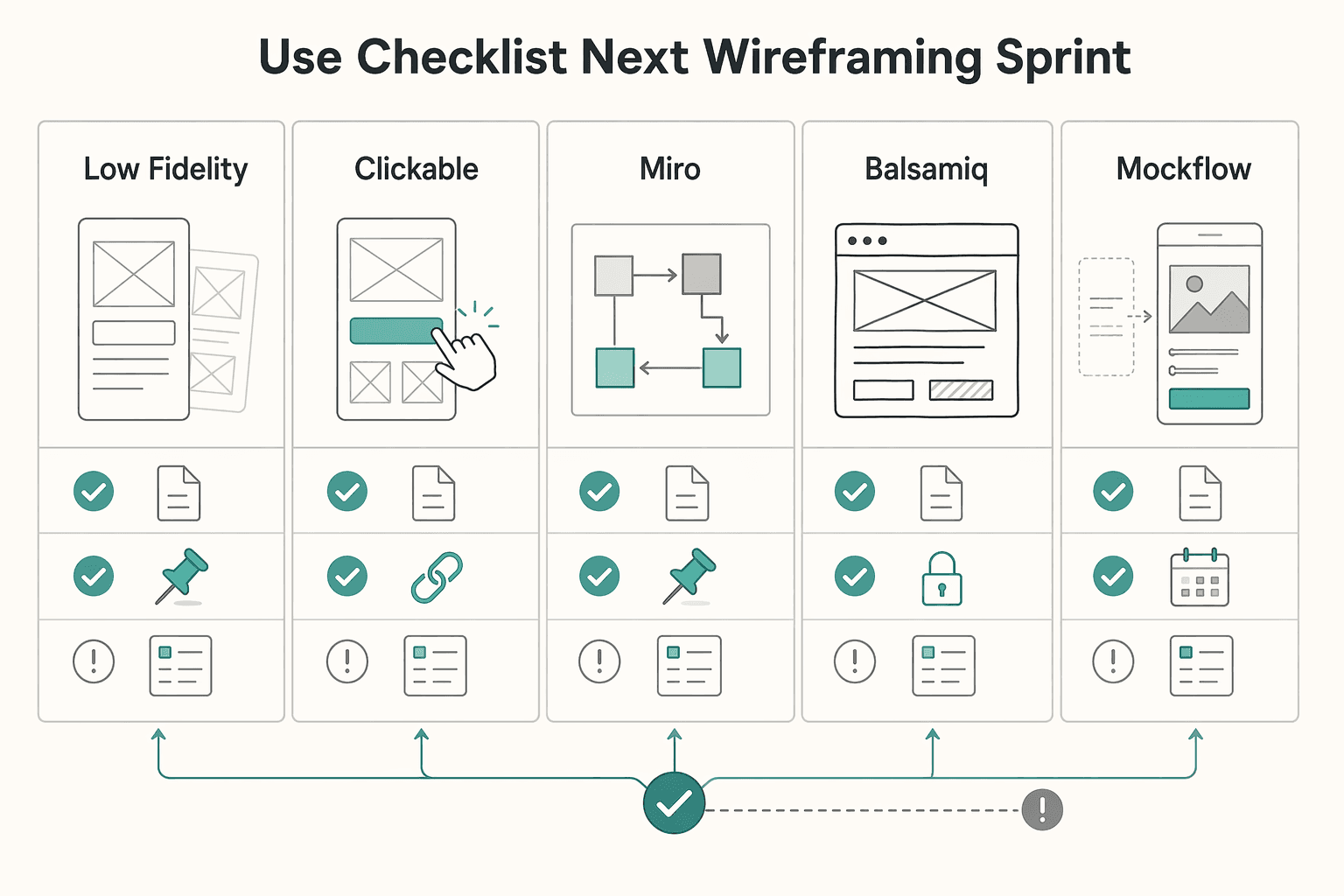
Copy and use this checklist for your next wireframing sprint#
Use this as your go/no-go gate before you treat the file as build-ready.
- Screen purpose is written, visible, and testable.
Pass if every screen has a one-line purpose in the file, and a reviewer can explain it without your narration. Fail if feedback immediately shifts to visual preference, or two screens appear to do the same job without a clear distinction.
- Your file shows a connected path, not a gallery.
Pass if each non-terminal screen shows where the user comes from and where they go next, with placeholders for verified and pending branches, such as [current branch coverage expectation after verification]. Fail if a reviewer asks "How do I get here?" or "What happens after this tap?" and the answer is not visible in the file. If you use an App Wireframe Template page, make those links explicit there.
- You chose fidelity and tool for a specific decision.
Pass if you can state the exact decision this format or tool must resolve. Fail if the reason is only "that's what we usually use." If useful, add a Comparison Chart Template page in the same file so the choice is explicit.
| Option | Decision goal to write down | Collaboration need to confirm | Handoff readiness note |
|---|---|---|---|
| Low-fidelity | What question does this rough detail settle? | Who needs to comment now? | Does this stay exploratory or move to the final file? |
| Clickable | What question requires linked behavior? | Who must test the path directly? | What still needs written notes after path testing? |
| Miro | Why this tool for this sprint? | [Who collaborates here?] | Interim workspace or final source? |
| Balsamiq | Why this tool for this sprint? | [Who collaborates here?] | Interim workspace or final source? |
| MockFlow | Why this tool for this sprint? | [Who collaborates here?] | Interim workspace or final source? |
| Figma | Why this tool for this sprint? | [Who collaborates here?] | Interim workspace or final source? |
- Handoff context is kept in one canonical file for this sprint.
Pass if you name one source-of-truth file and keep frame-level context there, with placeholders where needed: [edge states confirmed], [platform difference confirmed yes/no], [copy owner], [decision owner]. Fail if critical context is split across chat, slides, exports, or duplicate boards.
- Final review is a decision gate, not a discussion.
Pass only if one reviewer can open the canonical file, follow the path from entry to outcome, find explicit edge-state coverage, and see an owner for every open decision before development starts. No-go if there are multiple "latest" versions, unresolved questions without owners, or implied edge cases that are not shown.
For a step-by-step walkthrough, see How to Write a Scope of Work for a Mobile App Development Project.
Want to confirm the next step for your project? Talk to Gruv.
Frequently Asked Questions
What are wireframes for mobile apps, and what are they not?
They are a collection of sketches and notes that show what the app might look like on a device and how it should behave before anyone writes code. They should make layout, navigation bars, buttons, and content blocks clear without extra explanation. Keep review focused on structure and screen purpose first.
How do I create wireframes for a mobile app in the right order?
Draft the screens you need, then validate each screen. On each screen, ask two checks: what is the user trying to do here, and what happens when they tap the main action? If you cannot answer those quickly, keep the wireframe rough and clarify structure and functionality first.
When should I stay low-fidelity versus making clickable wireframes?
Use low-fidelity wireframes when you need to outline structure and functionality quickly. | Format | Use it when | Decision it resolves | Common misuse risk | |---|---|---|---| | Low-fidelity wireframe | You need to outline structure and functionality quickly | Whether the screen purpose and core on-screen elements are clear | Teams start polishing before screen purpose and tap outcomes are clear | | Clickable wireframe | You need to communicate flow and interaction outcomes more clearly | Whether the flow is understandable across screens | Treating a draft as final before core screen decisions are settled |
How many screens should an MVP wireframe set include?
Do not count by an arbitrary target. Count by user job: each screen should be a self-contained interface with one purpose. If two screens support the same action with no real difference, cut or merge them because duplication can confuse users.
What must every mobile wireframe include before developer handoff?
Each core screen should clearly show key layout elements such as navigation, buttons, and content blocks, plus its single purpose. A reviewer should be able to answer what the user is trying to do and what happens when they tap key actions. If those checks fail, the wireframe is not ready.
What mistakes do teams make most often in early mobile wireframing?
The first is combining unrelated features into one screen, which muddies purpose. The second is duplicating screens for the same action, which can confuse users. The fix is simple: keep each screen focused on one job, and remove duplicate screens that do not add a different purpose.
Which tool should I start with if I work alone and need speed?
Prioritize an approach that keeps each screen focused on one purpose and makes tap outcomes explicit.
Try a related tool
Researched and edited by the Gruv editorial team. Gruv builds cross-border billing, payouts, and finance-operations software for global businesses.
Sources
- bryanuniversity.edu/wp-content/uploads/2022/03/BU-Catalog-2022_R...trusted
- catalog.albertus.edu/_resources/archives/Accelerated-Adult-Underg...trusted
- centralia.edu/pathways/docs/2018-19_catalog.pdftrusted
- eureka.edu/file/2261trusted
- farmingdale.edu/courses/index.shtmltrusted
- mavmatrix.uta.edu/context/cse_dissertations/article/1268/viewc...trusted
- pmc.ncbi.nlm.nih.gov/articles/PMC12820269trusted
- trustees.ufl.edu/media/trusteesufledu/minutes/2018/Ed-Policy_...trusted
Educational content only. Not legal, tax, or financial advice.
Related Posts

Thailand's Long-Term Resident (LTR) Visa for Professionals
For a long stay in Thailand, the biggest avoidable risk is doing the right steps in the wrong order. Pick the LTR track first, build the evidence pack that matches it second, and verify live official checkpoints right before every submission or payment. That extra day of discipline usually saves far more time than it costs.

Best Mobile App Prototyping Tools for Freelancers
A prototyping tool is not the software line item to cut first. It is part of how you sell, scope, and deliver the work. The prototype shapes outcomes you can actually control: clearer scope decisions, faster client alignment, and a cleaner developer handoff. It is the first draft of the product, but it also affects how confidently you sell, how smoothly you deliver, and how much rework you absorb.

Client Journey Mapping for Solopreneurs: From Inquiry to Payment and Handoff
If you work solo, a client [journey map](https://www.nngroup.com/articles/journey-mapping-101) should do more than describe how a client feels. It should help you control how work starts, moves, gets approved, and gets paid. In standard UX, a journey map shows the steps a person takes to reach a goal. In a service business, that same structure can become an operating tool for spotting where payment timing, scope clarity, handoff friction, and admin steps break down.