
Quick Answer
Build a freelance brand style guide as an operating playbook, not a gallery file. Lock voice and positioning first, then set enforceable standards for logo use, color choices, typography roles, and imagery boundaries. Apply those standards immediately in real client documents so decisions stay repeatable under deadline pressure. Use a pass/fail acceptance check before approving outsourced deliverables, then run a 30-day implementation cycle to test, refine, and publish what people can actually follow.
Your brand guide should run your business, not decorate it#
Treat your guide as a working document, not a design trophy. A freelance brand style guide should make daily decisions easier and keep your brand consistent in the files clients actually read.
Start with one brand book that holds core standards in one place. Include clear rules for logo use, color palette, imagery, brand voice, and tone, then apply those rules to real outputs like proposals and other client-facing communications. Small inconsistencies usually start when people have to guess, not when they disagree on intent.
A guide that looks polished but lives outside daily work usually fails at the exact moment it is needed. If you or a collaborator has to stop mid-proposal, mid-invoice, or mid-client email to ask what version of the logo to use or how formal the language should sound, the problem is not effort. The rule was not usable fast enough.
- Define the minimum decisions first.
Set only the rules you need for repeatable choices. If a rule is vague, rewrite it until two people would apply it the same way. Good rules answer the practical question fast: what do I do right now in this file?
That means replacing broad statements with applied guidance. "Use the brand confidently" is not a rule. "Use the documented default logo version and default heading/body styles unless this file already has an approved exception" is a rule people can act on.
- Tie each rule to a live client asset.
A guide matters only if it shows up in active documents and messages. If a rule never appears in real work, refine it or remove it. Keep theory short and usage examples concrete.
Proposals, invoices, onboarding materials, and routine client communication are the real test. If your guide cannot support those assets cleanly, it is not finished, no matter how polished it looks on its own.
- Stress-test for clarity.
Ask someone else to produce a client-facing draft from the guide. Where they hesitate or interpret differently, tighten the language. If they need to ask you for approval at every step, the guide is still too abstract.
Pay attention to where they pause. Hesitation usually shows up around defaults, exceptions, or channel-specific tone. Those pauses tell you exactly which lines need rewriting.
Keep the tradeoff clear: you want consistency in core decisions without flattening your human voice. Think of the guide as guardrails, not a script. When the guardrails are clear, you spend less time debating basics and more time on client outcomes.
Gather what you need before you draft anything#
If the goal is practical use, prep is simple: inventory what already works before you write new rules. Your first checkpoint is whether you can answer routine questions right now, such as logo placement, approved color combinations, and how communication should read in client touchpoints.
This step matters because most brand drift starts long before anyone opens a style guide. It starts when files live in different places, old assets sit next to current ones, and nobody is fully sure which version is approved. Good prep removes that ambiguity before you write a single rule.
- Step 1: Gather core visual assets and usage notes in one folder.
Collect current logo files and variants, your active color palette, typography choices, and recurring imagery. Add existing notes on clear space or unacceptable uses. Someone reviewing the folder should quickly see what is current and what is outdated.
Make the approved versions obvious at a glance. If older files are still useful for reference, separate them clearly from live assets so contributors do not pull the wrong file under deadline pressure.
- Step 2: Pull real client-facing materials as reference.
Use the documents and templates you already send, plus recent communication examples. This keeps the guide grounded in real production and shows where communication rules belong next to visual rules.
Do not limit this to polished examples only. Pull a few routine assets that required edits or caused confusion too. Those are often more useful than your best-looking files because they show where rules are currently missing.
- Step 3: Prepare this draft for collaborators.
Organize assets and notes so internal teammates and external contributors can use the same references without guesswork.
The goal is shared orientation, not just storage. A collaborator should be able to open the folder, understand which assets are live, and see enough context to use them without a separate explanation call.
- Step 4: Run a quick usability check before drafting sections.
Confirm the guide can answer implementation questions such as recommended logo size and placement, plus approved color combinations. If answers are still vague, tighten the rule before drafting more sections.
Use this as an early quality filter. If you cannot answer common usage questions now, writing longer guidance will not solve the problem. Clarify the decision first, then document it.
Add one practical prep move before writing: make the approved versions of assets obvious to everyone using the guide. Clear file names, current versions, and a visible distinction between live and outdated assets reduce avoidable confusion later.
Specific prep takes extra effort up front, but it reduces drift later and makes collaboration easier. You do not need a perfect archive. You need a clean starting point where decisions are visible and reusable.
If you want a deeper dive, read The 1% Tax Regime for Entrepreneurs in Georgia.
Lock your core brand decisions in one focused session#
Lock strategy before visuals. Decide who you serve, what you promise, and how you should sound first, then shape visual choices around that. If you skip this sequence, design decisions may look polished but send mixed signals.
Brand guidelines work best when they cover communication and design together. A document that only defines visuals often breaks down in practice because messaging still gets improvised.
Keep this working session focused on decisions, not brainstorming without a finish line. The point is to leave with clear defaults, not a long list of possibilities. If you already have recent proposals, invoices, or onboarding materials, use them as prompts to spot where your positioning and tone are already strong and where they still drift.
- Draft a strategy sheet before design work.
Capture mission, values, audience, niche, unique promise, and voice and tone guidance for common situations. Outcome: someone else can explain your positioning and communication approach without opening design files.
This sheet does not need to be long. It needs to be specific enough that a collaborator can explain what you do, who it is for, and how communication should feel without filling in missing logic on their own.
- Define what is fixed and what is flexible.
Mark decisions that must stay consistent and areas where adaptation is allowed. Keep only rules that support your target client, and cut the rest. Tradeoff: enough structure for consistency, enough flexibility for real project needs.
Fixed decisions often include core positioning, approved logo usage, baseline typography, and voice traits. Flexible decisions usually show up in tone by situation, imagery selection within approved criteria, and how templates adapt to a specific client context.
- Set default choices for unclear moments.
Add simple fallback guidance for high-friction areas so decisions stay fast when time is tight. Test those rules on real assets, then rewrite anything people interpret differently.
Defaults are especially helpful when someone is moving quickly. If they are unsure which option fits, the guide should tell them what to choose first, not force them into another round of interpretation.
- Run a quick verbal clarity check.
Explain your audience, promise, voice, and consistency rules out loud. If the explanation sounds vague or too long, revise before moving on.
Spoken clarity is a strong filter here. If it takes too long to explain or keeps slipping into general language, your written guidance will likely create the same problem later.
A useful pressure test for this section is a common handoff: a collaborator needs to write a proposal intro and adjust a client email without asking for help. If they can complete both with the strategy sheet alone, your foundations are clear enough to support the next sections.
Turn design choices into enforceable visual rules#
Make this section usable at production speed. You or a collaborator should be able to build on-brand work without asking what you meant. Clear rules for logo use, color palette, typography, and imagery keep outputs aligned across channels.
The standard here is enforceability. You are not trying to describe a visual identity in a flattering way. You are trying to make correct use easier than incorrect use. If someone still has to rely on taste or memory, the rule is not finished.
- Define logo usage with clear yes/no rules.
List approved logo versions, where each one is allowed, and examples of acceptable and unacceptable use. Checkpoint: someone can place the correct logo on a proposal cover and a social post without clarification.
This is where many guides stay too vague. Do not stop at showing the logo. State which version is the default, where alternate versions belong, and what should not happen. A collaborator should be able to choose the correct option without asking what "works best."
- Constrain color and type by role, not preference.
Set a limited palette and define where each color is used. Set default typography for headlines, body copy, and callouts so choices stay fast under pressure. Default rule: if uncertain, use the documented default color and heading/body styles.
Role-based rules matter because they reduce per-file improvisation. When colors and type are assigned to jobs instead of taste, people can move quickly without reopening the same decision every time.
- Define imagery style with accepted and off-brand examples.
Show what fits and what does not using criteria like tone, composition, and overall look. This reduces subjective debates during review.
The contrast matters here. Two images can look technically fine and still send different signals. Accepted and off-brand comparisons make the style easier to apply consistently, especially when contributors are sourcing or selecting under time pressure.
- Test the rules on two real assets before finalizing.
Build one proposal asset and one social post using only this section. Add reusable templates so correct usage is easier than ad hoc choices. Checkpoint: both assets should read as one coherent visual identity in different contexts.
Watch for where the rules slow people down. If the same question comes up twice during the test, the guide probably needs a clearer default or simpler wording.
- Add a pre-release review step.
Before you send client-facing work, run a quick check for logo, color, typography, imagery, and alignment with your communication rules. Ask a collaborator to recreate one asset from this section alone. If they hesitate, rewrite the unclear line.
This review should be short enough to use every time. If the check is too long or too separate from real files, people will skip it and fall back on habit.
Add one more practical rule to keep this section maintainable: document exceptions when you approve them. If exceptions are not recorded, they can turn into informal defaults and make the guide harder to enforce over time.
If the guide looks finished but cannot produce a correct asset on the first pass, it is still too abstract. Enforceability is the standard here, not visual polish in isolation.
Related: How to Build a Referral Program for Your Freelance Business.
Write voice rules that keep client communication consistent#
Voice rules should help two people sound like one cohesive brand. This section keeps communication consistent in day-to-day client interactions.
A useful voice section does more than describe personality. It shows how that personality behaves in the exact channels where clients experience your business. If a proposal sounds thoughtful, an invoice sounds abrupt, and onboarding sounds like it came from a different person, the brand feels less stable even when the design looks consistent.
Step 1 Define voice traits and tone shifts#
Document brand voice traits in plain language, then show how tone shifts by situation without changing the underlying personality.
- Include examples for recurring situations so contributors can apply the same voice under different conditions.
Keep each trait tied to behavior. For example, if your voice is direct, show what direct looks like in a sentence opening, not just a label in a list.
It helps to anchor traits to existing channels. Show how the same voice appears in a proposal intro, a project update, an onboarding note, or an invoice message. The wording can shift in warmth or firmness depending on the situation, but the underlying personality should still feel recognizably yours.
Step 2 Add do/don't examples from real channels#
Definitions are easy to misread; examples are easier to apply.
| Component | Do | Don't |
|---|---|---|
| Voice traits | Show short examples of each trait in action. | Leave traits as labels with no examples. |
| Tone by situation | Show how tone shifts without changing brand personality. | Let tone shifts change the underlying voice. |
| Vocabulary choices | List preferred wording and wording to avoid. | Leave word choice to individual preference. |
Keep examples brief enough to scan quickly before sending so people actually use them.
Use real channels you already send, not invented samples that never appear in practice. When examples come from proposals, onboarding notes, invoices, and normal client messages, contributors can transfer the rule more reliably.
Step 3 Apply the clarity-over-cleverness rule#
Set one non-negotiable decision rule: if a line sounds clever but increases ambiguity, rewrite it for clarity.
Quick check before sending:
- Name who is doing what.
- Name what is included and excluded.
- Name the next step and timing.
When possible, test this check on real drafts, not isolated snippets. A sentence can sound clear on its own but become confusing when placed next to timeline or scope details.
This rule is especially useful in places where people try to sound polished fast. A proposal headline, a scope note, or a payment message can all sound sharper than they read. If the line makes a client pause and reinterpret what happens next, it failed the test.
Step 4 Add vocabulary guardrails#
Keep a living list of phrases to avoid and preferred replacements so each touchpoint sounds consistent. Store these guardrails with your visual rules, then update them with examples from recent client communication.
Focus on wording that appears repeatedly in client-facing work: scope labels, next-step language, timing language, and simple explanations of what is included or excluded. Those repeated phrases shape consistency more than isolated lines do.
Maintenance matters here. If your offers or client mix changes, revise wording examples so the guide reflects current work, not old positioning.
Build the working templates freelancers actually use#
A style guide becomes most useful when it shows up in the documents clients actually see. Build templates so common decisions are easy to find. When lookup is slow, people guess, and consistency drops even when intentions are good.
The easiest way to improve adoption is to put the guide inside the work itself. A separate brand document can hold the rules, but your high-use templates should carry those rules into practice. That way you do not have to remember everything. You only need to follow what has already been standardized.
Step 1 Standardize the proposal template around repeat decisions#
Use a repeatable proposal structure tied to voice and visual rules. The goal is consistency and speed, not rewriting from scratch for every lead.
Use a stable sequence that fits your work, for example:
- Client objective in plain language
- Scope boundaries
- Timeline with first milestone
- Price and next action
Add a quick-reference area for high-use choices such as logo, color, typography, and voice. This reduces guesswork and unnecessary revisions.
Keep the structure fixed wherever possible. The client-specific content should change, but the order of information, the language pattern, and the visual hierarchy should stay stable enough that someone can update the proposal without redesigning the document each time.
A practical checkpoint for this step is simple: can someone update only the client-specific details without touching structural language? If not, your template is carrying too many ad hoc choices.
Step 2 Align the invoice template with the same language and tone#
The invoice should feel like a continuation of the proposal, not a different brand. Keep terminology and formatting aligned so handoff stays clear.
If you use deposit billing, include a reusable payment note. A 50% deposit is one example, not a universal rule. The key point is consistency between what you proposed and what you invoice.
Add one operational check here: compare wording for scope labels and payment milestones between proposal and invoice, and fix mismatches before sending.
This is a common failure point because the invoice often gets treated as a separate admin file. It should still carry the same brand logic. If the proposal uses one set of labels and the invoice uses another, clients can feel avoidable friction even when the numbers are correct.
Step 3 Turn the client onboarding document into a reusable packet#
Treat onboarding as a repeatable packet because project starts set expectations for everything that follows. Keep it concise and easy to scan.
Include the core details each client needs to start well, and use a format that is easy to access and update.
When onboarding is clear, teams spend less time repeating clarifications and can reduce revision churn later.
A reusable packet should answer the practical questions clients tend to have right after they sign: what happens first, what they need to send, how your process will read and feel, and where your communication style should remain consistent with everything they have already seen. The packet does not need more volume. It needs fewer gaps.
Step 4 Pressure test everything before calling the guide complete#
Test your proposal, invoice, and onboarding packet on real work before calling the guide complete. A practical benchmark is to run 5-10 real requests through your system.
During the test, check how quickly people can find key decisions. If lookup feels slow, simplify until high-use rules are obvious and answers are easy to find in under 30 seconds.
Document what failed during the test and what changed after edits. That change log helps future collaborators understand why certain template choices are fixed and why others can adapt.
Look closely at the moments where people make the wrong edit, miss a required field, or rewrite a standard line in a different tone. Those are not minor user errors. They are evidence that the template still leaves too much room for interpretation.
You might also find this useful: How to Build a Waitlist for a New Freelance Service.
As you standardize your invoice format, use this free invoice generator to turn your style rules into a reusable client-ready template.
Decide whether to DIY or hire on Fiverr or Upwork#
Choose the path based on constraints, not platform loyalty. Budget, speed, creative confidence, and project complexity should drive the decision. The main tradeoff is straightforward: lower upfront spend can mean more revision management on your side.
There is no universal right choice here. The best option depends on how stable your brand direction already is and how much management time you can realistically give the project. A less expensive path can still become costly if the brief is unclear and you spend too much time correcting misunderstandings.
Step 1 Score your constraints first#
Use a simple comparison before you choose.
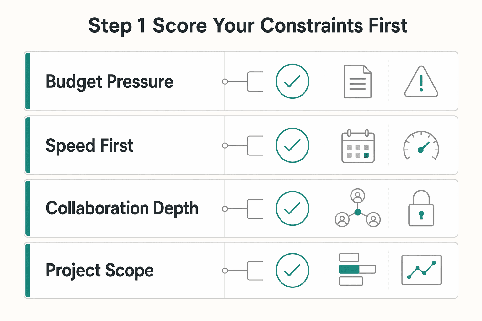
| Constraint | DIY | Fiverr | Upwork |
|---|---|---|---|
| Budget pressure | Can reduce cash spend if you invest your own time | Lower-entry options are common | Often more expensive, often positioned for higher-quality work |
| Speed to first draft | Depends on your availability and decision speed | Fast for tightly scoped tasks | Varies by project setup and scope |
| Collaboration depth | Full control, but you own all revisions | Often limited on lower-cost gigs | Better fit for collaborative or ongoing work |
| Project scope | Useful for early drafts and direction checks | Best for narrow, clearly bounded tasks | Better for broader or longer engagements |
Use this table as a decision filter, not a ranking. A path that looks cheaper at the start may cost more in your own revision time.
It helps to write short notes beside each row based on your real situation. If the same option keeps losing on the constraints that matter most to you, that is usually enough to narrow the decision.
Step 2 Decide based on stability and precision needs#
If your offer is still changing, avoid locking a large paid scope too early. When requirements move, revision effort often increases. If your positioning is stable and you need deeper collaboration over a longer scope, Upwork may be a better fit; for fast, transactional tasks, Fiverr may be a better fit.
Run one practical check before deciding: if you cannot define acceptance criteria yet, do a short DIY pass first or commission only a small paid task.
This protects you from paying for precision before your own direction is precise. A stable brief supports a larger engagement. An unstable brief usually needs a smaller test first.
Step 3 Only hire with a clear brief and strict acceptance criteria#
Use Fiverr or Upwork only when the brief is specific. Lower-budget options can come with limited revisions and less back-and-forth.
Before payment, confirm in writing:
- Requested file formats are delivered for real use.
- Commercial usage rights are clearly stated.
- Output matches your brand guidelines.
If file format or rights language is unclear, pause and re-scope before continuing. Ambiguity at this stage can become conflict at delivery.
A good rule here is simple: if the work is clear in your head but not clear on the page, you are not ready to hire yet. The provider should not have to infer your standards from scattered messages.
Step 4 Run a small paid pilot, then assess Fiverr Pro separately#
Start with one tightly scoped paid task and grade brief adherence, revision quality, and response speed. If you want to compare a moderate-budget Fiverr option, evaluate Fiverr Pro as a separate tier instead of the default.
After the pilot, make a one-line continue or stop decision based on pass rate and revision effort. If a provider misses core acceptance points in the pilot, do not expand scope and hope quality improves later.
A pilot is most useful when it reflects real use. Choose a task that resembles the kind of asset you actually need, then assess not only how the draft looks but how well it follows the brief without extra explanation from you.
If you outsource, write a brief that prevents expensive rework#
When you outsource, the brief becomes a core quality-control document. Unclear expectations are a common source of delays and extra revisions, so write the brief as if it will be used to resolve disagreements later.
A strong brief reduces avoidable subjectivity. It gives the provider a clear target and gives you a clear standard for approval. Without that, feedback tends to slide into preference-based loops that waste time on both sides.
Step 1 Audit your brand before writing the brief#
Run a quick touchpoint audit so the brief matches what is actually live. Review key channels and note inconsistencies in logo use, typography, imagery, and message tone.
Create a one-page baseline that separates fixed decisions from flexible ones. Include your current brand identity, target client profile, and examples that show the intended direction.
A useful audit check is to compare touchpoints side by side and identify what changed. That gives you practical guidance to include in the brief.
This step is less about diagnosis language and more about evidence. If a proposal, social post, and onboarding file all feel slightly different, name exactly where that difference shows up so the outsourced work solves a visible problem.
Step 2 Define required inputs and bounded deliverables#
Put required inputs at the top: brand guidelines, logo usage rules, preferred typography, imagery direction, and audience context.
Then define bounded deliverables. Specify what editable assets are expected, whether a usable visual brand style guide is included, and which applied examples are required for your priority touchpoints.
Keep this section concrete. Generic phrases such as "full brand package" are harder to enforce than named assets and named use cases.
It helps to package the brief so the provider can see the rules and references in one pass. The easier it is for them to understand the approved inputs, the less likely they are to fill gaps with assumptions that later turn into rework.
Step 3 Set revision boundaries before kickoff#
Write revision boundaries in plain language before work starts. Confirm included revision rounds, expected response windows, and how scope changes will be handled.
If a request changes core deliverables, timeline, or approval criteria, pause and re-align scope before continuing. A short pause here can reduce late-stage conflict.
Add one internal rule for your team: all revision requests should map back to acceptance criteria. That keeps feedback focused and avoids taste-based loops.
You can make this even cleaner by grouping feedback by artifact and criterion. That way the provider is not trying to decode scattered notes that mix visual changes, wording issues, and new ideas in the same message.
Step 4 Use objective done means done criteria#
Tie approval to your brand book so decisions are based on criteria, not taste.
- Follows logo and typography rules.
- Keeps message clarity and tone consistent across key touchpoints.
- Includes promised editable assets and access.
- Shows applied use in selected client-facing formats.
Final check: polished visuals are not enough if the message is unclear. Approve only when both visual consistency and message clarity are present. If one fails, request revision against the exact criterion that failed.
A good handoff should stand on its own. If you still have to explain how to use the files every time someone opens them, the deliverable may be visually finished but operationally incomplete.
Accept or reject deliverables with a quality checkpoint#
Use a pass/fail checkpoint before approval so vague expectations do not turn into revision churn. Review the handoff against the brief and real client-facing use, not personal taste.
The fastest way to lose control of quality is to approve based on appearance alone. A deliverable should be judged by whether it works in the assets you actually send and whether another person can use it without extra interpretation.
Step 1 Run a stress test across core client-facing artifacts#
Test the handoff in your proposal and other priority touchpoints. This keeps the review tied to real use instead of mockups.
- Proposal: check that scope and timeline stay clear after applying the new rules.
- Priority touchpoint: check that tone, hierarchy, and instructions stay clear and aligned.
- Another priority touchpoint: check the same standards hold without extra interpretation.
Checkpoint: pause approval if any artifact requires major interpretation to use correctly. If users need extra explanation to apply the asset, the handoff is not ready.
This is where polished samples often fail. A mockup can look complete while a real proposal or onboarding document becomes harder to read, update, or send once the design is applied.
Step 2 Verify deliverables against the brief line by line#
Compare what was delivered to the agreed deliverables and formats. Confirm outputs are clearly named, present, and usable as delivered.
Reject when key items are missing, including:
- Explicitly defined deliverables listed in the brief.
- Brand guidelines and other agreed brand assets.
- Agreed file formats for each deliverable.
This step is where many teams rush. Slow down and validate every line item before discussing aesthetics.
A simple line-by-line review helps keep the conversation objective. Missing files, missing editable assets, or unclear formats are not minor issues to "sort out later." They are delivery gaps.
Step 3 Check brand fit and message clarity together#
Evaluate each artifact for both visual consistency and communication quality. A clean design is not enough if scope, timeline, or client instructions become unclear.
Red flag: the documents look polished, but language is generic or ambiguous. Treat that as a rejection condition, not a minor note.
The review should ask one practical question: does this make real client communication easier to understand? If not, visual improvement alone is not enough reason to approve.
Step 4 Run a practical handoff usability test#
Make small updates to colors, typography, and text, then adjust layout. If routine updates create extra back-and-forth, the handoff is not ready.
Final checkpoint: approve only when you can apply and update assets across priority touchpoints with minimal friction. The handoff succeeds when normal maintenance is easy, not when static examples look clean.
This last test matters because a guide is rarely used once. It gets reused and updated in ongoing work. If ordinary edits create confusion immediately, that friction will compound over time.
Fix the mistakes that make freelance branding fall apart#
If execution starts to drift, treat it as a brand clarity issue and fix it fast. Inconsistent choices weaken credibility, confuse prospects, and make it harder to win work.
Most breakdowns do not come from a total lack of effort. They come from small repeated shortcuts: an old logo file gets reused, a message gets rewritten in a hurry, a template gets copied and slowly altered, or outsourced work looks polished but never gets fully integrated into daily use.
Step 1 Contain visual drift#
When visuals start to fragment, reduce choices to a small approved set and apply it consistently across client-facing files. Keep core typography and color decisions aligned everywhere prospects see your brand.
When in doubt, remove optional variations before adding new ones. Fewer options make consistency easier during busy delivery periods.
It also helps to review where the drift entered the system. If outdated files are still circulating or approved exceptions were never documented, fix the source instead of repeatedly correcting the symptom.
Step 2 Tighten messaging rules by channel#
When design looks polished but wording shifts, tighten tone rules with channel-specific examples. Add short do and do-not examples for common client messages.
If two people write the same message in very different voices, your rule is too broad. Rewrite it with a clearer example.
Focus on the channels where inconsistency has the highest client impact first. Proposal language, invoice wording, onboarding instructions, and routine project communication usually expose weak voice guidance faster than isolated marketing assets do.
Step 3 Make the guide usable at send time#
A guide can get ignored when it sits outside daily files, so embed quick checks directly in your templates. Before sending, confirm visual consistency, voice consistency, and logo usage consistency, and keep regular maintenance on the calendar.
Treat maintenance as prevention, not cleanup. Regular checks support long-term visibility and repeat business.
The goal is to review the guide at the moment of use, not only during a separate brand review. If the check is part of the proposal, invoice, or onboarding file itself, adoption becomes much easier.
Step 4 Re-brief outsourced work around practical use#
When you review outsourced branding work, do not approve based on polish alone. Evaluate day-to-day usability, test logo distinctiveness from a customer viewpoint, and confirm assets are easy to apply consistently.
Cost still matters, but cheapest is not always lowest total cost. Pricing examples can vary widely, including ranges like $1k to $5k in some cases, so treat that as context rather than a universal benchmark.
If outsourced work is close but still impractical, re-brief around use cases instead of broad taste feedback. Show where the asset breaks in proposals, invoices, onboarding, or other priority files, and tie revision requests back to the original criteria.
Launch in 30 days with a copy-paste checklist#
Use a focused 30-day sprint as your first execution block, then keep refining inside a broader 30-90 day window. The goal of the first month is practical adoption, not perfect completion. Treat the week-by-week plan below as a working example, not a fixed formula.
| Week | Focus | Key actions |
|---|---|---|
| Week 1 | Lock foundations, then visuals | Finalize mission, values, audience, and positioning; finalize logo usage guidelines, color palette, typography, and imagery style rules; store all approved inputs in one location |
| Week 2 | Apply rules in real client documents | Implement the guide in proposals, invoices, and onboarding materials; build checks into each file; simplify template structure if edits require frequent lookup |
| Week 3 | Run a QA pass beyond templates | Test the same checklist on a social post, presentation, and client email; add concrete do and do-not examples if voice guidance is vague; record each failure point and the rule update that fixed it |
| Week 4 | Publish and maintain | Publish the brand book, archive outdated assets, schedule a recurring review cadence, and confirm core files can be updated quickly without extra explanation |
- Week 1: lock foundations, then visuals. Finalize mission, values, audience, and positioning first. Then finalize logo usage guidelines, color palette, typography, and imagery style rules. Keep each rule plain enough that someone else can apply it without guesswork, and store all approved inputs in one location. As you work, separate what is fixed from what is flexible so later template decisions do not reopen core brand questions.
- Week 2: apply rules in real client documents. Implement the guide in a few high-frequency client documents, for example proposals, invoices, and onboarding materials. Build checks into each file so consistency is reviewed during creation, not only at the end. If edits require frequent lookup, simplify template structure. The goal for this week is not more design. It is easier use in the files you already send.
- Week 3: run a QA pass beyond templates. Test the same checklist on additional outputs such as a social post, presentation, and client email to catch drift early. If voice guidance is vague, add concrete do and do-not examples so contributors interpret it the same way. Record each failure point and the rule update that fixed it. This creates a practical change log you can reuse when collaborators join later.
- Week 4: publish and maintain. Publish the brand book, archive outdated assets, and schedule a recurring review cadence. A one-time guide is not enough without ongoing checks and updates. Before you call the system live, do one last pass through your core files and confirm they can be updated quickly without extra explanation.
Next step: if you outsource any part, require the same acceptance checkpoint before final approval.
After your 30-day rollout, use the freelancer tools library to keep your client-facing documents consistent with the same brand system.
Frequently Asked Questions
What should a freelance brand style guide include first?
Start with the essentials that prevent inconsistency: logo usage, colors, fonts, and overall design direction. Then add usage rules so outputs stay consistent across channels. If a collaborator can apply those rules without asking follow-up questions, your foundation is strong.
Do freelancers really need brand guidelines if they work solo?
Yes. Guidelines reduce guesswork and keep work consistent over time, especially once collaborators or contractors are involved. Even when you are solo, a clear reference helps you stay on brand over time.
How long should a freelance brand style guide be?
There is no universal page or word count. Keep it as short as possible, but complete enough to prevent inconsistent visual and messaging choices. If people keep interpreting key rules differently, add clarity before adding length.
Should I build my guide in Canva or Adobe Creative Cloud?
There is no universal winner. Choose the setup you can maintain reliably and that supports practical handoff needs like editable files and usable exports. The better tool is the one you can update without creating new inconsistency.
How do I choose between DIY and hiring on Fiverr or Upwork?
There is no universal winner between DIY, Fiverr, and Upwork. Decide based on clarity of your direction, execution support needed, and how much revision management you can handle. If you hire, use a clear brief and validate deliverables against acceptance criteria.
How do I know a hired style guide is actually good?
Judge it by usability, not polish. A strong handoff includes clear usage rules, editable native source files, and final files for print and digital use. If you can apply it to your core assets without extra interpretation, the handoff is doing its job.
What causes branding inconsistency even after a guide is finished?
Inconsistency can come from weak adoption, not just missing assets. If teams rely on memory instead of the guide, choices drift and messaging quality becomes uneven. Keep checks close to day-to-day templates so consistency is reviewed at the point of use.
Try a related tool
A successful freelance creative director, Sofia provides insights for designers, writers, and artists. She covers topics like pricing creative work, protecting intellectual property, and building a powerful personal brand.
Sources
Includes 3 external sources outside the trusted-domain allowlist.
- brand.berkeley.edutrusted
- brand.cornell.edutrusted
- identity.stanford.edutrusted
- newpaltz.edu/media/ocm/style-guide/NP_Style%20Guide.-Aug....trusted
- www3.uwsp.edu/ucm/Documents/communication-standards-manual...trusted
- apastyle.apa.org/style-grammar-guidelinesexternal
- copypress.com/kb/marketing-channels/the-comprehensive-bran...external
- jessicajonesdesign.com/brand-identity-design/frequently-asked-quest...external
Educational content only. Not legal, tax, or financial advice.
Related Posts

Georgia 1% Tax for Entrepreneurs Without Filing Surprises
Treat Georgia's 1% tax path as a compliance question first and a rate discussion second. The goal is a setup you can defend under review, not a shortcut that fails at filing time.

Build a Freelance Referral Program Without Payout Disputes
Your week one control set is a practical baseline: the offer, the Referral Program Terms and Conditions, and the decision log. If a payout decision cannot point to one clause in the terms and one dated record entry, you are not ready to launch.

How to Build a Waitlist for a New Freelance Service
**Build your freelance waitlist like an operator: treat it as a controlled intake pipeline, not just a "collect emails" project.** You're the CEO of a business-of-one. Your waitlist is how you control demand without letting demand control your calendar. The goal is simple: avoid calendar chaos during your next service launch and keep records clean if you ever need to explain who got offered what, when, and why.