
Quick Answer
Start with a narrow design system in figma: lock a v1 scope, build foundations first, then publish only stable reusable assets. Use design tokens, styles, and variables to keep decisions centralized, and apply variable modes for light mode and dark mode instead of manual overrides. Build a small component library with clear component properties, verify handoff details in Dev Mode, and keep a release log so updates, migration, and rollback are controlled.
How to scope and build a Figma design system that teams can trust and maintain under pressure#
A design system in Figma gives your team shared foundations, reusable assets, and enough documentation to move with fewer repeated decisions. Treat this as a focused v1 build target, not permission to start a side project that drags on for months. The point is not to make files look tidy.
Define success before you draw anything#
Define success in operational terms before you draw anything. If this effort is working, you should see cleaner UI choices, faster handoff in Dev Mode, and fewer avoidable differences between mobile and web. Reusable components and a shared language only matter if they improve consistency and speed.
That is why version 1 should stay deliberately small. You are building the first publishable layer: foundations, a core component library, and the rules that explain how to use them. A durable system is more than a set of polished screens. If your file has mockups but no shared logic behind them, you have a design file, not a system.
Set a scope rule for version 1#
Set one rule early: every item in scope should help real delivery this month. This guide stays focused on minimum viable scope, governance, and recovery because those are the parts that keep the work useful under client pressure. Without scope control, teams bloat the library with edge cases. Without ownership, changes slip in without review. Without recovery notes, a bad publish can turn into a scramble.
Use a simple checkpoint before you publish version 1. For each core asset group, you should be able to point to three things: what it is, who can change it, and where its usage is documented. Documentation matters because it turns design principles into instructions people can actually follow.
Build for handoff, not for theory#
Build this to support handoff, not to replace judgment. Dev Mode can help keep design and development aligned, and variables can save engineering time, but only if your naming is clean and your assets are intentional. If your color, typography, or components are inconsistent at the source, those inconsistencies will still show up in handoff.
The main early red flag is trying to solve every future need before you solve current repeat work. If a pattern is rare, unstable, or tied to one screen, keep it out of v1 and document it as a candidate instead. By the end of this guide, you should have something modest but usable. Build a small, documented foundation that can survive real product work, not a beautiful library nobody trusts enough to ship.
For a step-by-step walkthrough, see How to Use Figma Variables to Build a Maintainable Design System.
Choose your starting path and lock version 1 scope#
Choose one starting path first, then lock a tight v1 scope so your system stays usable instead of bloated.
Step 1 Pick the path that fits your current rules#
Use a Community-assisted start when you need momentum and want a prebuilt base you can adapt. Figma Community includes templates, and starter design system templates can include foundations like typography, color styles, buttons, and spacing, so you are not starting from a blank file.
Build from scratch when your existing brand rules are already specific enough that imported naming, structure, and assumptions would create heavy cleanup. The practical question is where you want the rework: upfront while building, or later during cleanup and handoff.
Before you commit to a template, inspect naming, variant grouping, and whether its foundations fit how you design for mobile and web.
| Criteria | Community-assisted start | Build in Figma from scratch |
|---|---|---|
| Setup time | Faster start with prebuilt foundations/components | Slower start because you define foundations yourself |
| Customization effort | Often more cleanup after import if structure does not match your rules | More upfront setup, usually less structural cleanup later |
| Long-term maintenance risk | Higher if inherited patterns remain unclear or unowned | Lower when naming and structure are authored deliberately |
| Readiness for mobile and web | Strong when template foundations already fit both contexts | Strong when you need patterns built for your own constraints |
Step 2 Freeze version 1 around foundations and repeated UI#
Version 1 should include foundations first, then only UI that repeats often enough to benefit from central control. Establish typography early, because loose type foundations create drift in everything built above them.
Keep the v1 boundary intentionally narrow: typography, spacing, early design tokens, and high-frequency UI. Components and styles create the most value when reuse is high and updates need to propagate consistently across designs.
Step 3 Keep unstable patterns out and document them#
If a pattern is rare, still changing, or limited to one area, keep it out of the shared library for now and log it as a candidate in documentation. This keeps the library focused on stable reuse.
Be strict with competing experiments. If two primary navigation variants are still being tested, adding both to the shared library creates confusion instead of clarity.
Use a simple checkpoint before moving on: does this item repeat enough to benefit from centralized updates, and is it stable enough for someone else to use without ambiguity? If either answer is no, keep it out of v1.
Prepare the inputs and ownership before building#
Set up your inventory and ownership first so the build stays consistent and publishing is controlled from day one.
Step 1 Audit the files you already have#
Start with the Figma files the team actively uses. List duplicate components, naming conflicts, and missing usage notes, with extra attention to styles because they define reusable color, text, effects, and layout-guide structure.
Treat duplicates as consolidation problems, not separate design debates. Your checkpoint is clear: for each repeated asset, identify the likely canonical version, the naming conflict, and the documentation gap. Include alternate and interactive states, not just happy-path screens.
Step 2 Gather the source artifacts you will build from#
Collect the working inputs before standardizing anything: your current style guide, icon assets used in shared UI, and screenshots of key flows across mobile and web. Screenshots help you ground decisions in the UI that actually ships.
Capture state variants where they exist, such as hover, error, loading, empty, and disabled. By the end, you should be able to compare equivalent patterns across platforms without digging through old files mid-build.
Step 3 Assign publishing and review ownership now#
Assign clear owners before the first library publish: one person to make publishing decisions, one to review quality, and one backup for urgent fixes. This is a practical workflow choice, not a Figma requirement.
Keep permissions aligned with responsibility. Publishing requires can edit access to the source file, and team admins can manage shared-library settings. Related: The Best Tools for Creative Collaboration with Remote Teams.
Build foundations with tokens, variables, and modes#
Build your foundations first so components inherit consistent decisions instead of one-off fixes. A practical sequence is color, typography, spacing, then grids, with each foundation mapped to named tokens you can reuse.
Step 1 Map foundation values to explicit tokens#
Turn raw values into named design tokens for the properties you reuse across the system, such as color, sizing, spacing, and font values. This gives design and code a shared source of truth.
Use a consistent naming rule from day one. Avoid labels like Blue 1, Text Large, or 16; use a structure you can scale, then apply it everywhere.
Step 2 Implement tokens with variables and modes#
Create variables from those tokens, then define variable modes for context-specific values, including light mode and dark mode. That keeps theme switching in system logic instead of manual frame-by-frame overrides.
If a value should change by theme, apply it through variables. Mixing variable-based values with direct one-off values is where theme consistency usually breaks.
Step 3 Convert repeated rules into styles and remove one-offs#
Convert repeated visual decisions into reusable styles for color, text, effects, and layout guides. When you update a style, Figma applies that update to objects using it, which is the consistency win you want at scale.
During cleanup, replace ad hoc values that do not map to your token system, or document why they are exceptions. Your checkpoint: each token has a clear name, a clear usage rule, and documentation your team can follow without guesswork.
Build the minimum viable component library#
Keep v1 intentionally small: prioritize reusable components that appear across core screens, then expand only when repeated use justifies it.
Step 1 Start with high-usage primitives#
Start your component library with common primitives such as buttons, inputs, selects, navigation, and status feedback. Focus first on the pieces you reuse in multiple flows.
Use a practical check: can you assemble your main screens without redrawing common UI? If yes, hold scope. If not, add the missing high-usage primitive before adding edge cases.
Step 2 Use component properties to handle real variation#
Use variants and variant properties to group similar components and represent meaningful differences like state, size, or emphasis. This keeps the library easier to scan and easier to use.
Keep sets understandable at a glance. If a variant/property matrix becomes hard to reason about, split the component into simpler sets instead of adding more properties. Also avoid grouping different icons as variants.
Step 3 Attach documentation before you call it reusable#
A component is not truly reusable until its usage guidance is documented. Keep docs short and practical:
- intent: what the component is for
- do and do not examples
- pattern context: where it fits in a larger flow or layout
If documentation for one component turns into long exception handling, treat that as a signal to simplify or split the component.
Publish libraries and tighten design-to-dev handoff#
Treat publishing as a release step: share only assets that are stable enough for reuse, then verify handoff details before marking work build-ready.
Step 1 Publish only stable assets to the team library#
Publish shared components, styles, and variables only when they are ready for other files, because publishing is what makes those assets available team-wide. After publish, other files can review changes and apply updates, so publish with that downstream impact in mind.
Use the publish description to make each release easy to scan, for example a short version-style label plus purpose and change summary. The goal is simple: a teammate should quickly understand what changed and what is safe to use now.
Step 2 Validate handoff in Dev Mode before development starts#
Before you mark anything ready, inspect the actual assets in Dev Mode. Confirm the implementation-facing details are aligned: layout, color, typography, text strings, component properties, styles, and variables.
Set an internal quality gate for naming consistency across variables, components, and library entries. Figma will not enforce that rule for you, so treat it as your own handoff standard. Then use statuses and annotations, and mark work as Ready for development only after that pass is complete.
Step 3 Keep a release log with migration and rollback notes#
Keep a release log in your documentation in addition to publish summaries. For each release, record owner, change summary, migration notes, and rollback steps so teams can adopt updates with less guesswork.
That context helps consumers decide how to update safely when a change is visually clear but operationally ambiguous.
Set governance that survives growth#
Governance works when it is explicit: define a repeatable maintenance loop, classify change impact in your documentation, and tightly control who can publish the main library.
Step 1 Set a maintenance rhythm you can actually keep#
Pick a recurring cadence for three jobs: request triage, stale component cleanup, and design token review. Keep that loop focused on testing, feedback, and contributions, not only emergency fixes.
Run reviews in a consistent order:
- Triage requests as accepted, deferred, or rejected.
- Review published components for stale or duplicate variants.
- Review variables and styles for outdated aliases, one-off values, or unreferenced tokens.
When you find half-migrated components or tokens, document them for the next versioned release instead of quietly changing them in place.
Step 2 Define change classes in documentation#
Use a clear taxonomy and tie each class to approvals. A practical structure is MAJOR.MINOR.PATCH for version impact, plus Deprecated in the changelog.
| Change class | Use it for | Log with |
|---|---|---|
| MINOR | Backward-compatible additions | Version, owner, affected components or tokens, migration notes, and rollback notes |
| MAJOR | Incompatible changes | Version, owner, affected components or tokens, migration notes, and rollback notes |
| Deprecated | Items planned for removal | Changelog entry, plus version, owner, affected components or tokens, migration notes, and rollback notes |
Use the classes consistently:
MINORfor backward-compatible additions.MAJORfor incompatible changes.Deprecatedfor items planned for removal.
For every publish, log version, owner, affected components or tokens, migration notes, and rollback notes.
Step 3 Restrict publishing rights and use branches for experiments#
Control publishing access on the main library file. In Figma, anyone with can edit access to that file can publish the team library, so keep edit access limited to maintainers.
Use branches for refactors, token cleanup, and other risky edits so experiments do not change the main file. In larger organizations, remember org admins control which libraries are available to all teams by default.
If you work solo, document this governance anyway so future collaborators can follow the same release and change process quickly.
Catch failure modes early and recover fast#
Governance controls who can publish. Recovery is what you do when a bad change is already in circulation.
| Failure mode | Recovery action | Key note |
|---|---|---|
| Token sprawl in variables and styles | Consolidate to one source, alias dependent values, delete unused variables or styles, and republish a clean foundation | If old names still show up in styles after cleanup, treat the migration as incomplete |
| Duplicate components in the component library | Pick a canonical version, deprecate duplicates in docs, and migrate consuming files during a release window | Moving published components between files gives the destination component a new ID, and consumers switch only after they accept updates |
| Light/dark mismatch across variable modes | Run side-by-side QA before release and review the same screens in both modes before publishing | Treat the review as a visual check, not a full accessibility guarantee |
| Template lock-in from Figma Community duplicates | Rename the duplicated file, restructure foundations into your system model, document ownership, and transfer file ownership if needed | A duplicated Community file is a new file and does not stay synced with the original |
-
Token sprawl in variables and styles: consolidate to one source, then clean. If the same value appears under multiple names, keep one source variable and alias dependent values to it so future updates stay centralized. Then delete unused variables or styles and republish a clean foundation. If old names still show up in styles after cleanup, treat the migration as incomplete.
-
Duplicate components in the component library: pick a canonical version and migrate deliberately. Keep one component as the standard, deprecate duplicates in your docs, and migrate consuming files during a release window. When you move published components between files, the destination component gets a new ID, and consumers switch only after they accept updates. If teams are not ready, do not replace the source quietly.
-
Light/dark mismatch across variable modes: run side-by-side QA before release. Modes let one collection hold contextual values like light and dark, which also makes mismatches easy to miss. Review the same screens in both modes before publishing, then use side-by-side update review to confirm what changed. Treat that review as a visual check, not a full accessibility guarantee.
-
Template lock-in from Figma Community duplicates: claim ownership immediately. A duplicated Community file is a new file and does not stay synced with the original. Rename it, restructure foundations into your system model, and document ownership in your workflow. If needed, transfer file ownership to the maintainer who controls releases.
Run a 30-day execution plan with a copy-paste checklist#
Use this as a practical 4-week rollout sequence in Figma, not a guaranteed timeline for every team.
| Week | Focus | Key actions |
|---|---|---|
| Week 1 | Audit first, then lock v1 scope | Audit what already exists, choose your path (adapt or rebuild), and freeze v1 scope for design tokens, typography, spacing, and grids |
| Week 2 | Build foundations and core components | Define variables first, use modes for contextual values like light and dark, build core components with component properties, and test them in one real mobile interface and one real web interface |
| Week 3 | Publish and verify handoff | Publish stable assets to your team library, validate handoff in Dev Mode, and ship one contained production feature with system components if your release flow allows it |
| Week 4 | Clean up and formalize governance | Remove unused or duplicate system parts, tighten naming, finalize ownership and publishing rules in documentation, and put recurring maintenance reviews on the calendar |
Week 1: audit first, then lock v1 scope. Start with an audit so you do not scale duplicate patterns. By the end of the week, choose your path (adapt or rebuild) and freeze v1 scope for design tokens, typography, spacing, and grids.
Week 2: build foundations and core components. Define variables first, then use modes when you need contextual values like light and dark. Build core components with component properties so teams can use consolidated controls instead of layer-by-layer overrides, then test those components in one real mobile interface and one real web interface.
Week 3: publish and verify handoff. Publish stable assets to your team library so styles, components, and variables are reusable across files. Validate handoff in Dev Mode by checking that variable and component details are clear during inspection, then ship one contained production feature with system components if your release flow allows it.
Week 4: clean up and formalize governance. Remove unused or duplicate system parts, tighten naming, and finalize ownership and publishing rules in documentation. End the month with recurring maintenance reviews on the calendar so updates stay controlled.
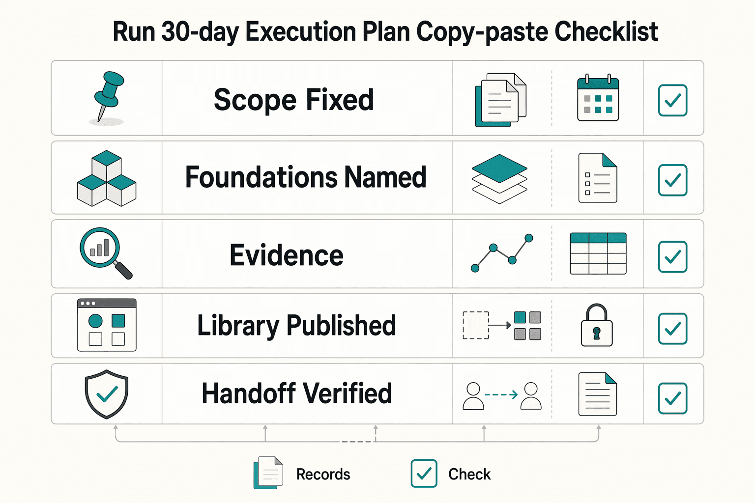
Copy-paste launch checklist:
- Scope fixed
- Foundations named
- Components documented
- Library published
- Handoff verified
- Governance assigned
- Recovery plan written
Related reading: Using Figma for Presentations as a Reusable Deck System.
Conclusion#
Keep version 1 small enough to publish, test, and maintain. The real win is not a huge library on day one. It is a shared source of truth that improves consistency, reduces repeated UI work, and makes handoff in Dev Mode less fragile as your product and team grow.
Choose a starting path today#
Do not spend another week debating whether you need a full rebuild. Two practical starting points exist: start from scratch or refine what already exists. If speed matters and your rules are still evolving, start from an existing base, then rename and restructure it before it becomes team-owned. If your rules are already strict, build your foundations directly in your own files. Checkpoint: by the end of today, write one sentence that defines your path and one short list of what v1 includes and excludes.
Block week 1 for the audit and ownership#
An audit is not admin overhead. It can show where rework is coming from. Review current files for duplicate components, local style overrides, naming collisions, and missing usage notes. At the same time, assign one person to approve changes and one backup to handle urgent fixes, even if your team is small. Failure mode: teams start building components before they know which version is canonical, then spend time merging duplicates. Checkpoint: finish week 1 with an evidence pack that includes screenshots of key flows, your current style guide, approved icons, and a list of repeated UI that deserves component status.
Set a 30 day target for a publishable first release#
Treat 30 days as a forcing function, not a guarantee. Your goal is a release that includes foundations, a small component library, documentation, and a library your team can actually use. Publish only what is stable enough to share. Libraries spread styles and components quickly, so bad naming and half-finished parts spread just as fast once published.
Verify the release in Dev Mode before you call it done. Component names, styles, and variables should match the implementation intent so important details do not get lost in handoff. If a component is overloaded with variants or your variables are full of one-off values, stop and simplify before you publish.
A disciplined design system in Figma is not about making every screen look neat for a presentation. It is about making repeated product work more consistent and faster to ship because you are reusing components instead of rebuilding them. Pick the path, schedule the audit, and put a launch date on the calendar. That is how this becomes a working asset instead of a side project.
Want to confirm what's supported for your setup? Talk to Gruv.
Frequently Asked Questions
What is a design system in Figma in plain language?
It is a reusable set of UI parts and rules so your team is not redrawing the same decisions on every screen. In practice, that means shared components, styles, and variables that keep work consistent as files, features, and contributors grow. If people are still copying UI between files and tweaking it by hand, that is usually a sign your system is not set up for reliable reuse yet.
How do I know if I need a design system now?
There is no single threshold. A common signal is repeated UI across files that keeps drifting in spacing, color, naming, or states. You do not need a giant library first, but shared foundations become valuable once inconsistency starts costing time.
What should go into version 1, and what should wait?
Keep version 1 focused on the foundations and patterns your team reuses most. Start small so the system is easy to apply and maintain, then add lower-frequency or product-specific patterns as they stabilize.
When should I use a Figma Community template instead of starting from scratch?
Use Figma Community when speed matters and you want a starter file that already includes libraries, UI, tools, or process artifacts you can adapt. Duplicate the file into your drafts, then rename, restructure, and verify that the naming and foundations match your own rules before you publish anything. Two red flags matter here: licensing terms vary across Community files, and changes to the original do not flow into your duplicated copy.
How do variables and variable modes reduce rework?
Variables give names to values so you can update a source decision instead of hunting one-off values across screens. Variable modes matter when you need alternate value sets, such as light mode and dark mode, in the same collection rather than duplicated designs that you recolor manually. They can reduce rework, but they still depend on clear naming and consistent use.
Who should own approvals and updates if I work with contractors?
Keep final publishing and approval with a named internal owner, even if contractors help build or maintain the library. In Figma, team admins manage members, permissions, libraries, and other team settings, and only team admins can manage default libraries for the team. If you are on Enterprise, library approval is also an admin workflow, with an approval check mark that signals the library is trusted. Contractors can contribute, but your business should own the approval path.
Try a related tool
Researched and edited by the Gruv editorial team. Gruv builds cross-border billing, payouts, and finance-operations software for global businesses.
Sources
Includes 5 external sources outside the trusted-domain allowlist.
Educational content only. Not legal, tax, or financial advice.
Related Posts

Value-Based Pricing for Freelancers Under Real Payment Risk
Value-based pricing works when you and the client can name the business result before kickoff and agree on how progress will be judged. If that link is weak, use a tighter model first. This is not about defending one pricing philosophy over another. It is about avoiding surprises by keeping pricing, scope, delivery, and payment aligned from day one.

The Best Tools for Creative Collaboration with Remote Teams
As the CEO of your business-of-one, you're not here for vibes; you're here for a repeatable system you can run.

Using High-Fidelity Prototypes in Figma to Lock Scope Before Build
**Treat your high-fidelity prototype in Figma as the shared scope baseline before a single line of code is written.** In practice, that means one file holds the UI flows and interactive paths your team reviews together. The prototype becomes the reference for scope, feedback, and pre-build alignment instead of just a polished design artifact.