
Quick Answer
Use a lean control guide first, then expand only after recurring mistakes. For create a brand style guide work, lock the decisions that repeat in proposals, deck slides, invoices, and onboarding emails: approved logo files, exact HEX colors, heading and body fonts, and a few voice cues. Run a usability check by asking a VA or contractor to produce a slide header and invoice header from the guide alone; if they pause, tighten the rule.
The Brand Authority System: A Lean Style Guide for the 'Business-of-One'#
If you work alone, your guide does not need to be a full brand book. It should work as a control document. Standardize the few choices that keep coming up so your proposals, reports, invoices, decks, and delegated work look and sound like they come from the same business.
A lean brand style guide is just a rule set for how your business shows up. The point is not theory. It is continuity across everyday touchpoints, especially when you are moving fast or handing work to a contractor. If you want a guide that actually gets used, start with the choices that create avoidable drift.
Start with the touchpoints that drive repeat decisions#
Start with the touchpoints that force repeat decisions right now. For many solo operators, that means four controls: logo usage, color palette, typography, and voice consistency. Those cover how your business looks and how it sounds.
Use a simple filter. If a choice comes up weekly, or if someone else could guess wrong, write a rule for it now. If it only shows up occasionally, or only in a custom client deliverable, leave it for later. That keeps the guide short enough to stay current instead of turning into a PDF no one opens.
A solid first pass usually answers questions like these:
- Which logo file goes on a proposal, slide deck, and invoice
- Which colors are approved, with exact HEX values
- Which fonts are used for headings, body copy, and callouts
- What your writing sounds like in emails, proposals, and presentation notes
Use this checkpoint. Hand the guide to a virtual assistant, a freelance designer, or your future self on a tired Friday. If you get the same result twice, you standardized the right things.
| Touchpoint | Without standards | With standards |
|---|---|---|
| Proposal PDF | Different fonts, inconsistent spacing, logo placed differently each time | Approved logo placement, fixed typography hierarchy, same cover and section styling |
| Client-facing deck | Accent colors drift slide to slide, headings feel improvised | Defined color palette and heading/body type rules keep slides cohesive |
| Invoice or statement of work | Default software template clashes with the rest of your brand | Basic branding rules carry into admin documents so the business feels consistent |
| Email and short updates | Tone swings from stiff to casual depending on your mood | Voice notes define how formal, direct, or conversational you are |
Keep the rules small and concrete#
Keep the rules small and concrete. It is easy to overbuild this. You do not need a long section on brand philosophy before you define which font is body copy and which logo version should never be stretched.
| Guide element | What to include |
|---|---|
| Logo usage | Primary logo files, where each one is used, and which logo version should never be stretched |
| Color palette | The color palette with exact codes |
| Typography | Heading and body fonts |
| Voice cues | Three voice cues such as plain English, direct, not cold, and specific over clever |
| Sample | One before-and-after sample from a real document |
Aim for rules, examples, and one clear "do not" in each core area. List your primary logo files and where each one is used. Show the color palette with exact codes. Name your heading and body fonts. Add three voice cues such as "plain English," "direct, not cold," or "specific over clever." Then include one before-and-after sample from a real document.
The failure mode is vague wording. "Use modern fonts" or "keep the tone professional" creates a fresh interpretation every time. Specificity makes handoffs cleaner and approvals easier, because the reviewer is checking against a standard instead of a mood.
Use this check. Open your last proposal and last invoice side by side. If a stranger would assume they came from different businesses, your rules are still too loose.
Use the guide as your delegation control#
Once the rules are clear, treat the guide as your delegation control. You do not need a formal gatekeeper, but you do need one source of truth that contributors cannot casually override. That matters when a subcontractor makes social graphics, a VA updates your deck, or a client asks for logo files.
Keep the control simple: one shared folder with approved assets, one current guide, and one short note on who can send or edit what. It will not create legal protection on its own. It can reduce common misuse such as outdated logos, off-brand colors, altered marks, and inconsistent messaging in public-facing materials.
The payoff shows up in the work itself: fewer corrections on fonts and colors, cleaner handoffs, and documents that feel consistent across steps. Keep the guide lean, keep it current, and only expand it when repeated mistakes show that a rule is actually needed. If you want a deeper dive, read The 1% Tax Regime for Entrepreneurs in Georgia.
The 'Minimum Viable Brand Guide': A 3-Hour Framework#
You can create a usable first guide in a focused three-hour pass if you structure it as Why, What, and How. The goal is simple: one source of truth so your proposal, deck, invoice, and onboarding materials look and sound like one business.
Define your why#
Start with a decision filter you can actually use. Write a short statement of who you serve, what clients should expect when they work with you, and how you should sound when you communicate. Add a clear boundary for what your brand is not, so you can reject off-brand choices quickly.
| Why component | What to include |
|---|---|
| Who you serve | Write a short statement of who you serve |
| What clients should expect | State what clients should expect when they work with you |
| How you should sound | Describe how you should sound when you communicate |
| What your brand is not | Add a clear boundary so you can reject off-brand choices quickly |
Use it as a gut check across real touchpoints. Compare your latest proposal intro, onboarding email, and deck headline. If they read like different people wrote them, your Why is still too vague. The failure mode here is spending energy on visuals while your client-facing language stays inconsistent.
Document your what#
Lock the assets that drive repeat decisions: logo usage, color palette, typography, and brand voice. Make each rule executable so someone else can apply it without following up with you.
Definition of done:
- Logo usage: approved files are named clearly, allowed backgrounds are specified, minimum size and spacing rules are stated, and common misuse examples are listed.
- Color palette: approved colors are listed with exact codes, role labels are clear (for example primary/secondary/accent), and approved text/background pairings are defined.
- Typography: heading and body fonts are named, standard weights and defaults for common docs are set, and a fallback font is specified.
- Brand voice: approved tone cues are listed, off-limits tone patterns are stated, and a short real sample is included from a client-facing message.
Quick verification: ask someone else to produce one slide header and one invoice header using only the guide. If they hesitate on logo file, type choice, color use, or tone, the rule is not finished.
| Control area | Rule not documented | Rule documented |
|---|---|---|
| Quality control | Reviews depend on opinion and drift is hard to catch | Reviews check against explicit rules and examples |
| Revision load | The same fixes repeat across deliverables | Corrections are narrower and easier to explain |
| Delegation readiness | Handoffs rely on memory and chat context | Contributors can execute from one reference file |
Show your how#
Put the rules to work immediately. Apply them to one proposal cover, one deck title slide, one invoice, and one onboarding document or email so placement, type hierarchy, and voice show up in real work. If you use a PowerPoint template, include it. If email or auto-replies are frequent touchpoints, include approved examples.
| Governance item | Detail |
|---|---|
| Source file | One source file |
| Asset folder | One asset folder |
| Owner | One owner |
| Version line | One version line |
| Update triggers | New logo files, recurring review comments, or a new recurring touchpoint |
Then keep governance light and explicit: one source file, one asset folder, one owner, one version line, and clear update triggers (such as new logo files, recurring review comments, or a new recurring touchpoint). Set the review cadence after verifying the right timing from client needs, policy, or source records.
How to Leverage Your Brand System to Win and Retain Clients#
Use your brand system consistently at every client stage so reviews stay focused on the work, not preventable presentation fixes.
| Stage | Without brand system (behavior -> consequence) | With brand system (behavior -> consequence) |
|---|---|---|
| Proposal | You restyle each proposal, so fonts, colors, and tone drift -> approvals start with formatting feedback. | You use one proposal template standard (logo usage, color palette, typography, voice) -> approvals focus on scope, fit, and next steps. |
| Onboarding | Clients ask for files and usage rules ad hoc -> back-and-forth slows setup. | You send a one-page brand sheet early -> clients get approved logo usage, color palette, typography, and voice cues in one place. |
| Handoff | Contractors work from memory or old files -> you spend time correcting avoidable inconsistencies. | You provide a contractor handoff pack -> clearer execution with logo usage, color palette, typography, and voice rules plus misuse examples. |
| Follow-on work | Status updates and later proposals feel disconnected -> reuse is harder and collaboration gets noisier. | You keep the same standards in updates, deliverables, and follow-on proposals -> smoother collaboration and easier asset reuse. |
Make proposal standards explicit first: lock the cover, heading hierarchy, footer, and opening-paragraph tone in one reusable template. Then check one proposal, one deck title slide, and one email touchpoint side by side. If they do not read like the same business, tighten the template before you send the next draft.
During onboarding, send a client-facing one-page brand sheet in the first few days. Keep it practical: approved logo files and usage, exact color palette, typography pair, and brief voice rules. If email is a core touchpoint, include your approved email template or signature format so clients can apply it consistently.
For handoff, treat your pack as an operations file, not a design mood board. Include the current rules, examples of correct use, and links to the online guide so updates stay centralized and old versions stop circulating. After delivery, keep using those same standards in status updates, deliverables, and follow-on proposals so your process stays predictable from project to project. Related: How to Create a Style Guide for Your Freelance Brand.
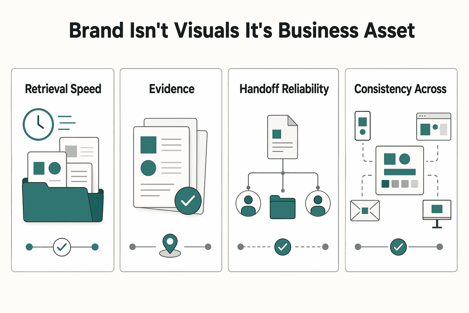
Your Brand Isn't Visuals - It's a Business Asset#
Treat your guide as a system for your brand, not as decoration. When you create a brand style guide, you set the controls for how your business appears across channels: approved files, logo usage guardrails, typography, color palette standards, tone guidance, and change approvals. That structure matters because inconsistency can confuse customers and weaken trust.
| Business outcome | Without system | With system |
|---|---|---|
| Retrieval speed | People search old folders and guess which file is current. | Current assets are kept in one known location with one current version. |
| Revision burden | Feedback stays vague, so edits loop longer. | Reviews start from documented rules, so edits are specific. |
| Handoff reliability | Contractors improvise from taste or outdated examples. | Handoffs include approved files, misuse examples, and practical rules. |
| Consistency across touchpoints | Proposals, onboarding docs, invoices, and social headers drift. | The same standards appear everywhere clients see your brand. |
Treat these files and guidelines as business IP. Keep master files and the guide in a central location, define edit access vs approved-use access, and document approved-use boundaries. If ownership, licensing, or transfer terms apply in your case, verify the exact terms in the governing contract before distribution.
Your quality check is straightforward: users can find the current files quickly, and the guide clearly shows its latest version. A practical format is a footer such as "Version 9" and "Updated 07.2023." The usual failure is not creativity; it is uncontrolled reuse of old files, stretched marks, broken lockups, or recolored logos when misuse examples are missing.
Use this adoption checklist:
- Store the current guide and approved asset files in one easy-to-access location.
- Assign one owner to update it and record the latest version date.
- Add a review line for business changes: current trigger list pending client/source-record verification.
For a step-by-step walkthrough, see A guide to creating 'Brand Guidelines' for a client.
Frequently Asked Questions
How do I create a brand style guide if I’m not a designer?
Start with a plain document or slide deck you can edit easily. Keep the first version focused on core sections: logo usage, color palette, typography, voice guidance, and approved files to share. Your checkpoint is simple: if a contractor can choose the right logo, colors, and type without asking you first, the guide is usable.
What are the minimum elements I should include?
At minimum, include clear logo usage rules, exact color codes, a typography hierarchy, and short voice guidance. For the logo, show approved versions, acceptable backgrounds, and at least one misuse example so people do not stretch, recolor, or improvise new marks. For files, provide share-ready EPS, PNG, TIFF, and JPEG versions in black and white, grayscale, and color where those treatments are approved.
Can a guide help me support higher pricing?
It can support a more credible presentation, but it does not guarantee higher rates. Use the guide to keep your proposal, onboarding PDF, and follow-up materials visually and verbally consistent so the client sees the same business each time. If you want proof, track your own numbers and notes, such as proposal comments, revision themes, or onboarding questions, and verify any benchmark from your own source records before using it.
What should I send a client during onboarding?
Send a one-page summary plus a link or folder with the current asset files. Include your primary logo, alternate approved treatments, exact color codes, heading and body font choices, three voice rules, and the approved EPS, PNG, TIFF, and JPEG files. Ask the client to confirm they are using the current version, because outdated assets can quickly create inconsistent outputs.
Do I need this if I’m the only person in the business?
Yes, because the first person it helps is you. It helps reduce re-deciding colors, type, and tone every time you send a proposal, update your site, or brief a collaborator. If outside partners ever touch your materials, keep the guide specific enough that a non-specialist can self-serve instead of waiting on constant design hand-holding.
What if I have more than one logo style or visual direction?
That can work, but only if you standardize when each version is used. Spell out which mark goes on proposals, social headers, invoices, or dark backgrounds so people do not choose by taste. If usage rules are vague, variation turns into inconsistency fast.
How do I maintain and update the guide over time?
Give one person clear ownership, even if that person is you, and put a version number and update date on the front page or footer. If possible, host the guide online so updates are visible without re-sending files, then archive old PDFs so outdated rules stop circulating. Good trigger events for an update can include approved logo or typography changes, repeated misuse problems, or a new partner need such as packaging examples.
Try a related tool
Researched and edited by the Gruv editorial team. Gruv builds cross-border billing, payouts, and finance-operations software for global businesses.
Sources
Includes 3 external sources outside the trusted-domain allowlist.
- communications.uoregon.edu/sites/default/files/2023-02/UO%20Style%20Gui...trusted
- fscj.edu/docs/default-source/discover/marketing-and-c...trusted
- gallaudet.edu/wp-content/uploads/2022/09/GU-Brandbook-2021...trusted
- spu.edu/style-guidetrusted
- uu.edu/styleguide/faq.cfmtrusted
- adobe.com/creativecloud/business/teams/resources/how-t...external
- bbdirector.com/brand-id-and-development/how-to-create-a-bra...external
- blog.startupstash.com/the-mvb-minimum-viable-brand-framework-c9c32...external
Educational content only. Not legal, tax, or financial advice.
Related Posts

Georgia 1% Tax for Entrepreneurs Without Filing Surprises
Treat Georgia's 1% tax path as a compliance question first and a rate discussion second. The goal is a setup you can defend under review, not a shortcut that fails at filing time.

Create a Freelance Brand Style Guide You Can Use Every Day
Treat your guide as a working document, not a design trophy. A freelance brand style guide should make daily decisions easier and keep your brand consistent in the files clients actually read.

How to Build a Waitlist for a New Freelance Service
**Build your freelance waitlist like an operator: treat it as a controlled intake pipeline, not just a "collect emails" project.** You're the CEO of a business-of-one. Your waitlist is how you control demand without letting demand control your calendar. The goal is simple: avoid calendar chaos during your next service launch and keep records clean if you ever need to explain who got offered what, when, and why.