
Quick Answer
Start by creating a one-page Brand OS with explicit rules for logo, color, type, voice, and imagery, then apply it in order to your proposal, invoice, deck, and main email template. If you want to create brand guidelines that actually get used, write each rule in checkable language, include one example per rule, and keep files plus approved assets in one maintained location.
Introduction: From Compliance Anxiety to Client Confidence#
If your proposal uses one logo lockup, your invoice uses another, and your client deck sounds like it came from a different business, you create doubt you do not need. Most clients will not call it out directly, but inconsistency can weaken recognition and trust. That is why inconsistent branding is not just a design issue. It is an operating issue.
You do not need the jargon. Here, it simply means the small set of rules that keeps your brand consistent across digital touchpoints: logo usage, colors, typography, imagery, and tone of voice. In practice, that is what brand guidelines are for. If you need to create brand guidelines, think about them this way.
Start with a quick reality check. Pull up your last proposal, invoice, and presentation and compare three things: the logo version, the type choices, and the sign-off language. If those basics drift from document to document, collaboration can feel messier and review rounds can become more subjective. People start reacting to inconsistency instead of the work itself. That kind of patching can also cost more over time, especially when the real problem is weak brand clarity.
Use this guide to reduce friction, not to look polished for its own sake. The goal is less day-to-day confusion and more consistency across client-facing documents. We covered this in detail in Create a Freelance Brand Style Guide You Can Use Every Day.
Why Your "Brand OS" is a Critical Business Asset, Not a Creative Exercise#
Your quick audit already shows the core point: inconsistency is an operating risk, not just a design issue. When your proposal, deck, and invoice shift in tone, structure, or logo treatment, clients spend extra effort interpreting your process instead of evaluating your work.
The useful reframe is this: your Brand OS is a control layer for how your business shows up across touchpoints. In the broader Brand OS model, brand functions as a platform for coordinated interactions, supported by process and governance. For an independent professional, that means practical rules, templates, and checks so your materials read like one coherent business.
Signal, interpretation, and outcome#
A practical test is simple: signal -> client interpretation -> business outcome.
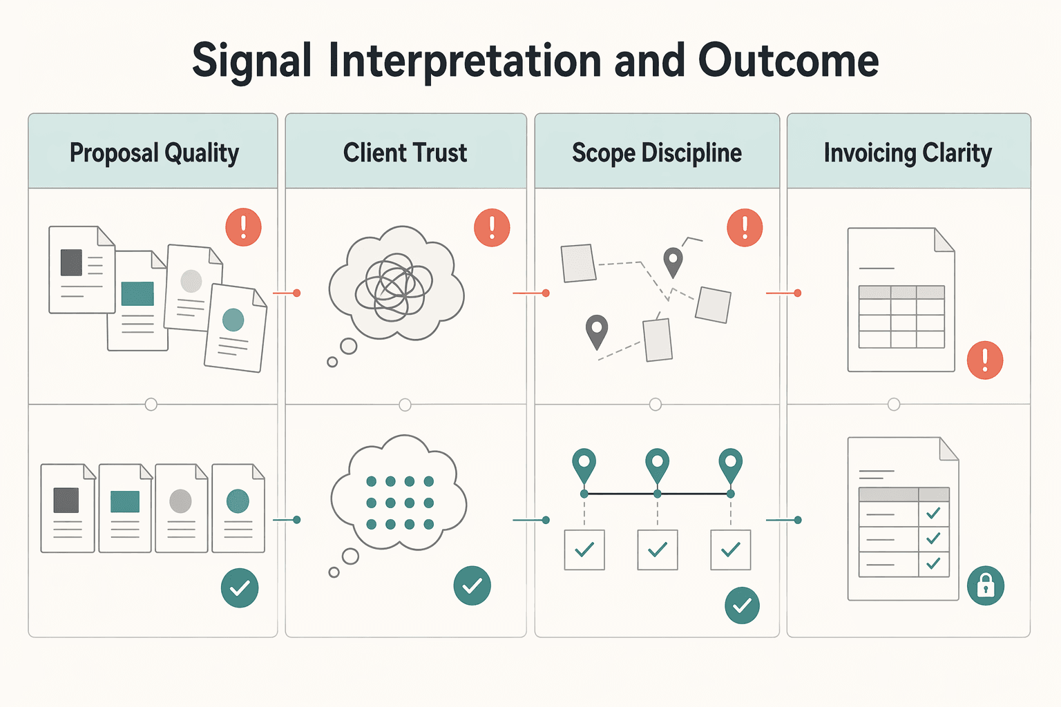
If your documents look fragmented, the signal is inconsistency. Clients may interpret that as loose execution, and the outcome is usually operational drag: more clarification, more avoidable revisions, rougher handoffs, and weaker payment follow-through. If your documents stay aligned, the signal is control. Clients can interpret that as organized delivery, and the outcome is cleaner decision flow around approvals, scope, and invoicing.
| Area | Without a Brand OS | With a Brand OS |
|---|---|---|
| Proposal quality | Structure and presentation vary by template or project, which can distract from the offer | Proposal format and voice stay consistent, so the offer is easier to evaluate |
| Client trust signals | Mixed tone, logo usage, or typography can create doubt about process consistency | Repeated cues make your operation easier to read as deliberate and controlled |
| Scope discipline | Inconsistent docs can invite informal edits and fuzzy boundaries | Consistent docs reinforce what is included, what is optional, and what needs approval |
| Invoicing clarity | Invoice can feel disconnected from earlier approvals | Invoice feels like the final step of the same process |
This does not replace strong delivery, clear thinking, or fair scope. It supports them by reducing noise around your decisions.
The pressure is higher now because faster content production also increases off-brand output and cleanup risk, and AI can amplify that if you work without guardrails. So treat consistency as an operational safeguard: start by standardizing the proposal-to-invoice path, then expand to the rest of your client-facing materials.
The 5 Core Components of Your Minimum Viable Brand OS#
You do not need a long manual. You need five clear rulesets that define what to use, where to use it, and what error each rule prevents. That is the point of a minimum viable brand: keep the essentials, apply them now, and refine them as feedback comes in.
Treat this as operational documentation, not a moodboard or a logo folder. A style guide works only when it is used across real outputs. Under time pressure and light review, teams usually drift into wrong colors, misplaced logos, and off-brand messaging.
| Component | Required rule | Common shortcut | Business risk |
|---|---|---|---|
| Logo | Approved variants, where each variant can appear, and misuse examples | Sharing one logo file and assuming people will use it correctly | Distorted marks, weak contrast, inconsistent placement |
| Color | Primary, secondary, accent, and neutral colors with digital and print values | Using "close enough" colors from memory | Mismatched decks, emails, PDFs, and print pieces |
| Typography | Defined roles for headings, body, and supporting text, plus fallback font | Choosing fonts per document or app | Unrelated-looking documents and weaker readability |
| Verbal identity | Voice traits with "say this, not that" examples | Letting tone shift by person, channel, or mood | Proposals, emails, and invoices sound like different businesses |
| Visual style | Rules for imagery, icons, charts, and brand devices | Pulling mixed assets from old templates | Fragmented look and weaker recognition |
1. Logo. Define the logo variants you actually use, for example full color, one-color dark, and one-color light, then define the usage contexts for each. Apply those rules anywhere the mark appears: proposal covers, deck footers, email signatures, invoices, and social headers. This prevents predictable errors like low-quality files, poor contrast, stretching, or crowded placement. For handoffs, share clearly named approved files plus a short "do not use" panel.
2. Color. Define a functional palette: primary, secondary, accent, and neutrals. Apply it across digital and print touchpoints, and record values in the formats people need to execute: HEX, RGB, and CMYK. This prevents "close enough" drift across channels. If print is part of your workflow, do one real-world print check before you lock the palette.
3. Typography. Define a text hierarchy by role: headline, subhead, body, and small supporting text, then define a fallback font. Apply it in proposals, SOWs, case studies, decks, and invoices. This prevents document-by-document font improvisation. As a practical check, confirm your smallest used size is readable with sufficient contrast in slides, PDFs, and mobile email views.
4. Verbal identity. Define two or three voice traits and back them with concrete examples. Apply them to subject lines, proposal intros, deck headings, social captions, and payment emails. This prevents tone whiplash across touchpoints. Example: "Here is the revised timeline" is clear and consistent; "Just circling back with a quick little update" signals a different voice.
5. Visual style. Define the non-logo elements that complete your visual system: photo treatment, icon style, chart style, illustration direction, and any brand devices such as patterns or shapes. Apply them in decks, one-pagers, proposal visuals, social graphics, and invoice headers where relevant. This prevents the "Frankensteined" look from mixed template eras. A brand cannot rely on logo rules alone.
Before you finalize, run a simple side-by-side check on your latest email, proposal, deck, and invoice. If logo use, color, type, voice, and visual style still feel like one business, your minimum setup is working. If not, tighten the rule that still depends on personal judgment.
For a step-by-step walkthrough, see Best Brand Guideline Templates for a Business of One.
How to Build Your "One-Page Brand OS" in Under 3 Hours#
Treat this as a focused build, not a full rebrand. Set a tight scope, choose one working format, write one rule plus one example per core component, and apply it to live client-facing assets the same day.
Your goal is a guide another person can use without guessing. Keep it in one place so you do not end up with conflicting versions.
Pick the format that matches how you actually work#
Choose the format you will actually open and maintain, not the one that just looks polished. Decide based on who updates it, who receives it, and whether your bigger risk is misuse or version drift.
| Format | Choose it if | Selection criteria | Handoff needs | Maintenance effort |
|---|---|---|---|---|
| Visual editor such as Figma or Canva | You need a designed one-pager that is easy to share externally | Use when visual examples and layout control are core to adoption | Share export plus editable file link when someone else may update it | Medium: content and layout both need checks |
| Text-first document such as Google Docs or Notion | You need fast updates and low-friction collaboration | Use when the guide is mostly rules, examples, and asset links | Share one live doc and links to current assets/templates | Low: quick edits and built-in version history |
| Hybrid approach | You need both an external one-pager and an internal working source | Use when client-facing polish and frequent internal edits both matter | Keep one live source, then refresh the one-pager from it | Medium to high: requires active sync |
If you update often, text-first is usually easier to keep current. If you hand off often, a visual one-pager can reduce misuse because people can see correct application.
Write a minimum spec, not a full manual#
For each component, include exactly three items: a required rule, a required example, and the first place you will apply it.
| Component | Include | Apply first |
|---|---|---|
| Logo | Approved variants and allowed contexts; one correct placement example | Proposal cover or invoice header |
| Color | Primary, secondary, accent, and neutral colors with exact values used in your tools; one correct palette example | Slide accents, headings, or invoice highlights |
| Typography | Roles for heading, body, and small text plus fallback; one hierarchy sample | Deck title slide or proposal body text |
| Verbal identity | 2-3 voice traits with one "say this, not that" example | Proposal intros, email templates, or payment reminders |
| Visual style | Image, icon, chart, and shape treatment; one example panel | Deck visuals or proposal case-study pages |
That is enough for a first pass. Write rules so they can be checked as pass or fail. If a collaborator cannot tell whether execution is correct, the rule is still too vague.
Roll out on key touchpoints immediately#
Do more than an invoice-only check. Open these four assets side by side and apply the guide in sequence: proposal, invoice, deck, and main email template.
| Touchpoint | Brand elements mentioned | Examples in the article |
|---|---|---|
| Proposal | Logo, typography, verbal identity, visual style | Proposal cover; proposal intros; proposal body text; proposal case-study pages |
| Invoice | Logo, color | Invoice header; invoice highlights |
| Deck | Color, typography, visual style | Slide accents; deck title slide; deck visuals |
| Main email template | Verbal identity | Email templates |
As you update each one, verify that logo use matches context, colors use stored values rather than near-matches, and small text remains readable. Version drift is usually operational, not creative: assets spread across 17 email threads and three different laptops.
Add light governance so it stays usable#
Make this one-page guide your single source of truth. Keep the guide and current assets in one central, accessible library, name one owner, and add a simple trigger line that records the owner and update trigger: Owner: the person responsible for the guide. Review trigger: after any logo, color, template, or voice change.
| Control | What to do | Detail |
|---|---|---|
| Single source of truth | Keep the guide and current assets in one central, accessible library | Make the one-page guide your single source of truth |
| Owner | Assign one owner | Owner still needs to be assigned |
| Review trigger | Review after any logo, color, template, or voice change | Review cadence still needs confirmation |
That keeps control clear as brand usage spreads across more teams, tools, and AI-assisted drafting.
If you want a deeper dive, read How to Manage Your Personal Brand as a Freelancer.
Conclusion: Your Brand OS is Your System for Trust#
Your guide matters because trust is built in ordinary moments, not in a brand presentation. When your proposal, invoice, deck, and emails all feel like the same business, you look more reliable. That is the practical job of a central guide: one source of truth for your brand identity, voice, and visual rules.
If you want the fastest payoff, stop treating the guide as a reference you might use later. Use it as a pass-or-fail check before anything customer-facing goes out. Verify the logo variant, color values, typography, and tone against your rules, and make sure the linked asset folder matches those rules. A common failure mode is having one polished touchpoint and another off-brand touchpoint, which creates a confusing impression.
A good style guide does not promise better pricing or guaranteed growth. What it does is reduce drift, especially once collaborators, templates, and old files start multiplying. Trust is confidence that you will do what you say you will do. Consistent execution is one of the clearest signals that you can deliver reliably.
| If you use the guide well | What it prevents | What it enables |
|---|---|---|
| One source of truth for assets and rules | Siloed files, outdated logos, mixed tone | Cleaner handoffs and fewer "almost right" versions |
| Consistent use across touchpoints | Disjointed, confusing impressions | Recognition and confidence over time |
| Simple review before publishing | Last-minute brand drift in customer-facing work | A more reliable customer experience |
If you just finished this article, do this next:
- Finalize your rules and mark that file as the source of truth.
- Apply them to your highest-visibility steps first: proposal, invoice, deck, and main email template.
- Set a review cadence and trigger an update whenever your logo, colors, templates, or voice change.
- If other people touch your materials, give them the guide, the current asset library, and clear instructions to use only approved files.
That is how you create brand guidelines that support real brand consistency instead of sitting unused in a folder. Related: How to Create a Brand Style Guide for a Client.
Frequently Asked Questions
What is the minimum viable guide for a solo professional?
Start with one page that covers core essentials: logo usage, color, typography, voice, and visual style. For each one, include one rule, one example, and one place you will apply it first. If a collaborator cannot review a proposal or invoice and judge whether it matches your brand voice and visual rules, the rule is still too vague.
How do I create brand guidelines for myself?
Do not begin with aesthetics alone. Start with the questions that surface what your audience actually values, because guessing at preferences is a common failure mode. A short branding questionnaire can help, especially if it forces you to define your brand voice and visual elements like logos, fonts, and colors before you design anything.
What free tools should I use?
Pick the format by access and update behavior, not by polish. If you work alone and change things often, a text-first document is often easier to keep current. If you hand files to clients or contractors, a visual format can make intended usage clearer. | Tool approach | Use it when | Watch for | |---|---|---| | Shared living doc | You need fast edits, shared access, and one live reference | Rules can get ignored if you do not add examples and asset links | | Visual one-pager | You need a designed handoff with visual examples | Exported files can drift from the editable source if nobody owns updates | | Hybrid doc plus one-pager | You need an internal reference and a clean handoff file | Two versions can conflict unless one is marked as the source of truth |
Will this help me charge more?
Do not treat a style guide as a pricing shortcut. What it can do is make your presentation and communication more consistent across your proposal, deck, and invoice. That supports clearer conversations about value, even though it does not guarantee higher rates.
What should show up on my invoice?
Your invoice should follow the same brand identity rules as your proposal: approved logo variant, consistent typography, correct colors, and the same voice you use elsewhere. A good checkpoint is to ask, “Is this messaging aligned with the brand personality, voice, and tone?” The failure mode is a polished front-end brand with a generic, off-brand invoice that feels like it came from someone else.
How do I hand this off to collaborators?
Give them more than a PDF. Share the guide, the current asset library, and a short training note that explains where to find approved logos, fonts, color values, and templates. If someone new joins, documented training procedures matter because handoff breaks down when people inherit files without context.
What is the next step after I create brand guidelines?
Apply them to four live steps in order: proposal, invoice, deck, and main email template. Then keep the guide in one central place, name one owner, and add a review trigger for any logo, color, template, or voice change. That is how you keep brand consistency from splitting into multiple “almost right” versions.
Try a related tool
Researched and edited by the Gruv editorial team. Gruv builds cross-border billing, payouts, and finance-operations software for global businesses.
Sources
Includes 6 external sources outside the trusted-domain allowlist.
- brand.illinois.edu/written-trainings/essential-questions-to-ask...trusted
- govinfo.gov/content/pkg/CHRG-113shrg88886/html/CHRG-113s...trusted
- bluecactus.digital/how-to-create-brand-guidelinesexternal
- brandpointservices.com/rolling-out-a-refresh-how-to-keep-brand-cons...external
- columnfivemedia.com/how-to-create-a-brand-style-guideexternal
- complexdiscovery.com/from-brand-guidelines-to-brand-guardrails-le...external
- forbes.com/councils/forbescommunicationscouncil/2023/07...external
- gruv.ai/blog/a-guide-to-creating-brand-guidelines-fo...external
Educational content only. Not legal, tax, or financial advice.
Related Posts

How to Manage Your Personal Brand as a Freelancer
Your brand is not a mood board. Think of it as the experience people have of your work: the promise you make, the proof you can show, and the way you present yourself across client touchpoints. Get that clear first, and your fit is easier to read from profile to proposal.

How to Create a Brand Style Guide for a Client
If you work alone, your guide does not need to be a full brand book. It should work as a control document. Standardize the few choices that keep coming up so your proposals, reports, invoices, decks, and delegated work look and sound like they come from the same business.

London, UK: A Guide for Expats and Remote Workers
Get two calls right early and the rest of the move gets easier: how you'll be in the UK, and where you'll work when conditions are less than ideal. Make those decisions before you lock dates or prepay a long stay. If you book first and sort the basics later, admin and work reliability usually collide in your first week.