
Quick Answer
Start by setting figma auto layout rules on the parent frame, then test failure states before handoff. Use Shift + A to create the Auto Layout parent, choose flow intentionally, and confirm how long copy, added items, and missing-data states behave in nested components. Fix breakage at the source component instead of patching instances so updates stay consistent and revision cleanup drops.
From Designer to Asset Manager: The Auto Layout Mindset Shift#
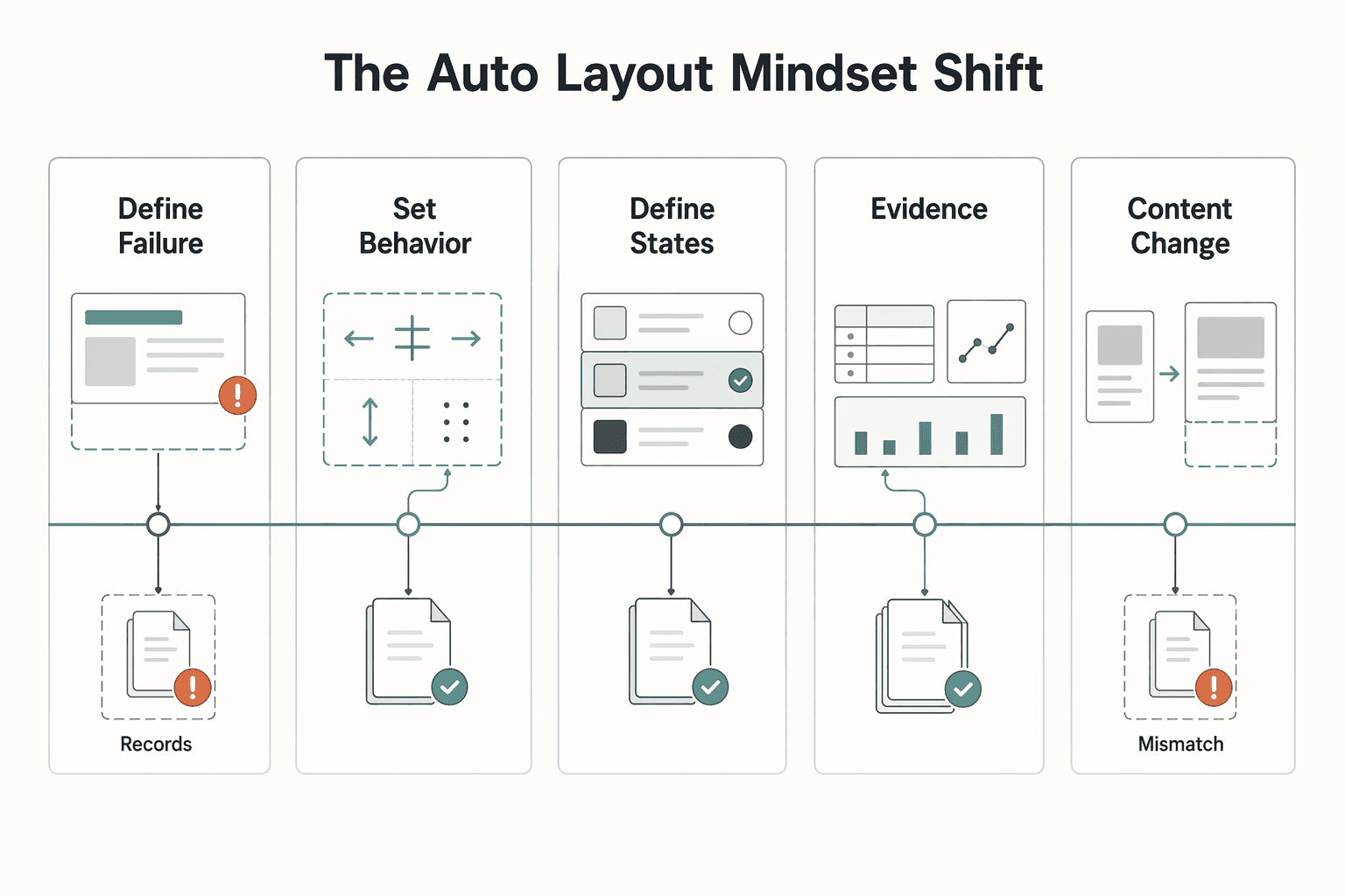
If you still treat figma auto layout as a faster way to align layers, you may keep paying for layout breakage later. The more useful shift is this: you are not just drawing screens. You are deciding how your assets behave when content changes, states change, and handoff begins. That shift rests on four practical pillars:
| Pillar | Focus | Details |
|---|---|---|
| Define failure modes before styling | Cases that usually break work | Longer copy; extra list items; missing-data fallback |
| Set behavior rules, not one-off fixes | Auto Layout behavior choices | Vertical, horizontal, or grid; use Wrap if horizontal content may overflow; grid is marked open beta |
| Define states and variability at the component level | Behavior across changing content states | Items may be added, removed, or hidden |
| Document handoff expectations | Short evidence pack | Parent frame uses Auto Layout; flow choice; spacing and padding rules; alignment intent; what can be hidden safely |
-
Define failure modes before styling. Start with the cases that usually break work: longer copy, extra list items, and missing-data fallback. If a card loses its thumbnail or a button label gets much longer, the real question is not whether it will happen. It is what the component should do when it does.
-
Set behavior rules, not one-off fixes. Auto Layout gives you explicit controls for direction, spacing, padding, alignment, and flow. Pick from the three flow options early: vertical, horizontal, or grid. If horizontal content may overflow, set Wrap instead of assuming one row will hold forever. If you are tempted to use grid, remember it is still marked open beta, so treat it as a conscious delivery risk.
-
Define states and variability at the component level. A component needs clear behavior across changing content states. Lists are a good example: items may be added, removed, or hidden, so the layout should adapt without manual repositioning.
-
Document handoff expectations. Anyone with edit access can change Auto Layout behavior, so your handoff needs a short evidence pack: parent frame uses Auto Layout, flow choice, spacing and padding rules, alignment intent, and what can be hidden safely. A quick setup checkpoint is selecting the parent layers and applying Auto Layout with
Shift + A.
| Decision area | Reactive manual fixes | System-first Auto Layout workflow |
|---|---|---|
| Content change | Realign layers after each copy or image update | Frame adapts when items are added, removed, or resized |
| Overflow handling | Fix collisions case by case | Set an overflow rule, such as Wrap for horizontal rows |
| Effort tracking | Spend time repeatedly correcting instances | Spend time upfront defining behavior at the component level |
What you do this week:
- Audit 3 common components and list their failure modes.
- For each one, write the behavior rule for flow, spacing, padding, and overflow.
- Add one handoff note that explains states, copy-length risk, and missing-data fallback.
That gives you the raw material for the mechanics in the next section. Related: The Best Tools for Creative Collaboration with Remote Teams.
Building Your "Bulletproof" Component System: The Core Mechanics#
If you want fewer unpaid fixes, define component behavior before visual polish. In Auto Layout, the practical question is: what is allowed to grow, what must stay stable, and what should happen first when content changes?
Treat each component as unfinished until it survives longer text, extra items, and missing fields. That is the difference between a layout that looks good once and an asset you can reuse safely.
Turn direction, padding, and spacing into rules#
Direction, padding, and spacing only help if you turn them into explicit rules in your component spec.
| Area | Purpose | Example |
|---|---|---|
| Direction | Lock reading order | List row keeps horizontal reading order unless overflow test fails. |
| Padding | Protect the outer edge | Card keeps outer breathing room when copy expands. |
| Spacing | Protect relationships between internal items | Nav items keep consistent gaps; no manual nudges. |
| Width policy | Set the usable width range and text behavior | Smallest usable width; widest practical width; what text should do inside that range |
Use direction to lock reading order, padding to protect the outer edge, and spacing to protect relationships between internal items.
Write these rules for each component before handoff. "List row keeps horizontal reading order unless overflow test fails." "Card keeps outer breathing room when copy expands." "Nav items keep consistent gaps; no manual nudges."
Also set a width policy up front: smallest usable width, widest practical width, and what text should do inside that range. If you skip this, content variability will decide for you during revisions.
Choose resizing by allowed change, then test it#
Use Fixed, Hug Contents, and Fill Container as intent choices, then verify behavior in your real component states.
| Choice | Use this when | Common failure pattern | Verify before handoff |
|---|---|---|---|
Fixed | One part must keep a confirmed size while nearby content changes | Longer content forces collision or clipping | Confirm the fixed size is intentional for long and short content, then document the confirmed component size. |
Hug Contents | The container should follow content length | Uneven rows or sibling misalignment when content length varies | Test short text, long text, and optional fields on/off. |
Fill Container | One child should absorb available space inside the parent | Multiple children compete for space and create unstable layouts | Confirm which child is allowed to grow and which must remain stable. |
When behavior breaks, check parent and child together. If their growth intent conflicts, the component will feel unpredictable even when each setting looks reasonable in isolation.
Build nested components in sequence, then validate#
Use a repeatable sequence for nested components:
- Build the content-heavy sub-group first.
- Build compact supporting sub-groups second.
- Combine them in a parent row/container and set spacing and alignment rules.
- Re-test resizing intent at parent and child levels.
Run this validation checklist before handoff:
- Replace normal copy with longer content and confirm reading order still holds.
- Hide optional fields and confirm spacing closes cleanly.
- Test localization expansion and confirm text behavior still holds.
This is where revision risk drops. When copy edits no longer break structure, your library behaves like a durable asset instead of a rework loop.
For a step-by-step walkthrough, see Best Figma Plugins for Reliable Client Design Work.
Stress-Testing Your System: Advanced Scenarios#
After your component works in the default mockup, try to break it on purpose. In Auto Layout, production-ready means people can still complete tasks when content changes, fields disappear, or extra elements are added.
Use one repeatable matrix so your checks stay consistent and your fixes map back to a clear failure.
Scenario matrix#
| Scenario | What usually breaks | What to verify |
|---|---|---|
| Content extremes | Long or short copy weakens scanability and priority. | Replace copy with very short and very long versions. Confirm reading order still works, primary actions stay clear, and truncation does not remove core meaning. |
| Added elements | Extra UI pieces make priority and flow less clear. | Add a likely extra item (for example, a tag or action). Verify the component still communicates the same order of importance. |
| Missing data states | Empty optional fields can make the layout feel unfinished. | Remove optional items one by one. Verify spacing closes cleanly and the component still reads as intentional. |
| Localization expansion | Longer labels can reduce clarity and crowd key UI. | Swap in longer label variants. Check that labels remain understandable and actions remain easy to identify. |
| Accessibility stress checks | Text scaling or clipping can hurt usability even when layout still fits. | Increase text size, review truncation behavior, and confirm heading/body/status/action hierarchy stays readable at a glance. |
Do not stop at visual polish. Check whether someone can actually complete tasks without friction. A simple checkpoint is to have a participant verify that buttons on the page work as expected, so you catch dead-end states before handoff.
Pre-handoff validation#
Before publishing the library, run this sequence on your highest-reuse components:
- Test core components against the matrix.
- Capture each failure state with a screenshot and a short note on what failed.
- Fix the source component rule, not just the instance.
- Re-test the same scenario before marking it done.
If possible, run key tasks with at least two participants. Even a focused 20-minute session can surface small issues early, when they are cheaper to fix.
Absolute position#
Use absolute positioning only when an element should stay independent from normal flow (for example, a decorative overlay). Avoid it for core content, essential labels, or primary actions.
Keep it only if it does not hide meaning, create interaction confusion, or make implementation intent unclear during handoff. If it does, rebuild with normal layout flow.
Use this pass/fail release check before publishing: readable hierarchy, usable actions, no dead ends, stable behavior with missing and expanded content, and fixes applied at the component source.
We covered this in detail in A guide to 'Design Handoff' from Figma to developers.
The ROI of Mastery: Quantifying the Value of Your System#
Once your components pass stress tests, the ROI is practical: you spend less time on unpaid revision cleanup, deliver with fewer surprises, and keep a reusable asset you can scope clearly.
The key question is: how much non-billable admin tax are you removing from each project?
A reusable ROI check#
Use verified inputs from your own recent work:
Annual value reclaimed = (Revision hours avoided per project) x (Projects per year) x (Verified billable rate)
Fill this in before you estimate impact:
Verified billable rate: verify the exact rate from current pricing policy or approved billing records before use.Revision hours: verify the exact hours avoided from time logs for the last 3-5 similar projects before use.Revision rounds: verify the exact content-change and layout-fix rounds from project records before use.Project volume: verify the exact annual project count from approved source records before use.
If you need a reference format, one illustrative example used 15 minutes per tweak, 4 tweaks per project, 15 projects/year, and $150/hour, resulting in $150 per project and $2,250 annual. Treat those values as placeholders, not benchmarks.
| Measure | Manual revision workflow | System-first Auto Layout workflow |
|---|---|---|
| Time cost | Repeated small fixes after copy edits, missing data, or added elements | More setup time early, less repeated cleanup later |
| Delivery predictability | "Small" content changes can reopen layout work | Fewer late surprises when components are tested against extremes before handoff |
| Margin protection | Unpaid revision time reduces profit | More quoted work stays inside the original budget |
| Client confidence | Confidence drops when issues appear late | Confidence improves when updates hold together without visible rework |
The tradeoff is timing: you invest earlier, then recover value through reuse. If fixes stay in local instances instead of source components, that value drops quickly.
Turn a service into a scoped deliverable#
Treat the library as a standalone deliverable with explicit boundaries:
| Scope area | How to define it | Examples |
|---|---|---|
| Included | Define per project | Component library package; approved variants; usage notes |
| Out of scope | Define per project | Net-new requests after approval; major redesigns; broader retrofits |
| Maintenance | Define per project | Optional follow-on support for updates, audits, and new additions |
Write these boundaries in your proposal and handoff so future changes are scoped, not assumed.
Measure trust with signals, not claims#
Track observable signals: fewer revision loops, smoother developer handoff, and repeat engagements that continue from the same library.
Keep a simple evidence log for yourself: fixed failure-state screenshots, the rule you changed, and revision-round counts before and after this workflow. That gives you stronger scope control and pricing conversations. For pricing strategy depth, see Value-Based Pricing: A Freelancer's Guide.
Your Design System is Your Business Engine#
You get more durable delivery when you treat each component you build with Auto Layout as a reusable asset, not a one-off screen. In practice, this usually means fewer repeat revision loops, clearer handoff behavior because sizing rules are explicit, and reusable patterns you can carry across projects.
| Delivery style | Workflow impact | Maintenance burden | Client confidence | Reuse potential |
|---|---|---|---|---|
| Layout-only delivery | Fast to present, slower to update when content changes | Changes stay local and are often manual | Looks finished, but behavior is harder to prove | Low |
| System asset delivery | Slightly slower upfront, faster when the same pattern repeats | Main component updates can keep instances in sync across the project | Easier to explain how cards, buttons, and rows should behave | High |
Use this operating framework before you mark any component as done:
- Give it a clear name.
- Define variant logic.
- Run a content-stress check.
- Add a short handoff note.
When you run the stress check, do it in real conditions: resize the parent frame, swap in long and short copy, test an empty or missing-data state, and confirm instances still follow the main component without unexpected overrides.
Keep one tradeoff in view: as Auto Layout, variants, component properties, and variables expanded, component instances also became more complex. If a component needs constant override cleanup to survive real content, simplify the nesting and variant structure before publishing it to your library.
Pick one recent component today. Rebuild it with reusable rules, run the stress checks, and document what changed so your next project starts from an asset, not a fragile layout.
You might also find this useful: How to create a 'Design System' in Figma. Want to confirm what's supported for your setup? Talk to Gruv.
Frequently Asked Questions
Quick comparisons
These are practical checks based on current product behavior. | Option | What it does | When available | Failure risk to watch | | --- | --- | --- | --- | | Vertical flow | Places objects along the y-axis | In Auto Layout flow options | A structure that looks fine alone can break as grouped structures get larger | | Horizontal flow | Places objects along the x-axis | In Auto Layout flow options | Overflow handling fails if you expect multi-line behavior without Wrap | | Wrap | Pushes overflowing objects to the next line | Only when horizontal flow is selected | Teams expect Wrap to appear in other flow modes | | Grid auto layout | Arranges objects in rows and columns | In open beta | Behavior may change, and bugs or performance issues can occur during beta | | Parent frame with Auto Layout | Defines how the parent frame interacts with child layers | Created by selecting layers and using Shift + A or Add auto layout | Troubleshooting gets harder when the structure is not set up as an Auto Layout parent frame |
How do you make text wrap properly?
In Auto Layout settings, Wrap means overflowing objects move to the next line, and it is available only in horizontal flow. If a layout seems responsive in isolation but breaks as the structure gets bigger, re-test it inside the full component.
What is the practical difference between Hug Contents and Fill Container?
Treat that choice as file-specific and verify behavior by resizing the parent frame in the full nested structure.
Do I need a Frame or a Group before I add auto layout?
Auto Layout is applied by creating a parent frame around selected layers. Select the layers and press Shift + A, or click Add auto layout, then verify how that parent frame interacts with child layers.
Why is my layout not working?
Start at the outermost parent and confirm it is an Auto Layout frame. Then check the flow mode (vertical, horizontal, or grid) and whether Wrap is available for your setup. If behavior looks correct in a small example but fails in a larger grouped structure, treat that as a known risk and test at full component size.
Can you build a dashboard grid with only auto layout?
Auto Layout supports vertical, horizontal, and grid flow options. If you use grid auto layout, treat it as beta: behavior may change, and bugs or performance issues are possible.
What is the cleanest way to space a navigation bar?
Use a parent Auto Layout frame and pick horizontal flow when items should run left-to-right. If items must move to another line, use Wrap (available only with horizontal flow), then verify behavior with realistic content length and full component nesting.
Try a related tool
Researched and edited by the Gruv editorial team. Gruv builds cross-border billing, payouts, and finance-operations software for global businesses.
Sources
Includes 7 external sources outside the trusted-domain allowlist.
- cs50.harvard.edu/x/gallerytrusted
- blog.thenounproject.com/how-to-use-auto-layout-in-figma-with-iconsexternal
- figma.com/resource-library/usability-testingexternal
- figma.com/blog/behind-the-feature-the-making-of-the-ne...external
- forum.figma.com/ask-the-community-7/a-quick-question-about-a...external
- github.com/rylena/awesome-openclawexternal
- gruv.ai/blog/a-guide-to-auto-layout-in-figmaexternal
- help.figma.com/hc/en-us/articles/360040451373-Guide-to-auto...external
Educational content only. Not legal, tax, or financial advice.
Related Posts

Value-Based Pricing for Freelancers Under Real Payment Risk
Value-based pricing works when you and the client can name the business result before kickoff and agree on how progress will be judged. If that link is weak, use a tighter model first. This is not about defending one pricing philosophy over another. It is about avoiding surprises by keeping pricing, scope, delivery, and payment aligned from day one.

The Best Tools for Creative Collaboration with Remote Teams
As the CEO of your business-of-one, you're not here for vibes; you're here for a repeatable system you can run.

How to Create a Design System in Figma
A **design system in Figma** gives your team shared foundations, reusable assets, and enough documentation to move with fewer repeated decisions. Treat this as a focused v1 build target, not permission to start a side project that drags on for months. The point is not to make files look tidy.